react-7 组件库 Ant Design

1.安装组件库
npm install --save antd-mobile常用组件
tabbar 底部导航
Swiper 轮播图(走马灯)
NavBar(顶部返回累) 配合 Dialog,Toast
InfiniteScroll 无限滚动(实现下拉刷新)
Skeleton 骨架屏:用图形表示内容占位
SideBar 侧边导航
2. 按需导入
我们可以根据项目需要导入需要用到的组件, 该组件的样式会自动导入.
eg:
import { Button } from 'antd-mobile';下载组件库,icon:特殊一点,导入使用
//下载
npm install --save antd-mobile-icons//导入使用
import { AntOutline } from 'antd-mobile-icons'
常用组件:
封装: tabbar
import React, { Component } from 'react';
import './MyTabbar.scss'
import { Badge, TabBar } from 'antd-mobile'
import { AppOutline, AppstoreOutline, MessageFill, MessageOutline, UserOutline } from 'antd-mobile-icons'
import { withRouter } from 'react-router-dom';
interface Props {history:any,match:any,location:any,
}
interface State {tabs: Array<any>
}class MyTabbar extends Component<Props, State> {constructor(props: Props) {super(props)this.state = {tabs: [{key: '/index/home',title: '首页',icon: <AppOutline />,},{key: '/index/mypage',title: '分类',icon: <AppstoreOutline />,},{key: '/index/mycate',title: '购物车',icon: (active: boolean) =>active ? <MessageFill /> : <MessageOutline />,},{key: '/index/my',title: '我的',icon: <UserOutline />,},]}}handleChange(key: string) {this.props.history.push(key)}render() {return (<TabBar className='tabbar' onChange={(key) => { this.handleChange(key) }}>{this.state.tabs.map(item => (<TabBar.Item key={item.key} icon={item.icon} title={item.title} />))}</TabBar>);}
}export default withRouter(MyTabbar);
.tabbar{position: fixed;bottom: 0;.adm-tab-bar-wrap{width: 100%;}
}
封装:swiper
拿到数据,通过组件传递给组件内数组。父向子
接收使用
import React, { Component } from 'react';
import './index.scss'
import { Swiper } from 'antd-mobile'interface Props {swiperlist: Array<any>
}
class MySwiper extends Component<Props> {render() {return (< Swiper className='myswiper' allowTouchMove={true} autoplay autoplayInterval={1000} loop >{this.props.swiperlist.map((item, index) => {return (<Swiper.Item key={index}><img src={item.img} alt="" key={index} /></Swiper.Item>)})}</Swiper>)}
}export default MySwiper;
.myswiper{height: 200px;img{//height: 200px;width: 100%;}
}navbar顶部返回:配合 Dialog,Toast
import React, { Component } from 'react';
import './index.scss'
import { NavBar,Dialog, Toast } from 'antd-mobile'
interface Props {match: any,location: any
}
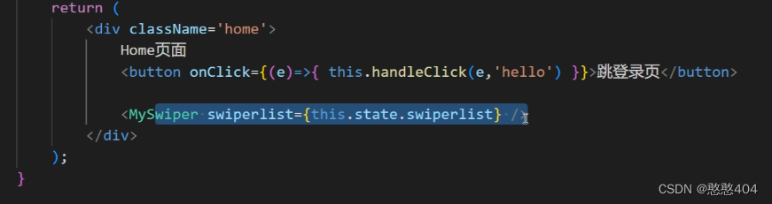
class Detail extends Component<Props> {back = () =>{// Toast.clear();// Toast.show({// content: '点击了返回',// duration: 1000,// })Dialog.clear() //关闭所有打开的对话框Dialog.confirm({content: '确定删除吗?',title:'警告',}).then((res)=>{if (res) {console.log('点击了确定,执行删除');} else {console.log('点击了取消');}})}render() {// 获取动态路由参数// console.log(this.props.match.params.id);// 获取固定路由参数,query,刷新页面参数会丢失// console.log(this.props.location.query.id);// 获取固定路由参数,stateconsole.log(this.props.location.state.proid); //商品信息获取了return (<div className='detail'><NavBar back='返回' onBack={() => { this.back()}}>商品详情</NavBar></div>);}
}
export default Detail;
下拉加载进度条:无线滚动
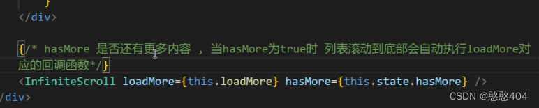
import { InfiniteScroll } from 'antd-mobile'{/* hasMore 是否有更多内容,当hasMore为true时,列表滚动到底部会自动执行loadMore对应的回调函数 */}
<InfiniteScroll loadMore={loadMore} hasMore={hasMore} />
loadMore是个异步函数:::
骨架屏(两种写法)先导入,再使用
//骨架屏
import { Skeleton } from 'antd-mobile'{// this.state.recommendlist.length == 0 &&<><Skeleton.Title animated /><Skeleton.Paragraph lineCount={5} animated /></>
}