Nomogram | 盘点一下绘制列线图的几个R包!~(一)

1写在前面
列线图,又称诺莫图(Nomogram),是一种用于预测模型的可视化工具,它可以将多个影响因素和结局事件的关系展示在同一平面上。🥳
列线图最早是由法国工程师Philbert Maurice d'Ocagne于1884年发明的,他在1880年提出了nomography的概念,用于快速计算复杂公式的图形表示法,曾经在工程和科学领域广泛使用,直到被计算机取代。🥸
列线图的基本原理是根据回归模型的系数,给每个影响因素的不同取值赋分,然后将各个分数相加得到总分,再根据总分和结局事件发生概率的转换关系,计算出预测值。🤓
本期就盘点一下基于R语言的列线图绘制方法。😜
2用到的包
rm(list = ls())
library(tidyverse)
library(survival)
library(rms)
library(nomogramFormula)
library(DynNom)
3示例数据
今天用一下伟大的cancer数据集中的colon。😘
data(cancer)

DT::datatable(colon)
4rms包制作列线图
4.1 构建模型
我们先构建个模型吧。🥸
## 以下2步为必须步骤
ddist <- datadist(colon)
options(datadist='ddist')
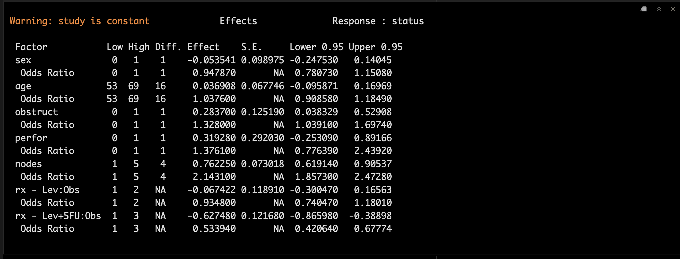
fit1 <- rms::lrm(status~rx+sex+age+obstruct+perfor+nodes,
data = colon)
summary(fit1)
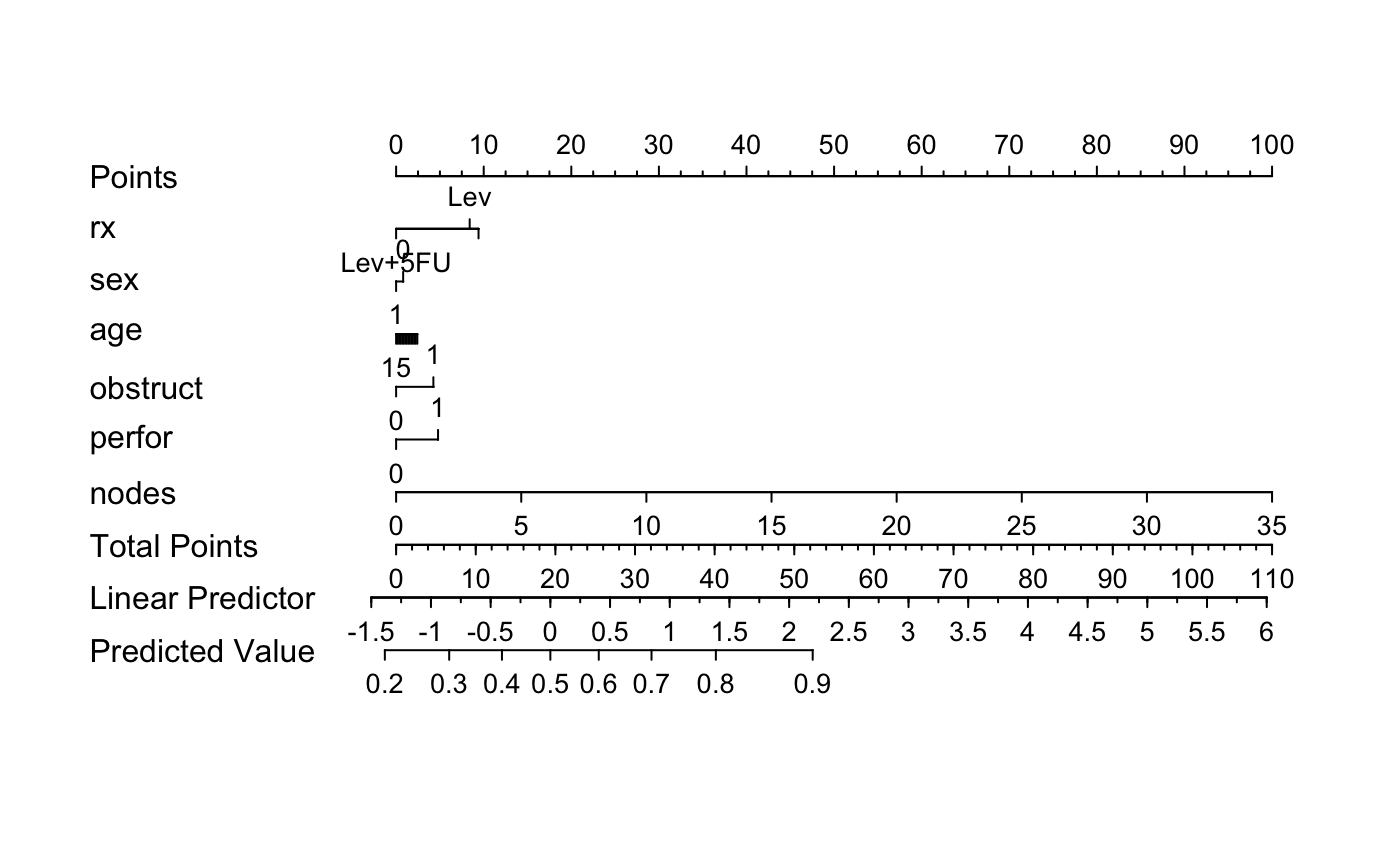
可视化一下吧。😜
## 绘图
nomogram <- nomogram(fit1, fun = function(x)1/(1+exp(-x)))
plot(nomogram)
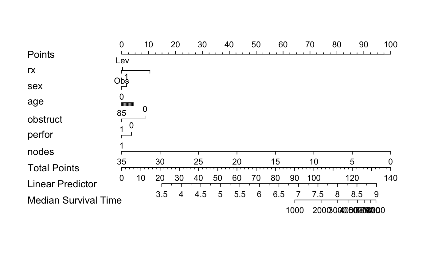
4.2 加入时间变量
我们再试着加入时间变量,需要用到psm和Surv。🤓
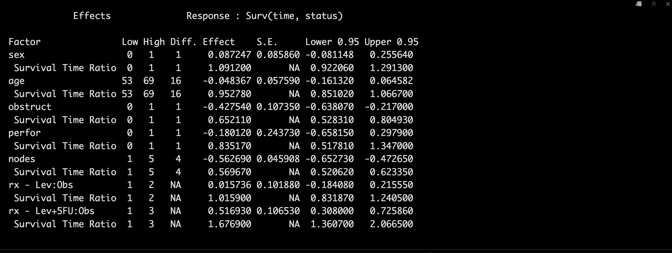
fit2 <- rms::psm(Surv(time,status) ~ rx + sex + age + obstruct + perfor + nodes,
                 data=colon, dist='lognormal')
summary(fit2)
可视化一下吧。😘
med  <- Quantile(fit2)
surv <- Survival(fit2)

plot(nomogram(fit2, fun=function(x) med(lp=x), funlabel="Median Survival Time"))
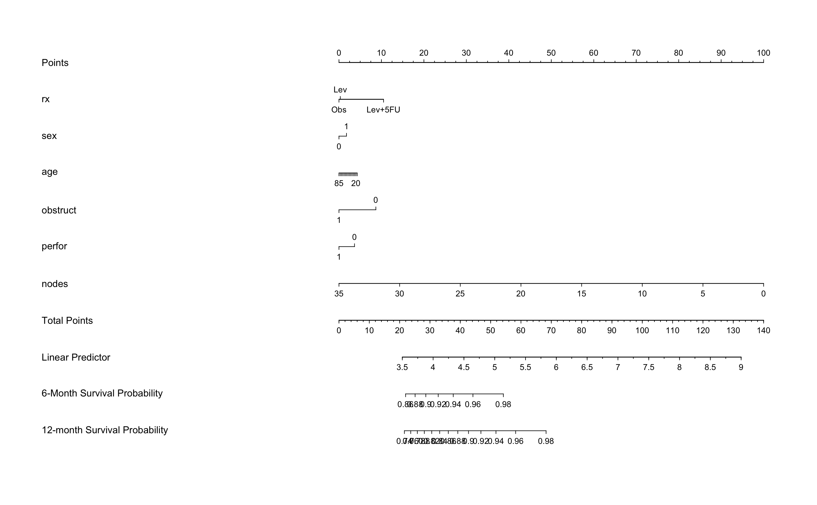
再试着把解决变量改成半年和1年的生存率。🤩
nom <- nomogram(fit2, fun=list(function(x) surv(6, x),
                            function(x) surv(12, x)),
            funlabel=c("6-Month Survival Probability",
                       "12-month Survival Probability"))
plot(nom, xfrac=.7)
5rms包的补充
rms的确很好用,但是很难计算出所有项目的总分和概率,这里可以用nomogramFormula包作为补充。😂
相关函数:👇
formula_rd(),formula_lp()➡️polynomial regression;points_cal()➡️total points;prob_cal()➡️lrm(), cph() or psm() regression。
5.1 formula_lp
formula_lp(nomogram = nom)
formula_lp(nomogram = nom,power = 1)
formula_lp(nomogram = nom,power = 3,digits=6)
5.2 formula_rd
formula_rd(nomogram = nom)
formula_rd(nomogram = nom,power = 1)
formula_rd(nomogram = nom,power = 3,digits=6)
5.3 Calculate Total Points
##get the formula by the best power using formula_lp
results <- formula_lp(nom)
points_cal(formula = results$formula,lp=fit3$linear.predictors)

#get the formula by the best power using formula_rd
results <- formula_rd(nomogram = nom)
points_cal(formula = results$formula,rd=df)
5.4 Calculate Probabilities
# lrm() function
f <- lrm(status~rx+sex+age+obstruct+perfor+nodes,
         data=colon,
         linear.predictors = T)

head(prob_cal(reg = f))

# cph() function
f <- cph(Surv(time,status)~rx+sex+age+obstruct+perfor+nodes,
         data=colon,
         linear.predictors=T,
         surv=T)

head(prob_cal(reg = f,times = c(365,365*2)))

# psm() function
f <- psm(Surv(time,status)~rx+sex+age+obstruct+perfor+nodes,
         data=colon)

head(prob_cal(reg = f,times = c(365,365*2)))
5.5 Caculate Total Points for nomogram Picture
TotalPoints.rms(rd = colon,fit = f,nom = nom)
6regplot包制作列线图
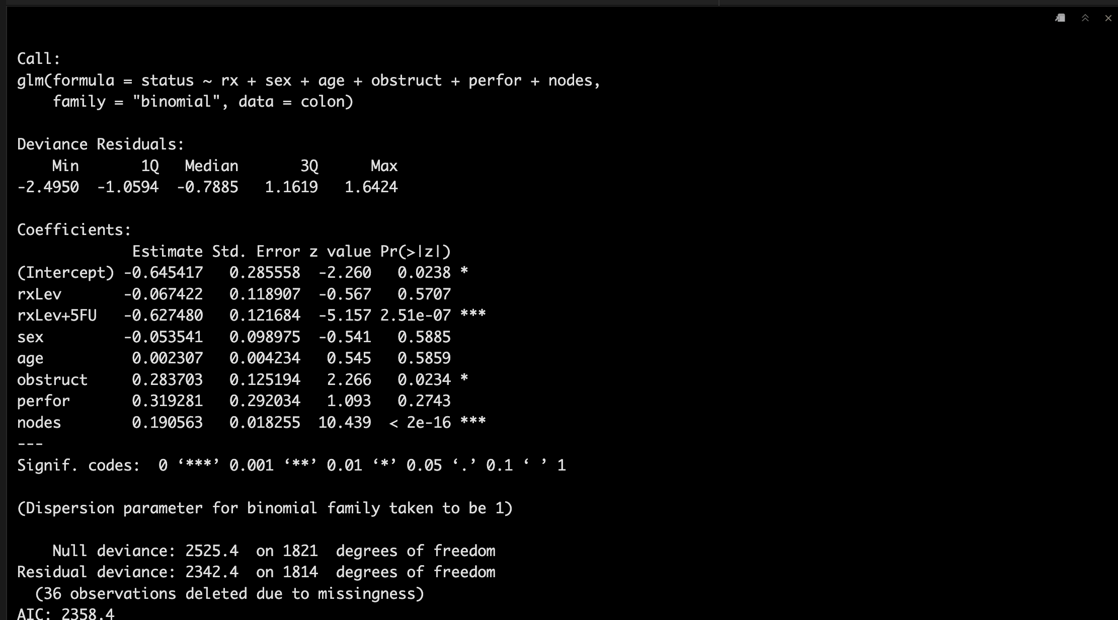
6.1 构建模型
glm函数来构建哦。💪
fit3 <- glm(status~rx+sex+age+obstruct+perfor+nodes,
           data=colon,
           family="binomial")
summary(fit3)
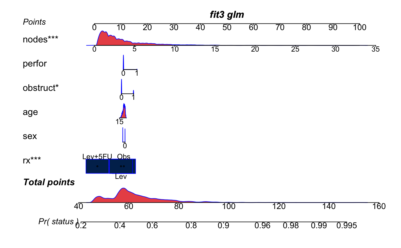
可视化一下吧。😏
regplot(fit3, plots = c("density","boxes"), center = T,
        observation = F,points = T,
        dencol = "#EA5455",boxcol = "#002B5B",
        droplines=T
        )
6.2 加入时间变量
这次我们换成使用coxph函数。😎
Coxfit<-coxph(Surv(time,status) ~ rx + sex + age + obstruct + perfor + nodes,
                 data=colon)

summary(Coxfit)
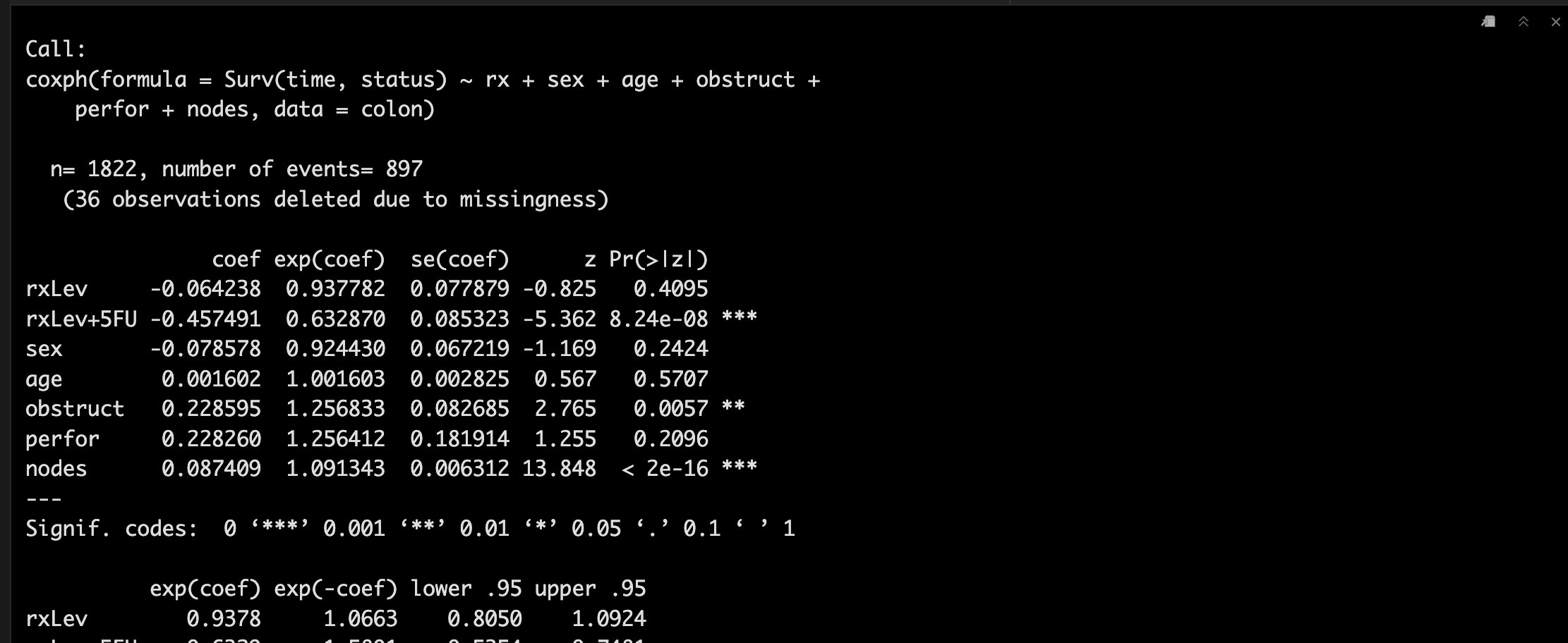
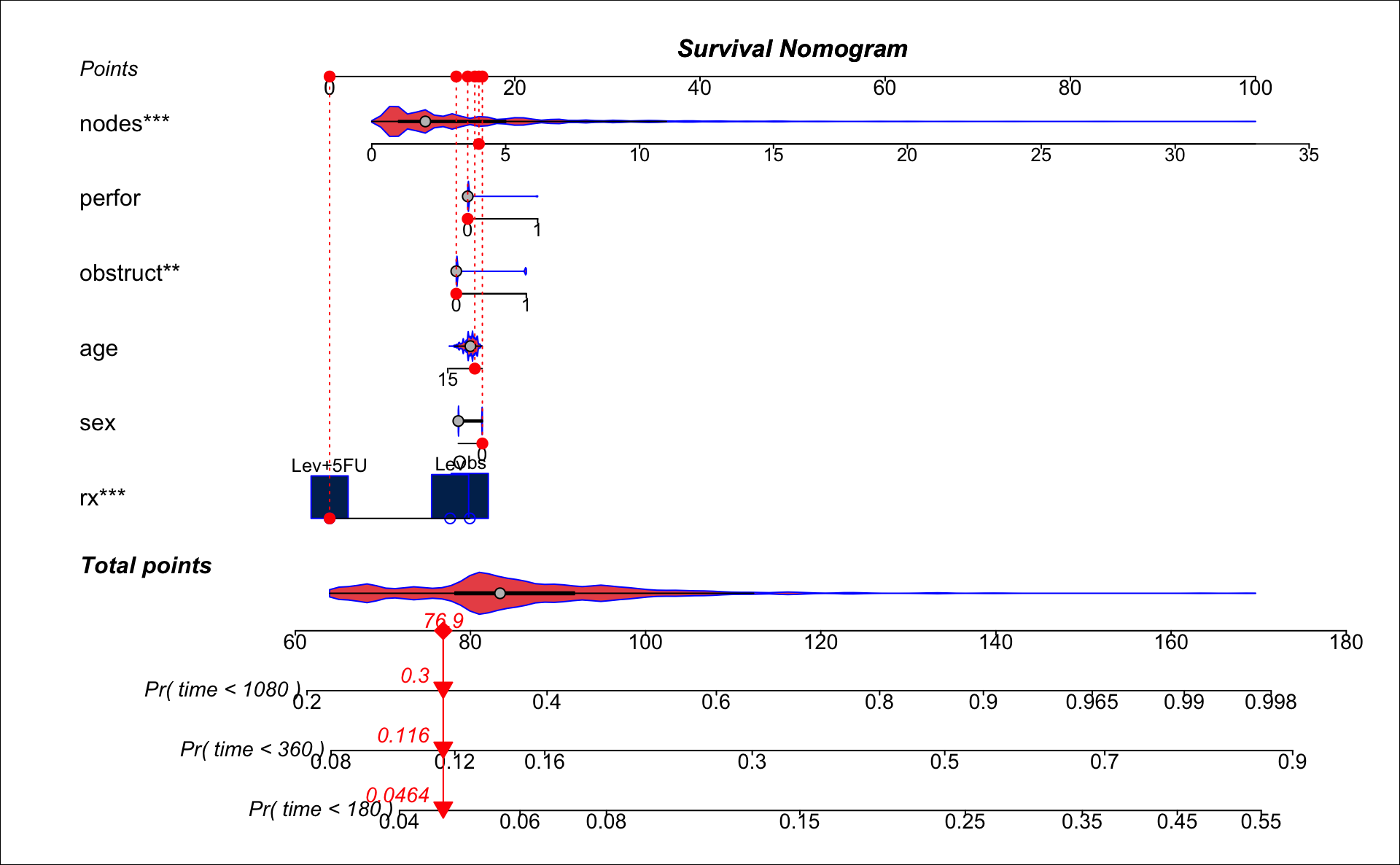
可视化一下吧。🥳
这里我们显示一下第50个病例的180天、360天、1080天的生存概率。🧐
regplot(Coxfit, plots=c("violin","bars"),
        observation = colon[50,],
        points = T,
        droplines=T,
        title="Survival Nomogram",
        dencol = "#EA5455",boxcol = "#002B5B",
        prfail=T,  # For survival models only
        failtime=c(180,360,1080), # For survival models only
        #clickable=T
        )
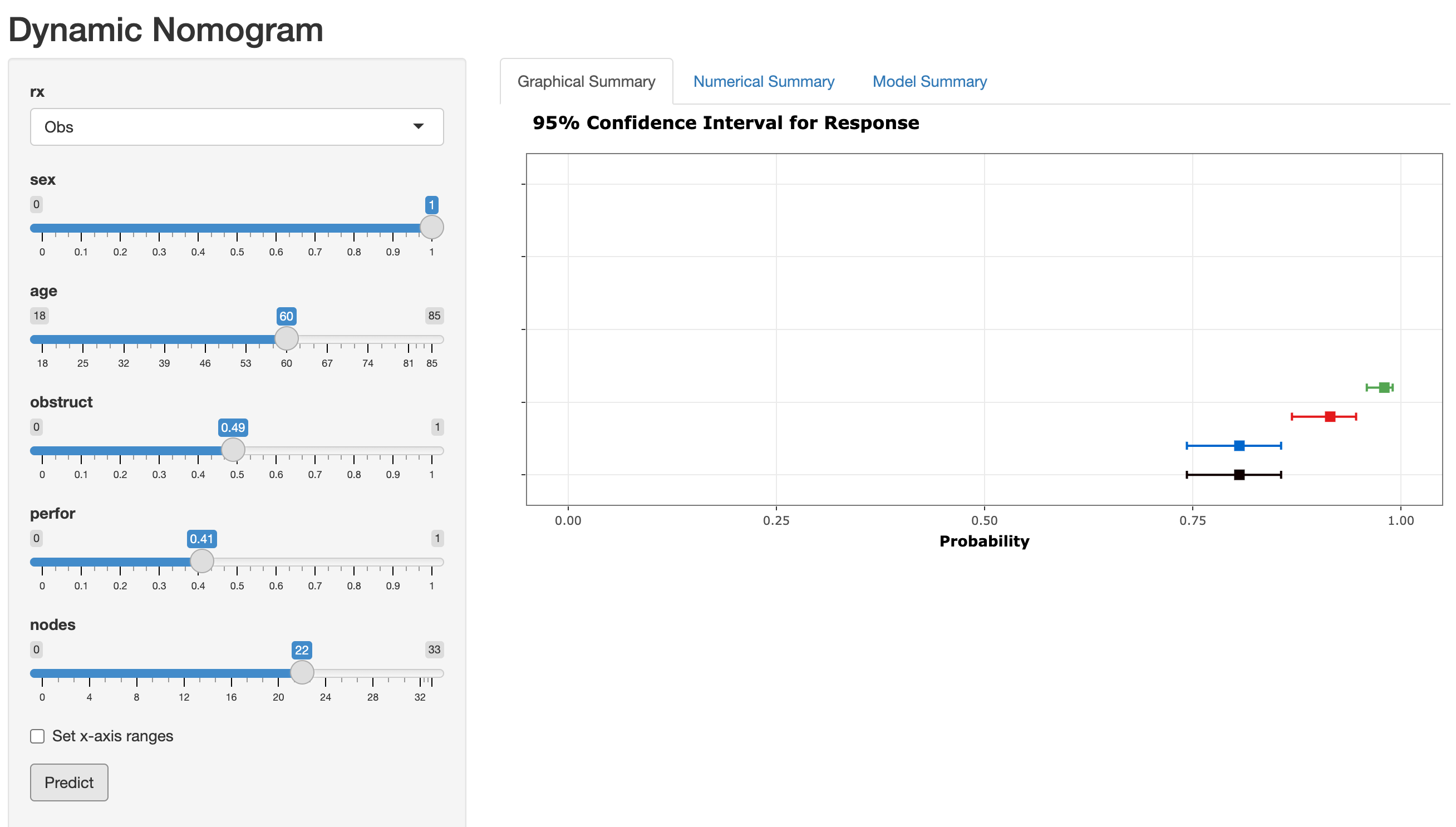
7DynNom包制作列线图
新鲜的shiny app,不过个人觉得不是特别好用。😔
# 需要glm函数
DynNom(fit3, colon)

最后祝大家早日不卷!~
点个在看吧各位~ ✐.ɴɪᴄᴇ ᴅᴀʏ 〰
📍 往期精彩
📍 🤩 WGCNA | 值得你深入学习的生信分析方法!~
📍 🤩 ComplexHeatmap | 颜狗写的高颜值热图代码!
📍 🤥 ComplexHeatmap | 你的热图注释还挤在一起看不清吗!?
📍 🤨 Google | 谷歌翻译崩了我们怎么办!?(附完美解决方案)
📍 🤩 scRNA-seq | 吐血整理的单细胞入门教程
📍 🤣 NetworkD3 | 让我们一起画个动态的桑基图吧~
📍 🤩 RColorBrewer | 再多的配色也能轻松搞定!~
📍 🧐 rms | 批量完成你的线性回归
📍 🤩 CMplot | 完美复刻Nature上的曼哈顿图
📍 🤠 Network | 高颜值动态网络可视化工具
📍 🤗 boxjitter | 完美复刻Nature上的高颜值统计图
📍 🤫 linkET | 完美解决ggcor安装失败方案(附教程)
📍 ......
本文由 mdnice 多平台发布