vue3 使用antv自定义漏斗对比图+热力图+echart图表注意事项

echart 官网自定义漏斗图链接:https://g2plot.antv.antgroup.com/zh/examples/case/statistical-scenario/#funnel-analysis
此处代码直接搬用即可
效果图
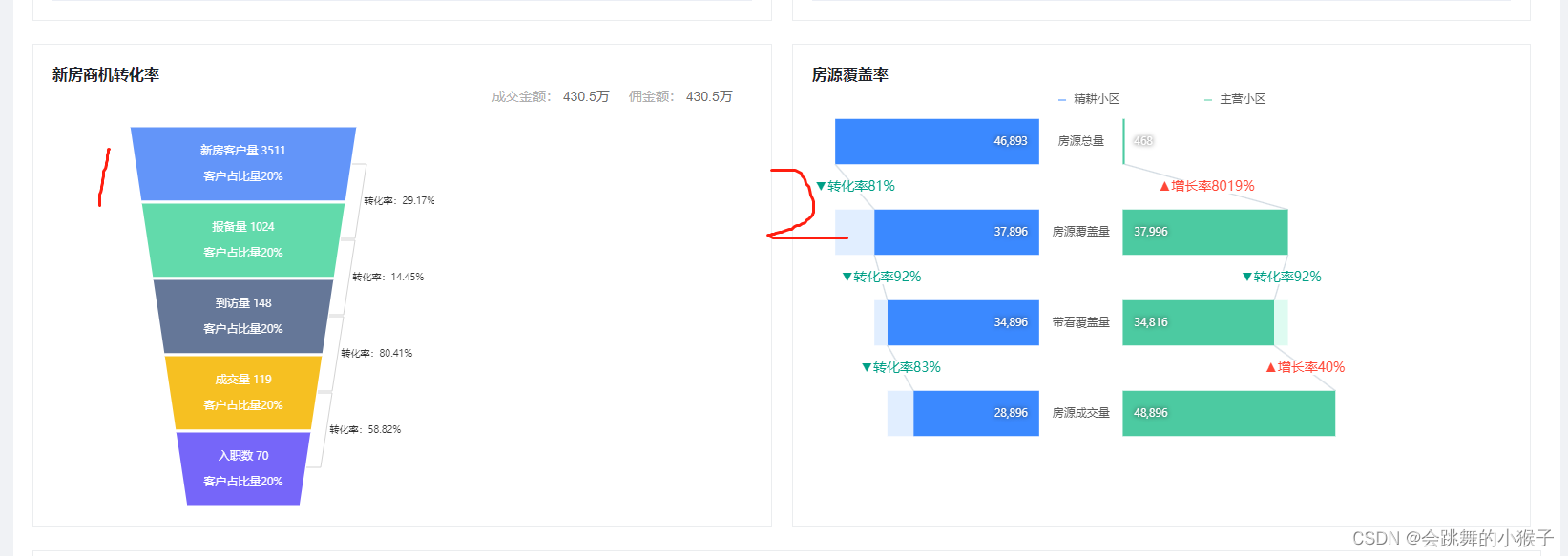
1.左侧漏斗对比图
在antv官网中代码为react使用方法。这里我转化为了vue3的形式
<script setup lang="ts">
import { Funnel } from '@antv/g2plot'
//insert-css需要npm i insert-css加载样式依赖
import 'insert-css'
const formatter = (v) => `${(v * 100).toFixed(2)}%`
const data = [{ stage: '新房客户量', count: 3511, popName: '20%' },{ stage: '报备量', count: 1024, popName: '20%' },{ stage: '到访量', count: 148, popName: '20%' },{ stage: '成交量', count: 119, popName: '20%' },{ stage: '入职数', count: 70, popName: '20%' },
].map((d) => ({ ...d, _count: 1 }))
const chartNodeRef = ref(null)
const plotRef = ref()const renderAnntations = (plot) => {const { chart } = plotconst coord = chart.getCoordinate()const elements = chart.geometries[0].elementsconst parsePoints = []elements.forEach((ele, idx) => {const { points, nextPoints } = ele.shape.get('origin')if (nextPoints) {let p0 = { y: (points[1].y + points[2].y) / 2 }if (idx > 0) {p0.x = parsePoints[idx - 1][1].x} else {p0.x = (points[2].x + points[1].x) / 2}let p3 = {x: (nextPoints[2].x + nextPoints[1].x) / 2,y: (nextPoints[2].y + nextPoints[1].y) / 2,}parsePoints.push([p0, p3])}})let container = chart.getLayer('fore').findById('annotation-group')if (!container) {container = chart.getLayer('fore').addGroup({ id: 'annotation-group' })} else {container.clear()}parsePoints.forEach((point, idx) => {const p0 = coord.convert(point[0])const p3 = coord.convert(point[1])const path = [['M', p0.x, p0.y],['L', p0.x + 15, p0.y],['L', p3.x + 15, p3.y - 2],['L', p3.x, p3.y - 2],]container.addShape('path', {attrs: {path,stroke: '#d3d3d3',lineWidth: 1,},})const fontSize = 10const offset = 5container.addShape('text', {attrs: {x: (path[0][1] + path[1][1]) / 2 + offset,y: (path[1][2] + path[2][2] + fontSize) / 2,text: `转化率:${formatter(data[idx + 1].count / data[idx].count)}`,fontSize: 10,fill: '#333',},})})chart.render(true)
}
onMounted(() => {if (chartNodeRef.value) {const plot = new Funnel('business', {data: data,xField: 'stage',yField: '_count',legend: false,conversionTag: false,dynamicHeight: true,label: {formatter: (text, item) => {//这里是漏斗上的文字,我发现使用div字符串拼接的办法不能使第二行文字换行,只要输入空格自己就换行了return `${item._origin.stage} ${item._origin.count}客户占比量${item._origin.popName}`},},tooltip: {customItems: (items) => {return items.map((d) => ({ ...d, value: d.data.count }))},},funnelStyle: {stroke: '#fff',lineWidth: 3,},})// Step 3: 渲染图表plot.render()plotRef.value = plot}let a = plotRef && plotRef.valueif (a) {renderAnntations(a)a.chart.on('afterchangesize', () => {renderAnntations(a)})}
})
</script><template><div><div class="title">新房商机转化率</div><div class="title-2"><div>成交金额:<span>430.5万</span></div><div>佣金额:<span>430.5万</span></div></div><section class="wrapper"><divid="business"ref="chartNodeRef"style="width: 400px; height: 100%"/></section></div>
</template>
<style lang="scss" scoped>
.title {color: #1f2329;font-weight: bold;font-size: 16px;
}
.title-2 {display: flex;justify-content: flex-end;margin-bottom: 20px;color: #aeaeae;span {color: #6b6b6b;margin-right: 20px;}
}
</style>
2.右侧漏斗对比图
antv中是vue3代码直接搬用就可以。
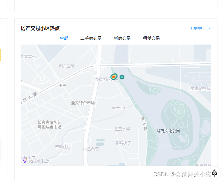
3.地图热力图
注意:在官网中直接import { Scene, HeatmapLayer, Source } from '@antv/l7’引入使用(npm下载),在vue3中一直报错,不知道是什么影响的或者是我的框架与其有冲突。需要在index.html CDN引入,并且使用时需要用L7.Scene
index.html
<script src='https://unpkg.com/@antv/l7'></script><script src='https://unpkg.com/@antv/l7@2.0.11'></script>
热力图代码
<script setup lang="ts">
import { Scene, HeatmapLayer, Source } from '@antv/l7'
import { GaodeMap } from '@antv/l7-maps'
const tabList = ref([{ id: 1, name: '全部' },{ id: 2, name: '二手房交易' },{ id: 3, name: '新房交易' },{ id: 4, name: '租赁交易' },
])
const actived = ref(1)
const init = () => {const scene = new L7.Scene({id: 'map',map: new L7.GaodeMap({style: 'light',center: [125.35, 43.88],abc: 14,}),})scene.on('loaded', () => {const data = [{lng: 125.35,lat: 43.88,//此处注意,在官方文档并未介绍这个字段,这个字段是判断点在那个阶级内,不同层级点的颜色不同。字段名在.size中设置abc: 0,},{lng: 125.3512,lat: 43.8811,abc: 2,},{lng: 125.3511,lat: 43.881,abc: 2,},{lng: 125.35122222,lat: 43.881111,abc: 5,},{lng: 125.3411111,lat: 43.8719999,abc: 4,},{lng: 125.354444,lat: 43.88444,abc: 2,},{lng: 125.35199,lat: 43.881010177,abc: 4,},{lng: 125.351010145,lat: 43.88101,abc: 5,},{lng: 125.351012122,lat: 43.881012188,abc: 1,},{lng: 125.3510115,lat: 43.8810199,abc: 9,},]const layer = new L7.HeatmapLayer().source(data, {parser: {type: 'json',x: 'lng',y: 'lat',},}).shape('heatmap').size('abc', [0, 1.0]) // weight映射通道.style({intensity: 2,radius: 10,rampColors: {colors: ['#FF4818','#F7B74A','#FFF598','#91EABC','#2EA9A1','#206C7C',].reverse(),positions: [0, 0.2, 0.4, 0.6, 0.8, 1.0],},})scene.addLayer(layer)})
}
const handelTab = (index) => {actived.value = index + 1
}
onMounted(() => {init()
})
</script><template><div class="hot-map"><div class="title"><span>房产交易小区热点</span><el-button link type="primary" class="to-detail">历史统计 ></el-button></div><div class="tab-box"><div:class="['tab', index === actived - 1 ? 'actived' : '']"v-for="(item, index) in tabList"@click="handelTab(index)">{{ item.name }}</div></div><div class="map-page"><div id="map" style="width: 100%; height: 400px"></div></div></div>
</template>
<style scoped lang="scss">
.map-page {position: relative;width: 100%;height: 100%;
}
.title {display: flex;justify-content: space-between;margin-bottom: 10px;color: #1f2329;font-size: 16px;font-weight: bold;.to-detail {cursor: pointer;z-index: 99;}
}
.tab-box {display: flex;justify-content: center;margin-bottom: 10px;.tab {margin-right: 40px;cursor: pointer;}
}
.actived {color: #008cff;
}
</style>
4.echart图表注意事项
(1)图表自适应 window.addEventListener(‘resize’, () => {
myChart.resize()
})加上这个方法
(2)当给容器宽度设为百分百,但图表只有100px时
// 初始化echart宽度
document.getElementById(props.idName).style.width =
document.querySelector(‘.pillar-box’).offsetWidth + ‘px’
使用获取元素dom方式给元素宽度