Element Plus 实例详解(六)___Progress 进度条

Element Plus 实例详解(六)___Progress 进度条
本文目录:
一、前言
二、搭建Element Plus试用环境
1、搭建Vue3项目(基于Vite + Vue)
2、安装Element Plus
三、Element Plus Progress 进度条功能试用
1、直线进度条
2、进度条内显示百分比标识
3、环形进度条
4、仪表盘形进度条
5、自定义内容
6、自定义进度条的颜色
7、动画进度条
四、官方资料中的各参数说明
五、总结
一、前言
Element Plus Progress 进度条,用于展示操作进度,告知用户当前状态和预期。
二、搭建Element Plus试用环境
1、搭建Vue3项目(基于Vite + Vue)
安装时请选择支持Typescript,本实例我安装在(C:\\00program\\vue\\vuelearn\\vueviteproject1)目录中,具体方法详见下面文章:
vue3 项目搭建教程(基于create-vue,vite,Vite + Vue)https://blog.csdn.net/weixin_69553582/article/details/129630880
安装完成后打开浏览器:http://localhost:5173/ ,能正常显示欢迎页面:
2、安装Element Plus
- NPM:npm install element-plus --save
详细参考:
Element Plus 实例详解系列(一)__安装设置 https://blog.csdn.net/weixin_69553582/article/details/129701286
三、Element Plus Progress 进度条功能试用
1、直线进度条
- Progress 组件设置 percentage 属性即可,表示进度条对应的百分比。
- 该属性必填,并且必须在 0-100 的范围内。
- 可以通过设置 format 来自定义文字显示的格式。
实现效果:

完整代码:
<template><div class="demo-progress"><h3>Progress 进度条</h3><el-progress :percentage="50" :stroke-width="10"/><el-progress :percentage="100" :stroke-width="10" :format="format" /><el-progress :percentage="100" :stroke-width="10" status="success" /><el-progress :percentage="100" :stroke-width="10" status="warning" /><el-progress :percentage="50" :stroke-width="10" status="exception" /></div>
</template><script lang="ts" setup>const format = (percentage) => (percentage === 100 ? 'Full' : `${percentage}%`)
</script><style scoped>.demo-progress .el-progress--line {margin-bottom: 35px;width: 350px;}
</style>
2、进度条内显示百分比标识
- 百分比不占用额外控件,适用于文件上传等场景。
- Progress 组件可通过 stroke-width 属性更改进度条的高度,
- 可通过 text-inside 属性来改变进度条内部的文字。
实现效果:

完整代码:
<template><div class="demo-progress"><h3>进度条内显示百分比标识</h3><el-progress :text-inside="true" :stroke-width="28" :percentage="70" /><el-progress :text-inside="true":stroke-width="28":percentage="100"status="success" /><el-progress :text-inside="true":stroke-width="28":percentage="80"status="warning" /><el-progress :text-inside="true":stroke-width="28":percentage="50"status="exception"/></div>
</template><style scoped>.demo-progress .el-progress--line {margin-bottom: 15px;width: 350px;padding:10px;}
</style>
3、环形进度条
- Progress 组件可通过 type 属性来指定使用环形进度条
- 还可以通过 width 属性来设置其大小。
实现效果:

完整代码:
<template><div class="demo-progress"><h3>环形进度条</h3><el-progress type="circle" :percentage="0" :stroke-width="10" /><el-progress type="circle" :percentage="35" :stroke-width="10" /><el-progress type="circle" :percentage="100" :stroke-width="10" status="success" /><el-progress type="circle" :percentage="70" :stroke-width="10" status="warning" /><el-progress type="circle" :percentage="50" :stroke-width="10" status="exception" /></div>
</template>
<style scoped>.demo-progress .el-progress--line {margin-bottom: 15px;width: 450px;}.demo-progress .el-progress--circle {margin-right: 15px;}
</style>
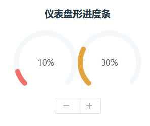
4、仪表盘形进度条
- 可以指定 type 属性到 dashboard 使用控制面板进度栏。
实现效果:
完整代码:
<template><div class="demo-progress"><h3>仪表盘形进度条</h3><el-progress type="dashboard" :percentage="percentage" :color="colors" :stroke-width="10"/><el-progress type="dashboard" :percentage="percentage2" :color="colors" :stroke-width="10"/><div><el-button-group><el-button :icon="Minus" @click="decrease" /><el-button :icon="Plus" @click="increase" /></el-button-group></div></div>
</template><script lang="ts" setup>import { onMounted, ref } from 'vue'import { Minus, Plus } from '@element-plus/icons-vue'const percentage = ref(10)const percentage2 = ref(0)const colors = [{ color: '#f56c6c', percentage: 20 },{ color: '#e6a23c', percentage: 40 },{ color: '#5cb87a', percentage: 60 },{ color: '#1989fa', percentage: 80 },{ color: '#6f7ad3', percentage: 100 },]const increase = () => {percentage.value += 10if (percentage.value > 100) {percentage.value = 100}}const decrease = () => {percentage.value -= 10if (percentage.value < 0) {percentage.value = 0}}onMounted(() => {setInterval(() => {percentage2.value = (percentage2.value % 100) + 10}, 400)})
</script>
<style scoped>.demo-progress .el-progress--line {margin-bottom: 15px;width: 300px;padding:10px;}.demo-progress .el-progress--circle {margin-right: 15px;}
</style>
5、自定义内容
- 通过默认插槽添加自定义内容。
实现效果:

完整代码:
<template><div class="demo-progress"><h3>自定义内容</h3><el-progress :percentage="80" :stroke-width="10"><el-button text>Content</el-button></el-progress><el-progress :text-inside="true":stroke-width="30":percentage="50"status="exception"><span>Content</span></el-progress><el-progress type="circle" :percentage="100" status="success" :stroke-width="10"><el-button type="success" :icon="Check" circle /></el-progress><span>通过默认插槽</span><el-progress type="dashboard" :percentage="70" :stroke-width="10"><template #default="{ percentage }"><span class="percentage-value">{{ percentage }}%</span><span class="percentage-label">Progressing</span></template></el-progress></div>
</template><script lang="ts" setup>import { Check } from '@element-plus/icons-vue'
</script><style scoped>.percentage-value {display: block;margin-top: 10px;font-size: 28px;}.percentage-label {display: block;margin-top: 10px;font-size: 12px;}.demo-progress .el-progress--line {margin-bottom: 15px;width: 450px;padding: 10px;}.demo-progress .el-progress--circle {margin-right: 15px;}
</style>
6、自定义进度条的颜色
- 可以通过 color 属性来设置进度条的颜色。
- 该属性可以接受十六进制颜色值,函数和数组。
实现效果:

完整代码:
<template><div class="demo-progress" ><h3>自定义进度条的颜色</h3><el-progress :percentage="percentage" :stroke-width="20" :color="customColor" /><el-progress :percentage="percentage" :stroke-width="20" :color="customColorMethod" /><el-progress :percentage="percentage" :stroke-width="20" :color="customColors" /><el-progress :percentage="percentage" :stroke-width="20" :color="customColors" /><div><el-button-group><el-button :icon="Minus" @click="decrease" /><el-button :icon="Plus" @click="increase" /></el-button-group></div></div>
</template><script lang="ts" setup>import { ref } from 'vue'import { Minus, Plus } from '@element-plus/icons-vue'const percentage = ref(45)const customColor = ref('#409eff')const customColors = [{ color: '#b6ff00', percentage: 20 },{ color: '#e6a23c', percentage: 40 },{ color: '#5cb87a', percentage: 60 },{ color: '#1989fa', percentage: 80 },{ color: '#6f7ad3', percentage: 100 },]const customColorMethod = (percentage: number) => {if (percentage < 30) {return '#909399'}if (percentage < 70) {return '#e6a23c'}return '#67c23a'}const increase = () => {percentage.value += 10if (percentage.value > 100) {percentage.value = 100}}const decrease = () => {percentage.value -= 10if (percentage.value < 0) {percentage.value = 0}}
</script>
<style scoped>.demo-progress .el-progress--line {margin-bottom: 15px;width: 350px;padding: 10px;}
</style>
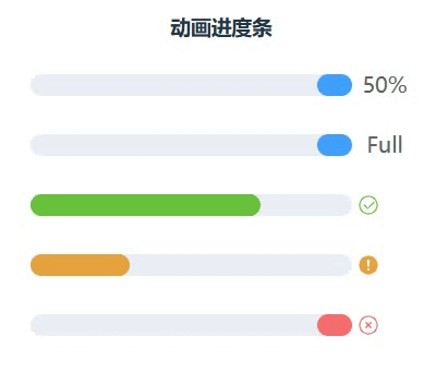
7、动画进度条
- 使用 intermediate 属性来设置不确定的进度,
- duration 来控制动画持续时间。
实现效果:
完整代码:
<template><div class="demo-progress"><h3>动画进度条</h3><el-progress :percentage="50" :indeterminate="true" :stroke-width="20"/><el-progress :percentage="100" :format="format" :indeterminate="true" :stroke-width="20"/><el-progress :percentage="100"status="success":indeterminate="true":duration="5" :stroke-width="20"/><el-progress :percentage="100"status="warning":indeterminate="true":duration="1" :stroke-width="20"/><el-progress :percentage="50" status="exception" :indeterminate="true" :stroke-width="20"/></div>
</template><script lang="ts" setup>const format = (percentage) => (percentage === 100 ? 'Full' : `${percentage}%`)
</script>
<style scoped>.demo-progress .el-progress--line {margin-bottom: 15px;width: 350px;}
</style>
四、官方资料中的各参数说明
Attributes属性
| 属性名 | 说明 | 类型 | 可选值 | 默认值 |
|---|---|---|---|---|
| percentage | 百分比,必填 | number | (0-100) | 0 |
| type | 进度条类型 | string | line/ circle/ dashboard |
line |
| stroke-width | 进度条的宽度 | number | — | 6 |
| text-inside | 进度条显示文字内置在进度条内(仅 type 为 'line' 时可用) |
boolean | — | false |
| status | 进度条当前状态 | string | success/ exception/ warning |
— |
| indeterminate | 是否为动画进度条 | boolean | - | false |
| duration | 控制动画进度条速度 | number | - | 3 |
| color | 进度条背景色 进度条背景色 (会覆盖 status 状态颜色) |
string/ function/ array |
— | '' |
| width | 环形进度条画布宽度(只在 type 为 circle 或 dashboard 时可用) | number | — | 126 |
| show-text | 是否显示进度条文字内容 | boolean | — | true |
| stroke-linecap | circle/dashboard 类型路径两端的形状 | string | butt/ round/ square |
round |
| format | 指定进度条文字内容 | function(percentage) | — | — |
Slots
| 名称 | 说明 |
|---|---|
| default | 自定义内容,参数为 { percentage } |
五、总结
|
1 |
Element Plus 实例详解(一)__安装设置 |
| 2 | Element Plus 实例详解(二)___Button 按钮 |
| 3 | Element Plus 实例详解(三)___Date Picker 日期选择 |
| 4 | Element Plus 实例详解(四)___Border 边框 |
| 5 | Element Plus 实例详解(五)___Scrollbar 滚动条 |
| 6 | Element Plus 实例详解(六)___Progress 进度条 |
| 7 | Element Plus 实例详解(七)___ |
| 8 | Element Plus 实例详解(八)___ |
| 9 | Element Plus 实例详解(九)___ |
| 10 | Element Plus 实例详解(十)___ |
| 11 | Element Plus 实例详解(十一)___ |
| 12 | Element Plus 实例详解(十一)___ |
推荐阅读:
| 31 |  |
Element Plus 实例详解(一)___安装设置 |
| 30 |
|
Vue3安装配置、开发环境搭建(组件安装卸载)(图文详细) |
| 29 |  |
SVG实例详解系列(一)(svg概述、位图和矢量图区别(图解)、SVG应用实例) |
| 28 |  |
查看jdk安装路径,在windows上实现多个java jdk的共存解决办法,安装java19后终端乱码的解决 |
| 27 |  |
别具一格,原创唯美浪漫情人节表白专辑,(复制就可用)(html5,css3,svg)表白爱心代码(1) |
| 26 |  |
2023年春节祝福第二弹——送你一只守护兔,让它温暖每一个你【html5 css3】画会动的小兔子,炫酷充电,字体特 |
| 25 |  |
2023春节祝福系列第一弹(上)(放飞祈福孔明灯,祝福大家身体健康)(附完整源代码及资源免费下载) |
| 24 |  |
HTML+CSS+svg绘制精美彩色闪灯圣诞树,HTML+CSS+Js实时新年时间倒数倒计时(附源代码) |
| 23 |  |
草莓熊python绘图(春节版,圣诞倒数雪花版)附源代码 |
| 22 |  |
【程序人生】卡塔尔世界杯元素python海龟绘图(附源代码),世界杯主题前端特效5个(附源码) |
| 21 |  |
python爱心源代码集锦(18款) |
| 20 |  |
巴斯光年python turtle绘图__附源代码 |
| 19 |  |
Three.js实例详解___旋转的精灵女孩(附完整代码和资源)(一) |
| 18 |  |
草莓熊python turtle绘图代码(玫瑰花版)附源代码 |
| 17 |  |
立体多层玫瑰绘图源码__玫瑰花python 绘图源码集锦 |
| 16 |  |
皮卡丘python turtle海龟绘图(电力球版)附源代码 |
| 15 |  |
【CSDN云IDE】个人使用体验和建议(含超详细操作教程)(python、webGL方向) |
| 14 |  |
草莓熊python turtle绘图(风车版)附源代码 |
| 13 |  |
用代码过中秋,python海龟月饼你要不要尝一口? |
| 12 |  |
《 Python List 列表全实例详解系列(一)》__系列总目录、列表概念 |
| 11 |  |
用代码写出浪漫__合集(python、matplotlib、Matlab、java绘制爱心、玫瑰花、前端特效玫瑰、爱心) |
| 10 |  |
Python函数方法实例详解全集(更新中...) |
| 9 |  |
matplotlib 自带绘图样式效果展示速查(28种,全) |
| 8 |  |
手机屏幕坏了____怎么把里面的资料导出(18种方法) |
| 7 |  |
2023年3月TIOBE 指数头条:编程语言 Go 进入 TIOBE 指数前 10 名,多家权威机构____编程语言排行榜__薪酬状 |
| 6 |  |
Python中Print()函数的用法___实例详解(全,例多) |
| 5 |  |
色彩颜色对照表(一)(16进制、RGB、CMYK、HSV、中英文名) |
| 4 |  |
Node.js (v19.1.0npm 8.19.3) vue.js安装配置教程(超详细) |
| 3 |  |
Tomcat 启动闪退问题解决集(八大类详细) |
| 2 |  |
Tomcat端口配置(详细) |
| 1 |  |
tomcat11、tomcat10 安装配置(Windows环境)(详细图文) |