Vue+Vant封装通用模态框单选框组件

前言
我们知道,在vant组件中提供的组件往往是比较基础的,能够满足基本需求。但是我们想实现ui设计的一些比较丰富效果的组件,需要自己去实现,且当项目中多次用到的时候,我们将以组件化的思想将其封装起来,供各个页面方面使用。
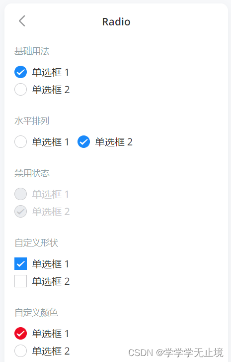
vant提供的单选框效果:
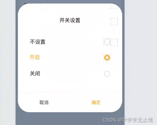
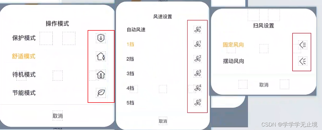
项目中UI提供的单选框效果图
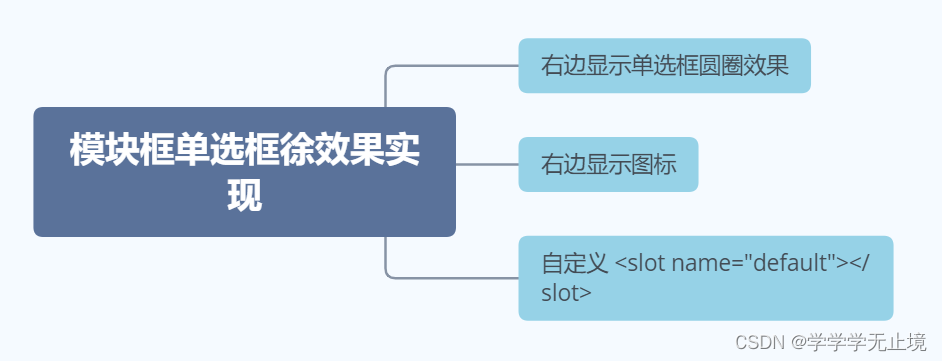
1.右边显示单选框效果
2.右边显示为图标效果
情况
实现思路
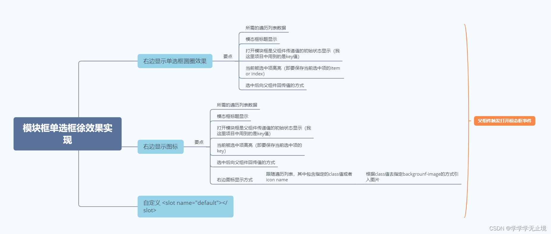
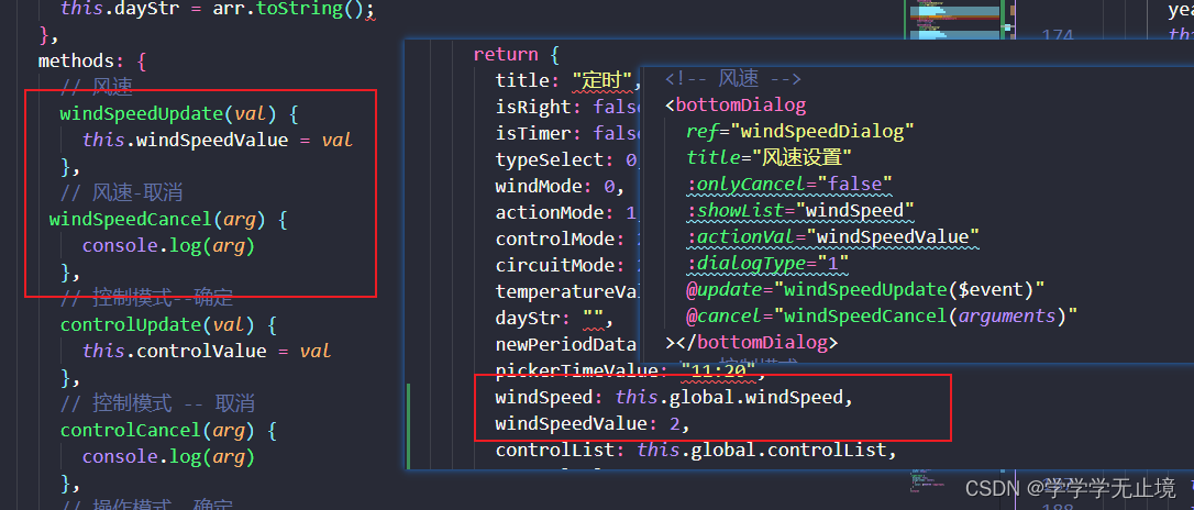
在组建中定义如下变量,用来接收父组件传的值
定义props值
- title:标题
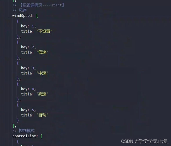
- showList:展示列表的数据
- actionVal:当前列表数据中被选中的值
- dialogType:弹框的类型(0-列表 文字 图标;1-列表 文字 radio;2-自动以内容)
- onlyCancel:是否只显示取消按钮,true只显示取消按钮,false:既显示取消按钮,又显示确定按钮。因为有些是需要点击单选框某项之后直接关闭模态框触发回传事件,有些是需要点击确定按钮再触发,所以这里做了一个区分
定义点击事件
1.列表项点击事件:listClick(i)
listClick(i){// 这个key值也是根据父组件传递过来的列表,key值是每项的唯一标识值,这个唯一标示值根据自身业务逻辑而定this.currActionVal=i.key//存储当前最新值this.$emit('update',this.currentActionVal);//这里可以稍微优化,若存在确定按钮,这一步在确定事件中再进行setTimeout(()=>{this.show=false},500)
}2.点击确定按钮事件:handleConfirm
handleConfirm(){this.$emit('update',this.currentActionVal)
}
3.点击取消事件:handleCancel
handleCancel(){this.$emit('cancel',this.currentActionVal,this.actionVal);//回传旧值和新值,若用户没有触发修改事件时,这里currentActionVal和this.actionVal相等
}
父组件调用
引入与注册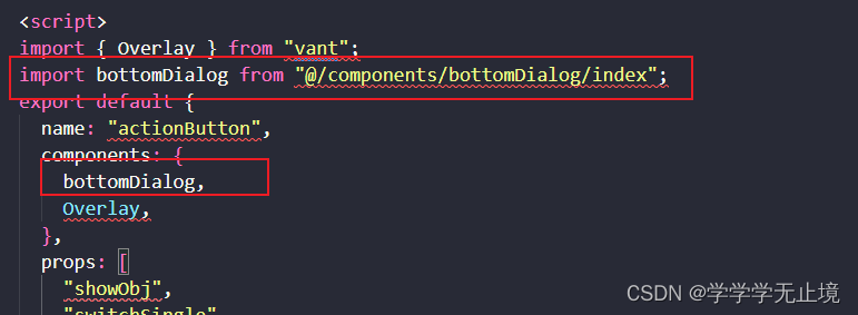
使用
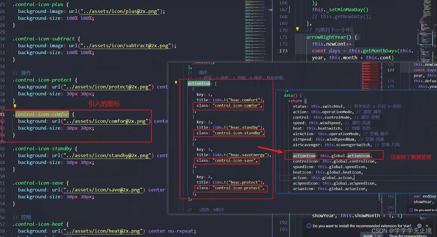
右边显示为图标效果
// html<bottomDialogref="actionDialog":title="$t('hvac.actionModel')":onlyCancel="true":showList="actionIcon":actionVal="action":dialogType="0"@update="actionUpdate($event)"@cancel="actionCancel(arguments)"></bottomDialog>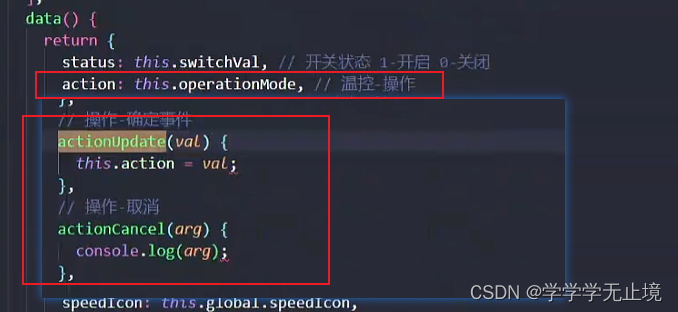
右边显示为radio效果
最后,附上封装的组件的代码
<template><div><van-dialogv-model="show":title="currTitle":confirmButtonText="$t('common.ensure')"confirmButtonColor="#FEB946":cancelButtonText="$t('common.cancel')"cancelButtonColor="#666666":showCancelButton="true":showConfirmButton="showConfirmFlag"@confirm="handleConfirm"@cancel="handleCancel"><!-- 列表 文字-图标 --><div class="list-container" v-if="Number(dialogType) === 0"><divclass="list-box"v-for="(i, k) in showList":key="k"@click="listClick(i)"><divclass="item-right no-action-font":class="{ 'smartOrange-color': i.key === currActionVal }">{{ i.title }}</div><div class="item-left" :class="i.class"></div></div></div><!-- 列表radio 文字-radio --><div class="list-container" v-if="Number(dialogType) === 1"><van-radio-group v-model="currActionVal"><div class="list-box" v-for="(i, k) in showList" :key="k"><divclass="item-right no-action-font":class="{ 'smartOrange-color': i.key === currActionVal }">{{ i.title }}</div><div class="item-left"><van-radio :name="i.key"><template #icon="props"><divclass="item-left":class="props.checked ? 'radio-icon-orange' : 'radio-icon-grey'"></div></template></van-radio></div></div></van-radio-group></div><!-- 自定义内容 --><div class="list-container" v-if="Number(dialogType) === 2"><slot name="default"></slot></div></van-dialog></div>
</template><script>
import { Dialog, RadioGroup, Radio } from "vant";
export default {name: "bottomDialog",components: {Dialog,RadioGroup,Radio,},props: {//   标题title: {type: String,default: "123",},//  是否只显示取消按钮  -true 只有取消按钮 -false 有取消、确定按钮onlyCancel: {type: Boolean,default: false,},// 展示列表数据showList: {type: Array,default() {return [];},required: false,},// 当前列表数据中被选中的值actionVal: {type: Number,default: 0,required: false,},// 弹窗的类型// 0-列表 文字-图标// 1-列表radio  文字-radio// 2-自定义内容dialogType: {type: Number,default: 0,},},data() {return {show: false,currTitle: this.title,showConfirmFlag: !this.onlyCancel,currActionVal: this.actionVal,};},computed: {},watch: {},created() {},mounted() {},methods: {//   点击确定按钮事件handleConfirm() {console.log(this.currActionVal);this.$emit("update", this.currActionVal);},// 点击取消按钮事件handleCancel() {console.log("newVal:" + this.currActionVal);console.log("oldVal:" + this.actionVal);this.$emit("cancel", this.currActionVal, this.actionVal);},// 列表-图标点击事件listClick(i) {this.currActionVal = i.key;this.$emit("update", this.currActionVal);setTimeout(() => {this.show = false;}, 500);},},
};
</script><style lang="scss" scoped>
.list-container {padding: 20px 40px;.list-box {display: flex;flex-direction: row;justify-content: space-between;align-items: center;.item-left {width: 30px;height: 30px;}}
}
// 重写vant弹窗初始样式
.van-dialog {position: fixed !important;top: auto !important;left: 50% !important;bottom: 60px !important;transform: translateX(-50%) !important;
}
.van-dialog__header {font-size: 18px !important;color: #feb946 !important;font-weight: 600 !important;
}
::v-deep .van-radio__icon{height: 100%;
}
.van-radio{height: 100%;
}
.van-radio__icon {height: 30px !important;
}
</style>