Compose TextField

TextField
@Composable
fun TextField(value: String,onValueChange: (String) -> Unit,modifier: Modifier = Modifier,enabled: Boolean = true,readOnly: Boolean = false,textStyle: TextStyle = LocalTextStyle.current,label: @Composable (() -> Unit)? = null,placeholder: @Composable (() -> Unit)? = null,leadingIcon: @Composable (() -> Unit)? = null,trailingIcon: @Composable (() -> Unit)? = null,isError: Boolean = false,visualTransformation: VisualTransformation = VisualTransformation.None,keyboardOptions: KeyboardOptions = KeyboardOptions.Default,keyboardActions: KeyboardActions = KeyboardActions(),singleLine: Boolean = false,maxLines: Int = Int.MAX_VALUE,interactionSource: MutableInteractionSource = remember { MutableInteractionSource() },shape: Shape =MaterialTheme.shapes.small.copy(bottomEnd = ZeroCornerSize, bottomStart = ZeroCornerSize),colors: TextFieldColors = TextFieldDefaults.textFieldColors()
)
Material Design filled text field
Filled TextField 比 Outlined TextField 有更多的视觉效果,可以让它们在被其他内容和组件包围时显得更加突出。
注意
Filled TextField 和 Outlined TextField 都是按照 Material Design 来设计的,所以里面的一些间距是固定的,当你使用 Modifier.size() 等之类的方法尝试去修改它很可能会有以下的效果
TextField(value = text,onValueChange = {text = it},modifier = Modifier.height(20.dp)
)
如果你想自定义一个 TextField 的高度,以及其他的自定义效果,你应该使用 BasicTextField
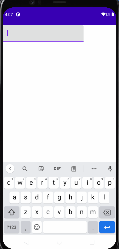
一个简单的 TextField 使用的例子是这样的:
import androidx.compose.runtime.*@Composable
fun TextFieldDemo() {var text by remember{ mutableStateOf("")}TextField(value = text,onValueChange = {text = it})
}
1. singleLine 参数
使用 singleLine 参数可以将 TextField 设置成只有一行
设置了 singleLine 再设置 maxLines 将无效
@Composable
fun TextFieldDemo() {var text by remember{ mutableStateOf("")}TextField(value = text,onValueChange = {text = it},singleLine = true)
}
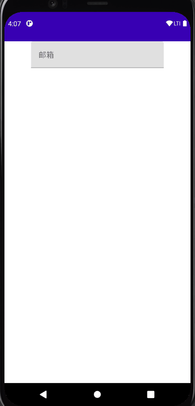
2. label 参数
label 标签可以运用在 TextField 中,当聚焦的时候会改变字体大小
@Composable
fun TextFieldDemo() {var text by remember{ mutableStateOf("")}Column(modifier = Modifier.fillMaxWidth(),horizontalAlignment = Alignment.CenterHorizontally) {TextField(value = text,onValueChange = {text = it},singleLine = true,label = {Text("邮箱")})}
}
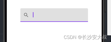
3. leadingIcon 参数
leadingIcon 参数可以在 TextField 前面布置 lambda 表达式所接收到的东西
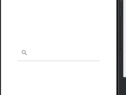
TextField(value = text,onValueChange = {text = it},leadingIcon = {Icon(Icons.Filled.Search, null)},
)
虽然名字上叫做 leadingIcon,但是 leadingIcon 接收来自一个 @Composable 函数的 lambda 表达式,
我们也可以在里面填入 Text 函数
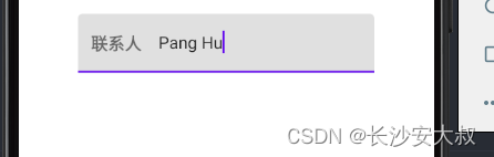
TextField(value = text,onValueChange = {text = it},leadingIcon = {Text("联系人")},
)
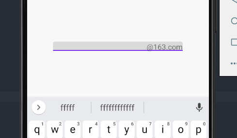
4. trailingIcon 参数
trailingIcon 参数可以在 TextField 尾部布置 lambda 表达式所接收到的东西
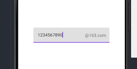
TextField(value = text,onValueChange = {text = it},trailingIcon = {Text("@163.com")},
)
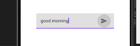
trailingIcon = {IconButton(onClick = {}){Icon(Icons.Filled.Send, null)}
},
5. Color 参数
@Composable
fun textFieldColors(// 输入的文字颜色textColor: Color = LocalContentColor.current.copy(LocalContentAlpha.current),// 禁用 TextField 时,已有的文字颜色disabledTextColor: Color = textColor.copy(ContentAlpha.disabled),// 输入框的背景颜色,当设置为 Color.Transparent 时,将透明backgroundColor: Color = MaterialTheme.colors.onSurface.copy(alpha = BackgroundOpacity),// 输入框的光标颜色cursorColor: Color = MaterialTheme.colors.primary,// 当 TextField 的 isError 参数为 true 时,光标的颜色errorCursorColor: Color = MaterialTheme.colors.error,// 当输入框处于焦点时,底部指示器的颜色focusedIndicatorColor: Color = MaterialTheme.colors.primary.copy(alpha = ContentAlpha.high),// 当输入框不处于焦点时,底部指示器的颜色unfocusedIndicatorColor: Color = MaterialTheme.colors.onSurface.copy(alpha = UnfocusedIndicatorLineOpacity),// 禁用 TextField 时,底部指示器的颜色disabledIndicatorColor: Color = unfocusedIndicatorColor.copy(alpha = ContentAlpha.disabled),// 当 TextField 的 isError 参数为 true 时,底部指示器的颜色errorIndicatorColor: Color = MaterialTheme.colors.error,// TextField 输入框前头的颜色leadingIconColor: Color = MaterialTheme.colors.onSurface.copy(alpha = IconOpacity),// 禁用 TextField 时 TextField 输入框前头的颜色disabledLeadingIconColor: Color = leadingIconColor.copy(alpha = ContentAlpha.disabled),// 当 TextField 的 isError 参数为 true 时 TextField 输入框前头的颜色errorLeadingIconColor: Color = leadingIconColor,// TextField 输入框尾部的颜色trailingIconColor: Color = MaterialTheme.colors.onSurface.copy(alpha = IconOpacity),// 禁用 TextField 时 TextField 输入框尾部的颜色disabledTrailingIconColor: Color = trailingIconColor.copy(alpha = ContentAlpha.disabled),// 当 TextField 的 isError 参数为 true 时 TextField 输入框尾部的颜色errorTrailingIconColor: Color = MaterialTheme.colors.error,// 当输入框处于焦点时,Label 的颜色focusedLabelColor: Color = MaterialTheme.colors.primary.copy(alpha = ContentAlpha.high),// 当输入框不处于焦点时,Label 的颜色unfocusedLabelColor: Color = MaterialTheme.colors.onSurface.copy(ContentAlpha.medium),// 禁用 TextField 时,Label 的颜色disabledLabelColor: Color = unfocusedLabelColor.copy(ContentAlpha.disabled),// 当 TextField 的 isError 参数为 true 时,Label 的颜色errorLabelColor: Color = MaterialTheme.colors.error,// Placeholder 的颜色placeholderColor: Color = MaterialTheme.colors.onSurface.copy(ContentAlpha.medium),// 禁用 TextField 时,placeholder 的颜色disabledPlaceholderColor: Color = placeholderColor.copy(ContentAlpha.disabled)
)
调用方法
TextField(value = text,onValueChange = {text = it},leadingIcon = {Icon(Icons.Filled.Search, null)},colors = TextFieldDefaults.textFieldColors(textColor = Color(0xFF0079D3),backgroundColor = Color.Transparent)
)
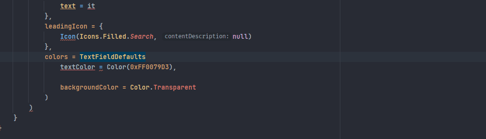
在你使用 IDE 智能补全的时候可能遇到这种情况
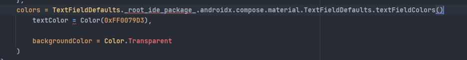
解决方法如下,手动打完函数名
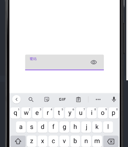
6. visualTransformation 参数
visualTransformation 可以帮助我们应用输入框的显示模式
var text by remember{mutableStateOf("")}
var passwordHidden by remember{ mutableStateOf(false)}TextField(value = text,onValueChange = {text = it},trailingIcon = {IconButton(onClick = {passwordHidden = !passwordHidden}){Icon(painterResource(id = R.drawable.visibility), null)}},label = {Text("密码")},visualTransformation = if(passwordHidden) PasswordVisualTransformation() else VisualTransformation.None
)
BasicTextField
@Composable
fun BasicTextField(value: String,onValueChange: (String) -> Unit,modifier: Modifier = Modifier,enabled: Boolean = true,readOnly: Boolean = false,textStyle: TextStyle = TextStyle.Default,keyboardOptions: KeyboardOptions = KeyboardOptions.Default,keyboardActions: KeyboardActions = KeyboardActions.Default,singleLine: Boolean = false,maxLines: Int = Int.MAX_VALUE,visualTransformation: VisualTransformation = VisualTransformation.None,onTextLayout: (TextLayoutResult) -> Unit = {},// 当输入框内文本触发更新时候的回调,包括了当前文本的各种信息interactionSource: MutableInteractionSource = remember { MutableInteractionSource() },cursorBrush: Brush = SolidColor(Color.Black),// 输入框光标的颜色decorationBox: @Composable (innerTextField: @Composable () -> Unit) -> Unit =@Composable { innerTextField -> innerTextField() }// 是一个允许在 TextField 周围添加修饰的 @Composable lambda// 我们需要在布局中调用 innerTextField() 才能完成 TextField 的构建
)
使用 BasicTextField 可以让你拥有更高的自定义效果
1. 简单使用
一个简单的使用例子如下:
var text by remember { mutableStateOf("") }Box(modifier = Modifier.fillMaxSize().background(Color(0xFFD3D3D3)),contentAlignment = Alignment.Center
) {BasicTextField(value = text,onValueChange = {text = it},modifier = Modifier.background(Color.White, CircleShape).height(35.dp).fillMaxWidth(),decorationBox = { innerTextField ->Row(verticalAlignment = Alignment.CenterVertically,modifier = Modifier.padding(horizontal = 10.dp)) {IconButton(onClick = { }) {Icon(painterResource(id = R.drawable.mood), null)}Box(modifier = Modifier.weight(1f),contentAlignment = Alignment.CenterStart) {innerTextField()}IconButton(onClick = { },) {Icon(Icons.Filled.Send, null)}}})
}
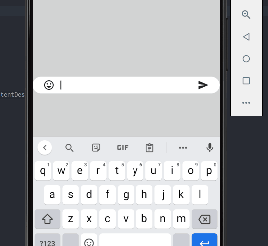
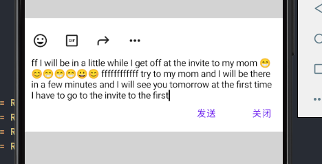
在刚才的例子中,我们在 decorationBox 里面写了很多布局组件,最后通过调用一次 innerTextFiled() 来完成输入框的构建。
2. 其他效果
代码查看:
网站内
Github
更多
TextField 参数详情
BasicTextField 参数详情