CSS实现checkbox选中动画

前言
👏CSS实现checkbox选中动画,速速来Get吧~
🥇文末分享源代码。记得点赞+关注+收藏!
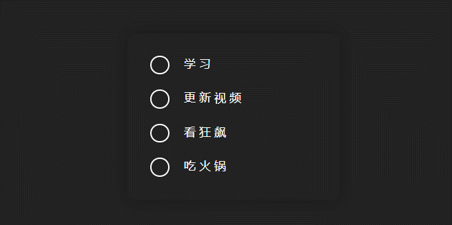
1.实现效果

2.实现步骤
- 定义css变量,–checked,表示激活选中色值
:root {--checked: orange;
}
- 创建父容器,添加box-shadow阴影
<div class="container"></div>
.container {min-width: 280px;padding: 30px;border-radius: 10px;box-shadow: 0 0 20px rgba(0, 0, 0, 0.3);position: relative;}
- 父容器内添加清单列表,使checkbox和label相互绑定
checkbox:复选框
label:表示用户界面中某个元素的说明
将一个 label 和一个 input元素匹配在一起,你需要给 input 一个 id 属性。而 label需要一个 for 属性,其值和 input 的 id 一样。
eg:
<div class="preference"><label for="cheese">Do you like cheese?</label><input type="checkbox" name="cheese" id="cheese">
</div>
或者,你也可以将 input 直接放在 label 里,此时则不需要 for 和 id属性,因为关联已隐含存在。
eg:
<label>Do you like peas?<input type="checkbox" name="peas">
</label>
- 这里我们为label设置for属性,为input设置id
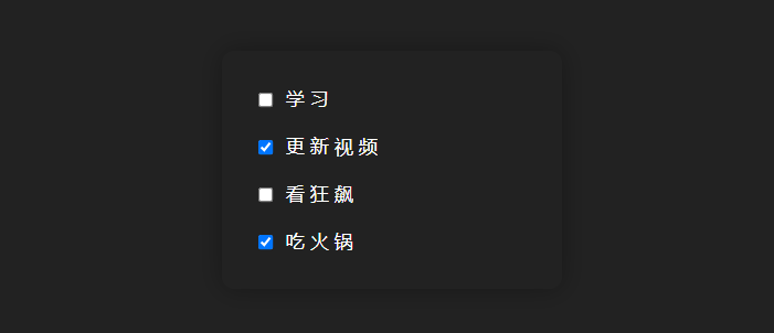
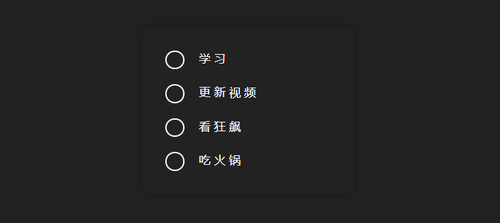
<div class="item"><input type="checkbox" id="option1" /><label for="option1">学习</label>
</div>
...//剩余清单列表这里不做多余展示
<div class="item"><input type="checkbox" id="option4" /><label for="option4">吃火锅</label>
</div>
.item {margin-bottom: 20px;font-size: 15px;letter-spacing: 5px;
}
/* 最后一个元素底边距为0 */
.item:last-child {margin-bottom: 0;}
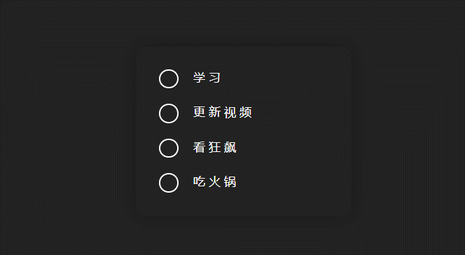
- 重写checkbox样式,这里提供两种方案
方案一:设置checkbox为appearance:none,不应用任何特殊样式
appearance:定义元素(特别是表单控件)默认情况下的显示方式。通过将该值设置为none默认外观,可以使用其他 CSS 属性完全重新定义。
input[type="checkbox"] {
/* 去除系统默认appearance的样式 */-webkit-appearance: none;/*设置新样式 */width: 25px;height: 25px;position: relative;margin-right: 10px;border: 2px solid #fff;border-radius: 50%;
}
- 添加checkbox选中样式,设置transform偏移,添加过渡效果,可以发现,父容器的高度随着checkbox的变化上下起伏,这并不是我想要的效果

input[type="checkbox"]:checked {height: 15px;width: 25px;border-top: none;border-right: none;border-radius: 0;transform: rotate(-45deg);transition: all 0.5s ease-in-out;
}
- 给checkbox添加一个伪元素,绝对定位,用来展示样式,当选中时候,去改其伪元素的样式,绝对定位不会影响到当前高度。
input[type="checkbox"] {- border: 2px solid #fff;- border-radius: 50%;
}
/* input的checkbox样式添加伪元素 */
input[type="checkbox"]::after {content: "";width: 100%;height: 100%;border: 2px solid #fff;position: absolute;left: 0;top: 0;border-radius: 50%;
}
/* 设置checkbox点击之后的样式 */
input[type="checkbox"]:checked::after {height: 15px;width: 25px;border-top: none;border-right: none;border-radius: 0;transform: rotate(-45deg);transition: all 0.5s ease-in-out;
}
方案二:考虑到appearance的兼容性,可以使用更加稳妥的方式来实现,隐藏checkbox框,添加新的标签用来展示样式
- 为checkbox添加兄弟元素
<div class="item"><input type="checkbox" id="option1" />
+ <span></span><label for="option1">学习</label>
</div>
- checkbox的隐藏,说到元素隐藏,有三种方式,在这浅浅的说下:
display: none 不占用页面空间,其占用的空间会被其他元素所占有,从而会引起浏览器的重排和重汇,不能点击。
visibility: hidden 会占用页面空间,因此只会导致浏览器的重汇而不会引起重排,不能点击
opacity: 0 占据页面空间,可以点击。
- 那这里需要的是隐藏,且能点击,使用opacity,绝对定位,且z-index要置于最上方
input[type="checkbox"] {visibility: hidden;position: absolute;width: 25px;height: 25px;/* 位于最上方 */z-index: 1;
}
.item span {width: 25px;height: 25px;position: relative;margin-right: 10px;display: inline-block;vertical-align: middle;
}
.item span::after {content: "";width: 100%;height: 100%;border: 2px solid #fff;position: absolute;left: 0;top: 0;border-radius: 50%;
}
"+"号选择器:相邻兄弟选择器,用于选取在同一父元素下的,紧跟指定元素之后的另一个元素
input[type="checkbox"]:checked + span::after {height: 15px;width: 25px;border-top: none;border-right: none;border-radius: 0;transform: rotate(-45deg);transition: all 0.5s ease-in-out;
}
- 设置label样式,text-decoration-line设置为横线,默认为透明颜色,偏移距离为1px,添加过渡效果
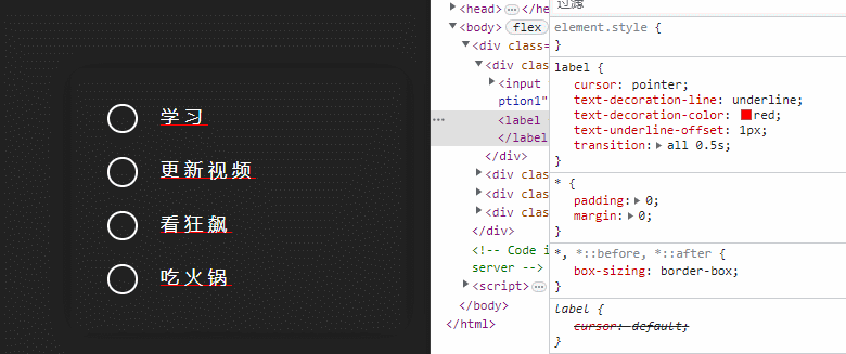
text-decoration-line:用于设置元素中的文本的修饰类型。当要设置多个线修饰属性时,用 text-decoration 简写属性会比分别写多个属性更方便。
text-decoration-color: 用于设置文本修饰线的颜色,文本修饰线是通过 text-decoration-line 属性指定的。
text-underline-offset:设置文本装饰下划线(使用 text-decoration 应用)与其原始位置的偏移距离。
label {cursor: pointer;text-decoration-line: underline;/* 设置底部线条颜色为透明色 */text-decoration-color: transparent;text-underline-offset: 1px;/* 添加过渡效果 */transition: all 0.5s;
}
- 设置lable处于hover状态的样式,当hover时候,设置文本修饰线颜色为–checked,文本颜色为–checked,偏移距离设置为10px
 /* label添加hover事件 */
label:hover {text-decoration-color: var(--checked);text-underline-offset: 10px;color: var(--checked);}
设置label处于被选中状态的样式,设置文本修饰线颜色为–checked,文本颜色为–checked,偏移距离设置为-5px,居于文本中间,就完成了啦
“~” 运算符:p~ul选择器表示 p之后出现的所有ul。两种元素必须拥有相同的父元素,但是 ul不必直接紧随 p。
/* 设置checkbox被选中之后label的样式 */
input[type="checkbox"]:checked ~ label {color: var(--checked);text-underline-offset: -5px;text-decoration-color: var(--checked);
}
3.实现代码
<!DOCTYPE html>
<html lang="en"><head><meta charset="UTF-8" /><meta http-equiv="X-UA-Compatible" content="IE=edge" /><meta name="viewport" content="width=device-width, initial-scale=1.0" /><title>CSS实现checkbox选中动画</title></head><link rel="stylesheet" href="../common.css" /><style>:root {--checked: orange;}.container {min-width: 280px;padding: 30px;border-radius: 10px;box-shadow: 0 0 20px rgba(0, 0, 0, 0.3);position: relative;}.item {margin-bottom: 20px;font-size: 15px;letter-spacing: 5px;}/* 最后一个元素底边距为0 */.item:last-child {margin-bottom: 0;}/* 重写input的checkbox样式 */input[type="checkbox"] {/* 去除系统默认appearance的样式 */-webkit-appearance: none;appearance: none;/*设置新样式 */width: 25px;height: 25px;position: relative;margin-right: 10px;}/* input的checkbox样式添加伪元素 */input[type="checkbox"]::after {content: "";width: 100%;height: 100%;border: 2px solid #fff;position: absolute;left: 0;top: 0;border-radius: 50%;}/* 设置checkbox点击之后的样式 */input[type="checkbox"]:checked::after {height: 15px;width: 25px;border-top: none;border-right: none;border-radius: 0;transform: rotate(-45deg);transition: all 0.5s ease-in-out;}/* 设置label的样式 */label {cursor: pointer;text-decoration-line: underline;/* 设置底部线条颜色为透明色 */text-decoration-color: transparent;text-underline-offset: 1px;/* 添加过渡效果 */transition: all 0.5s;}/* label添加hover事件 */label:hover {text-decoration-color: var(--checked);text-underline-offset: 10px;color: var(--checked);}/* 设置checkbox被选中之后label的样式 */input[type="checkbox"]:checked ~ label {color: var(--checked);text-underline-offset: -5px;text-decoration-color: var(--checked);}</style><body><div class="container"><div class="item"><input type="checkbox" id="option1" /><label for="option1">学习</label></div><div class="item"><input type="checkbox" id="option2" /><label for="option2">更新视频</label></div><div class="item"><input type="checkbox" id="option3" /><label for="option3">看狂飙</label></div><div class="item"><input type="checkbox" id="option4" /><label for="option4">吃火锅</label></div></div></body>
</html>