svg可缩放矢量图绘制线、面

概述
什么是SVG?
SVG是一种基于XML语法的图形形式,全程是可缩放矢量图(Scalable Vector Graphics)。其他图像格式都是基于像素处理的,SVG则是属于对图像的形状描述,所以它本质上是文本文件,体积较小,且不管放大多少倍都不会失真。
SVG文件可以直接插入网页
SVG文件可以直接插入网页,成为DOM的一部分,然后用JavaScript和CSS进行操作。
<!DOCTYPE html>
<html lang="en">
<head></head><body><svg id="mysvg" width="200" height="200" ><circle id="mycircle"  cx="400" cy="300" r="50" /></svg>
</body></html>
使用svg的多种方式
上面是SVG代码直接插入网页的例子。
SVG代码也可以写在一个独立文件中,然后用 *"img/object/iframe/embed" 等标签插入网页。
<img src="../img/pao.svg">
<iframe src="../img/pao.svg" scrolling="no" width="450" height="200" style="border: none;"></iframe>
<object data="../img/pao.svg" type="image/svg+xml"></object>
<embed id="embed" src="../img/pao.svg" type="iamge/svg+xml"></embed>
CSS也可以使用SVG文件。
<!DOCTYPE html>
<html lang="en">
<head><meta charset="UTF-8"><title>Document</title><style type="text/css">.bgred{fill: mediumpurple;}.bgBlue{fill: deepskyblue;stroke: red;stroke-width: 3px;}</style>
</head>
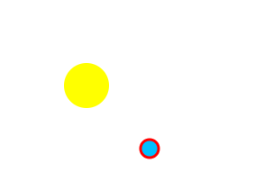
<body><svg width="200" height="200" ><circle cx="100" cy="100" r="25" fill="yellow" /><circle cx="170" cy="170" r="5" class="bgred" /><circle cx="170" cy="170" r="10" class="bgBlue" /></svg></body>
</html>语法
<svg>标签
SVG代码都放在顶层标签<svg>之中。下面是一个例子。
<svg width="100%" height="100%"><circle id="mycircle" cx="50" cy="50" r="50"/>
</svg>svg的width属性和height属性,制定了SVG图像在HTML元素中所占据的宽度和高度。除了相对单位,也可以采用绝对单位(单位:像素)。如果不指定这两个属性,SVG图像默认大小是300像素(宽)*150像素(高)。
如果只想展示SVG图像的一部分,就要指定viewBox属性。
<svg width="100" height="100" viewBox="50 50 50 50"><circle id="mycircle" cx="50" cy="50" r="50"/>
</svg>
viewBox 属性的值有四个数字,分别是左上角的横坐标和纵坐标、视口的高度和宽度。上面代码中,SVG图像是100像素宽*100像素高,viewBox属性指定视口从( 50,50)这个点开始。所以,实际看到的是右下角的四分之圆。
注意,视口必须适配所在的空间。上面代码中,视口的大小是50 50,由于SVG图像的大小是100 100,所以视口会放大去适配SVG图像的大小,即放大了四倍。
如果不指定width属性和height属性,只指定viewBox属性,则相当于只给到定SVG图像的长宽比。这时,SVG图像的默认大小将等于所在的HTML元素的大小。
<circle>标签-圆
<circle>标签代表圆形。
<svg width="300" height="180"><circle cx="30" cy="50" r="25"/><circle cx="90" cy="50" r="25" class="red"/><circle cx="150" cy="50" r="25" class="fancy"/>
</svg>
上面的代码定义了三个圆。<circle>标签的cx、cy、r属性分别为横坐标、纵坐标和半径,单位为像素。坐标都是相对于<svg>画布的左上角原点。
class属性用来指定对应的CSS类。
.red {fill: red;
}
.fancy {fill: none;stroke: black;stroke-width: 3pt;
}
SVG的CSS属性与网页元素有所不同。
- fill:填充色
- stroke:描边色
- stroke-width:边框宽度
<line>标签-直线
<line>标签用来绘制直线。
<svg width="300" height="180"><line xl="0" yl="0" x2="200" y2="0" style="stroke:rgb(0,0,0);stroke-width:5"/>
</svg>
上面代码中,<line>标签的x1属性和1属性,表示线段起点的横坐标和纵坐标:x2属性和V2属性,表示线段终点的横坐标和纵坐标;style属性表示线段的样式。
<polyline>标签-折线
<poyline>标签用于绘制一根折线。
<svg width="300" height="180"><polyline points="3,3 30,28 3,53" fill="none" stroke="black"/>
</svg>
<polyline>的points属性指定了每个端点的坐标,横坐标与纵坐标之间与号分隔,点与点之间用空空格分隔。
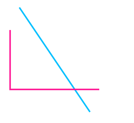
画线、折线示例:
<!DOCTYPE html>
<html lang="en"><head><meta charset="UTF-8"><title>Document</title><style type="text/css">.line {stroke: #00BFFF;stroke-width: 5px;/* 过度效果 */transition: all 2s;/* transform: rotate(45deg); */transform-origin: center;animation: xuanzhuan 2s linear infinite;}@keyframes xuanzhuan {from {transform: rotate(0deg);}to {transform: rotate(360deg);}}/* 鼠标放上去 */.line:hover {stroke: yellow;}.polyline {stroke: deeppink;stroke-width: 5px;fill: none}</style>
</head><body><svg width="400" height="400"><!-- 画直线 --><line x1="50" y1="50" x2="350" y2="350" class="line"></line><!-- 画折线 --><polyline points="50,100 50,300 350,300" class="polyline"></polyline></svg></body></html>
<rect>标签-矩形
<rect>标签用于绘制矩形。
<svg width="300" height="300"><rect x="0" y="0" height="100" width="200" style="stroke: #70d5dd; fill: #dd524b"/></svg><rect>的x属性和V属性,指定了矩形左上角端点的横坐标和纵坐标;width属性和height属性指定了矩形的宽度和高度(单位像素)。
<ellipse>标签-椭圆
<ellipse>标签用于绘制椭圆。
<svg width="300"height="180"><ellipse cx="60" cy="60" ry="40" rx="20" stroke="black" stroke-width="5" fill="silver"/>
</svg>
<ellipse>的cx属性和y属性,指定了圆中心的横坐标和纵坐标(单位像素);rx属性和ry属性,指定了椭圆横向轴和纵向轴的半径(单位像素)。
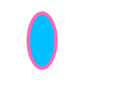
绘制椭圆示例:
<!DOCTYPE html>
<html lang="en"><head><meta charset="UTF-8"><title>Document</title><style>ellipse {fill: deepskyblue;stroke: hotpink;stroke-width: 5px;}</style>
</head><body><svg width="400" height="400"><ellipse cx="60" cy="60" rx="20" ry="40"></ellipse></svg>
</body></html>
<polygon>标签-多边形
<polygon>标签用于绘制多边形。
<svg width="300" height="180"><polygon fill="green" stroke="orange" stroke-width="1" points="0,0 100,0 100,100 0,1000.0"/>
</svg>
<polygon>的points属性指定了每个端点的坐标,横坐标与纵坐标之间与逗号分隔,点与点之间用空格分隔。
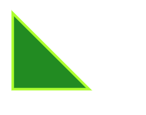
绘制多边形示例:
<!DOCTYPE html>
<html lang="en"><head><meta charset="UTF-8"><title>Document</title><style>polygon {fill: forestgreen;stroke: greenyellow;stroke-width: 10px;}</style>
</head><body><svg width="900" height="900"><polygon points="50,50 350,350 50,350"></polygon></svg>
</body></html>
<path>标签-路径
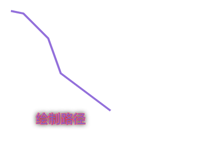
<path>标签用于绘制路径。
<svg width="300" height="180">
<path d="M 18,3L 46,3L 46,40L 61,40L 32,68L 3,40L 18,40Z"></path>
</svg>
<path>的d属性表示绘制顺序,它的值是一个长字符串,每个字母表示一个绘制动作,后面跟着坐标。
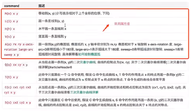
- M:移动到(moveto)
- L:画直线到 (lineto)
- Z:闭合路径
<text>标签-文本
<text>标签用于绘制文本。
<svg width="300" height="180"><text x="50" y="25">He11o world</text>
</svg>
text的x属性和y属性,表示文本区块基线( baseline )起点的横坐标和纵坐标。文字的样式可以用class或style属性指定。
绘制路径添加文本示例:
<!DOCTYPE html>
<html lang="en"><head><meta charset="UTF-8"><title>Document</title><style>path {stroke: #9370db;stroke-width: 8px;fill: none;}path:hover {stroke: red;}text {/* 不再使用color设置字体颜色,设置color无效 *//* color: #FFC0CB; */fill: #9370db;/* 裸空 *//* fill: none; */font-size: 50px;/* 字体加粗 */font-weight: 900;/* 描边 */stroke: #FF0000;/* 描边宽度 */stroke-width: 1px;/* 模糊度 */text-shadow: 0 0 20px #333;}</style>
</head>
<body><svg width="600" height="600"> <!-- 闭合的话末尾加 Z , 闭合的话会首尾相连--><path d="M 50,50 L 100,60 L 200,160 L 250,300 L 450,450 "></path><text x="150" y="500">绘制路径</text></svg>
</body>
</html>
组合自定义图形
<use>标签-复制形状
<use>标签用于复制一个形状
<svg viewBox="0 0 30 10" xmlns="http://www.w3.org/2000/svg"><circle id="myCircle" cX="5" cy="5" r="4"/><use href="#myCircle" x="10" y="0" fill="blue"/><use href="#myCircle" x="20" y="0" fill="white" stroke="blue"/>
</svg>
<use>标签的href属性指定所要复制的节点,x属性和y属性是左上角的坐标。另外,还可以指定width和height坐标。
复制形状的示例:
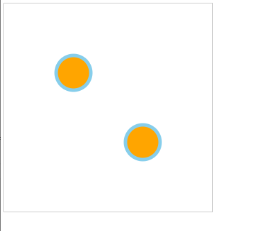
<!DOCTYPE html>
<html lang="en">
<head><meta charset="UTF-8"><title>Document</title>
</head>
<body><svg width="600" height="600" style="border:1px solid #ccc"><!-- 先绘制好ui,定义id --><circle id="circle1" cx="200" cy="200" r="50" fill="orange" stroke="skyblue" stroke-width="10"></circle><!-- 根据id进行复制 --><use href="#circle1" x="200" y="200"></use></svg>
</body>
</html>
<g>标签-形状组
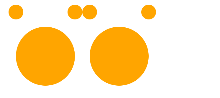
<g>标签用于将多个形状组成一个组(group),方便复用。
<svg width="300" height="100"><g id="myCircle"><text x="25" y="20">圆形</text><circle cx="50" cy="50" r="20"/></g><use href="#myCircle" x="100" y="0" fill="blue"/><use href="#myCircle" x="200" y="0" fill="white" stroke="blue"/>
</svg>
组的示例:(定义的组会显示出来)
<!DOCTYPE html>
<html lang="en">
<head><meta charset="UTF-8"><title>Document</title>
</head>
<body><svg width="1300" height="1300"><!-- 将多个形状组成一个组(group), 方便复用,定义好会显示出来 --><g id="miqi" fill="orange"><circle cx="100" cy="100" r="50"></circle><circle cx="500" cy="100" r="50"></circle><circle cx="300" cy="400" r="200"></circle></g><!-- 复制一个米奇 --><use href="#miqi" x="500" y="0"></use></svg>
</body>
</html>
<defs>标签-自定义形状
<defs>标签用于自定义形状,它内部的代码不会显示,仅供引用。
<svg width="300" height="100"><defs><g id="myCircle"><text x="25" y="20">圆形</text><circle cx="50" cy="50" r="20"/></g></defs><use href="#myCircle" x="0" y="0"/><use href="#myCircle" x="100" y="0" fill="blue"/><use href="#myCircle" x="200" y="0" fill="white" stroke="blue"/>
</svg>
自定义形状示例:(定义的形状不显示出来,但是占着位置)

<!DOCTYPE html>
<html lang="en"><head><meta charset="UTF-8"><title>Document</title>
</head><body><svg width="1300" height="1300"><!-- 定义一个形状组,这个形状不会显示,复用时才显示 --><defs><g id="miqi" fill="orange"><circle cx="100" cy="100" r="50"></circle><circle cx="500" cy="100" r="50"></circle><circle cx="300" cy="400" r="200"></circle></g></defs><use href="#miqi" x="500" y="0"></use></svg>
</body></html>
<pattern>标签-自定义可以平铺的形状
<pattern>标签用于自定义一个形状,该形状可以被引用来平铺一个区域。
<svg width="500" height="500"><defs><pattern id="dots" x="0" y="0" width="100" height="100" patternUnits="userSpaceOnUse"><circle fill="#bee9e8" cx="50" cy="50" r="35” /></pattern></defs><rect x="0" y="0" width="100%" height="100%" fill="url(#dots)" />
</svg>
上面代码中,<pattern>标签将一个圆形定义为dots模式。patternUnits="userSpaceOnUse" 表示<pattern><pattern>的宽度和长度是实际的像素值。然后,指定这个模式去填充下面的矩形。
平铺的示例:
<!DOCTYPE html>
<html lang="en">
<head><meta charset="UTF-8"><title>Document</title>
</head>
<body><svg width="500" height="500"><defs><pattern id="dots" x="0" y="0" width="100" height="100" patternUnits="userSpaceOnUse"><circle fill="#bee9e8" cx="50" cy="50" r="35"/></pattern></defs><rect x="0" y="0" width="100%" height="100%" fill="url(#dots)"/></svg>
</body>
</html>
<image>标签-图片
<image>标签用于插入图片文件。
<svg viewBox="0 0 100 100" width="100" height="100"><image xlink:href="path/to/image.jpg" width="50%" height="50%"/>
</svg>
上面代码中,<image>的xlink:href属性表示图像的来源。
<animate> 标签-动画
<animate>标签用于产生动画效果。
<svg width="500px" height="500px"><rect x="0" y="0" width="100" height="100" fill="#feac5e"><animate attributeName="x" from="0" to="500" dur="2s" repeatCount="indefinite"/></rect>
</svg>
上面代码中,矩形会不断移动,产生动画效果。
animate的属性含义如下。
attributeName:发生动画效果的属性名。
from:单次动画的初始值。
to:单次动画的结束值。
dur:单次动画的持续时间。
repeatCount:动画的循环模式。
可以在多个属性上面定义动画。
<animate attributeName="x" from="0" to="500" dur="2s" repeatCount="indefinite"/>
<animate attributeName="width" to="500" dur="2s" repeatCount="indefinite" />
定义动画的示例:从左上角向右下角移动,并变色。


<!DOCTYPE html>
<html lang="en">
<head><meta charset="UTF-8"><title>Document</title>
</head>
<body><svg width="1000" height="1000"><rect x="0" y="0" width="100" height="50" fill="orange"><animate attributeName="x" from="0" to="500" dur="2s" repeatCount="indefinite"></animate><animate attributeName="y" from="0" to="500" dur="2s" repeatCount="indefinite"></animate><animate attributeName="fill" from="orange" to="skyblue" dur="2s" repeatCount="indefinite"></animate></rect></svg>
</body>
</html>
<animateTransform>标签-变形动画
<animte>标签对CSS的transform属性不起作用,如果需要变形,就要使用<animateTransform>标签。
<svg width="500px" height="500px"><rect x="250" y="250" width="50" height="50" fi11="#4bc0c8"><animateTransform attributeName="transform" type="rotate" begin="0s" dur="10s" from="0 200 200" to="360 400 400" repeatCount="indefinite"/></rect>
</svg>
上面代码中,<animateTransform>的效果为旋转(rotate ),这时from和to属性值有三个数字,第一个数字是角度值,第二个值和第三个值是旋转中心的坐标。from="0 200 200"表示开始时,角度为0,围绕(200,200)开始旋转;to="360 400 400" 表示结束时,角度为360,围绕(400,400)旋转。
变形动画示例:
<!DOCTYPE html>
<html lang="en">
<head><meta charset="UTF-8"><title>Document</title>
</head>
<body><svg width="500" height="500"><rect x="250" y="250" width="50" height="50" fill="#4bc0c8"><animateTransform attributeName="transform" type="rotate" begin="0s" dur="10s" from="0 200 200"to="360 400 400" repeatCount="indefinite" /></rect></svg>
</body>
</html>