Flutter(二)--布局容器

基础组件大多数都是一个个单个的控件,控件在View树中处于叶子节点,单个的控件对我们UI的搭建显然是不够的,还需要布局来摆放它们,今天介绍布局与容器,它们其实都算是布局,只不过容器的自定义性比布局低一些,上次的Chip也算是一种容器,它包含了一组摆放固定位置的子控件
文章目录
-
-
- 一、布局
-
- 1.线性布局(Row、Column)
- 2.弹性布局(Flex)
- 3.流式布局(Wrap)
- 4.约束容器
-
- 4.1 ConstrainedBox
- 4.2 DecoratedBox
- 4.3 SizedBox
- 5.层叠布局(Stack)
-
- 5.1 Stack
- 5.2 IndexedStack
- 6.表格布局(Table)
- 7.LayoutBuilder
- 二、容器
-
- 1.边距(Padding)
- 2.相对定位(Align)
-
- 2.1 Alignment
- 2.2 FractionalOffset
- 3.变换(Transform)
-
- 3.1 平移(Transform.translate)
- 3.2 缩放(Transform.scale)
- 3.3 旋转(Transform.rotate)
- 4.容器(Container)
- 5.其他Box类型容器
-
- 5.1 自适应容器(FittedBox)
- 5.2 权重容器(FractionallySizedBox)
- 5.3 旋转容器(RotatedBox)
- 5.4 重置约束容器(OverflowBox)
- 6.隐藏容器(Offstage)
- 7.骨架(Scaffold)
-
一、布局
布局是和基础组件(控件)同样重要的组件,它们能帮助我们规定如何摆放其他组件,Flutter中固定布局都使用的盒子模型,后续会在约束布局中讲到Box类布局
1.线性布局(Row、Column)
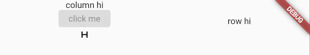
Row和Column为一对线性布局组件,Row对应横向摆放组件,Column对应纵向摆放组件,我们只需要对其中一个熟悉后,另一个自然就会使用了,下面以Column为例子
Colum构造如下:
Column({super.key,super.mainAxisAlignment,// 横向子组件对齐方式super.mainAxisSize,// 横向宽度方式,同match_parent wrap_contentsuper.crossAxisAlignment,// 纵向子组件对齐方式super.textDirection,// 子组件文本方向super.verticalDirection,// 子组件纵向摆放方向super.textBaseline,// 对齐基于哪种文本基线super.children,// 子组件集合}
下面组合使用Row和Column:
Row(mainAxisAlignment: MainAxisAlignment.spaceAround,// 水平均分crossAxisAlignment: CrossAxisAlignment.center,// 垂直居中children: [Column(mainAxisSize: MainAxisSize.min, //Column的宽度按子组件最小宽度children: const [Text("column hi"),ElevatedButton(onPressed: null, child: Text("click me")),Icon(Icons.h_mobiledata),],),const Text("row hi"),],
);
效果:
2.弹性布局(Flex)
弹性布局Flex支持按自定义比例来分配布局控件,在安卓中类似于layout_weight,Row和Column都继承至Flex,所以线性布局本身也支持比例摆放
如果要按比例摆放,还需要使用子组件Expanded,Expanded只能用在Flex 中,其flex属性用来定义比例大小
Flex(direction: Axis.horizontal,children: [Expanded(flex: 1,child: TextField(decoration: InputDecoration(labelText: "hi1",hintText: "input1",),),),Expanded(flex: 2,child: TextField(decoration: InputDecoration(labelText: "hi2",hintText: "input2",),),),],
);
效果:

3.流式布局(Wrap)
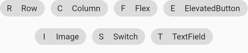
有时我们想水平摆放一些子组件,但希望快要超出屏幕时之后的子组件能够自动换行,这就是流式布局
Wrap是Flutter中的流式布局,构造如下:
Wrap({super.key,this.direction = Axis.horizontal,// 摆放子组件方向this.alignment = WrapAlignment.start,// 整体水平对齐方式this.spacing = 0.0,// 子组件之间的水平间距this.runAlignment = WrapAlignment.start,// 整体纵向对齐方式this.runSpacing = 0.0,// 纵向间距this.crossAxisAlignment = WrapCrossAlignment.start,// 一行子组件的纵向对齐方式this.textDirection,this.verticalDirection = VerticalDirection.down,this.clipBehavior = Clip.none,super.children,})
使用:
Wrap(alignment: WrapAlignment.center,spacing: 10,runAlignment: WrapAlignment.center,runSpacing: 20,children: [Chip(avatar: Text("R"), label: Text("Row")),Chip(avatar: Text("C"), label: Text("Column")),Chip(avatar: Text("F"), label: Text("Flex")),Chip(avatar: Text("E"), label: Text("ElevatedButton")),Chip(avatar: Text("I"), label: Text("Image")),Chip(avatar: Text("S"), label: Text("Switch")),Chip(avatar: Text("T"), label: Text("TextField")),],
);
效果:
4.约束容器
这边说的约束为对子组件添加一些约束,不要和安卓中的约束布局搞混,简单来说就是使宽高固定的一个容器,这些约束会传递给子组件,并保持其约束条件,容器和布局的区别:布局内可以有任意多个子组件,而容器内为一个或固定几个子组件。由于下面我们要对约束有一个概念,所以在布局中我们先把约束容器介绍完
4.1 ConstrainedBox
ConstrainedBox必传一个constraints参数作为约束条件,类型为BoxConstraints,BoxConstraints构造如下:
const BoxConstraints({this.minWidth = 0.0,// 最小宽度this.maxWidth = double.infinity,// 最大宽度this.minHeight = 0.0,// 最小高度this.maxHeight = double.infinity,// 最大高度})
此外它还有命名式构造:最大约束BoxConstraints.tight、最小约束BoxConstraints.loose等,约束会对子组件其效果,如我们约束一个最大宽度和最大高度为50,子组件利用文本量很多的一个Text
ConstrainedBox(constraints: const BoxConstraints(maxHeight: 50, maxWidth: 50),child: Text("hi," * 100,),
);
效果可以看到Text的宽高被约束在了50*50的区域:

4.2 DecoratedBox
DecoratedBox必传一个Decoration(抽象类),可以修饰边框,形状,颜色等等,Decoration常用的实现类BoxDecoration构造如下:
const BoxDecoration({this.color,this.image,this.border,this.borderRadius,this.boxShadow,this.gradient,this.backgroundBlendMode,this.shape = BoxShape.rectangle,})
使用:
ConstrainedBox(constraints: BoxConstraints.tight(Size(50, 50)),child: DecoratedBox(decoration: BoxDecoration(color: Colors.blue),child: Text("hi"),),
);
效果:

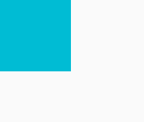
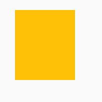
4.3 SizedBox
SizedBox为固定宽高的布局,实际上就是ConstrainedBox的变种
SizedBox(width: 50,height: 50,child: DecoratedBox(decoration: BoxDecoration(color: Colors.cyan),),
);
效果:
5.层叠布局(Stack)
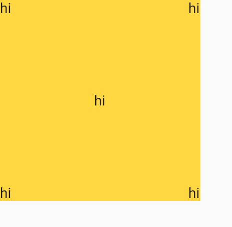
5.1 Stack
Stack为子组件可以重叠的布局,Positioned是专门为其设计的子组件,Positioned可以固定在Stack布局的任意位置,构造如下:
const Positioned({super.key,this.left,// 距离Stack左边的距离this.top,// 距离Stack顶边的距离this.right,// 距离Stack右边的距离this.bottom,// 距离Stack底边的距离this.width,// 固定宽this.height,// 固定高required super.child,})
Stack构造如下:
Stack({super.key,this.alignment = AlignmentDirectional.topStart,// 非Positioned子组件的位置this.textDirection,this.fit = StackFit.loose,// 非Positioned子组件如何去适应Stack的大小。StackFit.loose:子组件的大小,StackFit.expand:扩伸到Stack的大小。this.clipBehavior = Clip.hardEdge,// 超出部分裁剪方式super.children,})
我们在四个角和中央上分别固定上文本:
SizedBox(width: 200,height: 200,child: DecoratedBox(decoration: BoxDecoration(color: Colors.amberAccent),child: Stack(alignment: Alignment.center,children: [Positioned(left: 0,top: 0,child: Text("hi"),),Positioned(right: 0,top: 0,child: Text("hi"),),Positioned(left: 0,bottom: 0,child: Text("hi"),),Positioned(right: 0,bottom: 0,child: Text("hi"),),Text("hi"),],),),
);
效果:
5.2 IndexedStack
IndexedStack只会显示一个子组件,我们可以通过index参数来选择性的显示哪个子组件
IndexedStack(index: 2,children: [Text("hi1"),Text("hi2"),Text("hi3"),],
);
效果:

6.表格布局(Table)
Table为表格布局,需要和子组件TableRow行元素配合使用,TableRow又和TableCell单元格配合使用用于单元格对齐方式
SizedBox(width: 400,child:  Table(columnWidths: const <int, TableColumnWidth>{0: IntrinsicColumnWidth(), // 自适应宽度1: FlexColumnWidth(), // 按比例宽度,默认权重为12: FixedColumnWidth(64), // 按固定64的宽度}, // 定义单元格宽border: TableBorder.all(),defaultVerticalAlignment:TableCellVerticalAlignment.middle, // 单元格内容居中children: [TableRow(children: [Container(height: 32,width: 50,color: Colors.green,),TableCell(verticalAlignment: TableCellVerticalAlignment.bottom,child: Container(height: 32,width: 32,color: Colors.red,)),Container(height: 64,color: Colors.blue,),],),],),
);
效果:

7.LayoutBuilder
LayoutBuilder可以拿到父布局的约束信息,通过约束信息做不同的处理,比如根据不同的宽度显示不同布局
下面根据宽度是否大于600来显示不同大小的Box:
LayoutBuilder(builder: (BuildContext context, BoxConstraints constraints) {if (constraints.maxWidth > 600) {return SizedBox(width: 300,height: 100,child: DecoratedBox(decoration: BoxDecoration(color: Colors.red),),);} else {return SizedBox(width: 100,height: 100,child: DecoratedBox(decoration: BoxDecoration(color: Colors.red),),);}
});
效果:

二、容器
上面提到容器为一个或固定几个子组件的布局,一般就是为了给子组件一些约束
1.边距(Padding)
有时我们希望组件距离别的组件或屏幕边缘有个边距,那么我们可以使用Padding为其设置上下左右的外边距,边距padding参数为单独的抽象类EdgeInsetsGeometry,我们通常使用其实现类EdgeInsets,含有多种方式的命名式构造:EdgeInsets.fromLTRB、EdgeInsets.all、EdgeInsets.only等,其使用也比较简单:
Padding(padding: EdgeInsets.all(20),// 上下左右各20的边距child: Text("hi"),
);
效果:
2.相对定位(Align)
有时我们仅仅有一个组件需要相对父组件进行定位,这时就使用Stack比较复杂,而Align满足这种需要,在使用上它足够简单,我们之前使用过的Center组件就是继承至Align,其构造如下:
const Align({super.key,this.alignment = Alignment.center,// 相对父组件的位置this.widthFactor,// 宽度,widthFactor*子组件宽this.heightFactor,// 高度,heightFactor*子组件高super.child,})
使用:
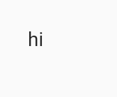
SizedBox(width: 200,height: 200,child: DecoratedBox(decoration: BoxDecoration(color: Colors.amberAccent),child: Align(alignment: Alignment.bottomCenter,child: Text("hi"),),),
);
效果:
2.1 Alignment
Flutter中Alignment是一个类,继承至抽象类AlignmentGeometry,它是以中心点为(0,0)起始点,的一个x,y坐标系,比较特殊的是x轴箭头朝右,y轴箭头朝下。除了Alignment外,还有对齐方式AlignmentDirectional也是相同的,所以我们也可以方便的自定义位置
SizedBox(width: 200,height: 200,child: DecoratedBox(decoration: BoxDecoration(color: Colors.amberAccent),child: Align(alignment: Alignment(1.0, 1.0),child: Text("hi"),),),
);
我在图上标明了坐标轴:

2.2 FractionalOffset
FractionalOffset是以左上角为(0,0)起始点,x向左,y向下的坐标轴。和安卓中View的坐标系相同,使用FractionalOffset居中的代码如下:
SizedBox(width: 200,height: 200,child: DecoratedBox(decoration: BoxDecoration(color: Colors.amberAccent),child: Align(alignment: FractionalOffset(0.5, 0.5),child: Text("hi"),),),
);
效果:

3.变换(Transform)
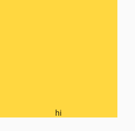
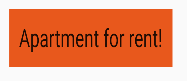
Transform通过矩阵变换,可以使子组件达到各种变换效果,Flutter内置Matrix4类,用于各种变换,这些效果只是达到视觉的效果,实际子组件的位置和大小并不会发生变化
Padding(padding: EdgeInsets.all(100),child: DecoratedBox(decoration: BoxDecoration(color: Colors.black),child: Transform(alignment: Alignment.topRight,transform: Matrix4.skewY(0.3)..rotateZ(-pi / 12.0),child: Container(padding: const EdgeInsets.all(8.0),color: const Color(0xFFE8581C),child: const Text('Apartment for rent!'),),),),
);
效果:
3.1 平移(Transform.translate)
除了手动指定矩阵变换外,Transform还提供了常用的几种变换效果的命名式构造,Transform.translate是平移效果的构造:
Padding(padding: EdgeInsets.all(100),child: DecoratedBox(decoration: BoxDecoration(color: Colors.black),child: Transform.translate(offset: Offset(20, 20),child: Container(padding: const EdgeInsets.all(8.0),color: const Color(0xFFE8581C),child: const Text('Apartment for rent!'),),),),
);
效果:
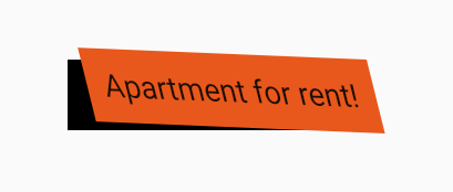
3.2 缩放(Transform.scale)
Transform.scale为缩放的变换效果,参数scale为等比例缩放,也可以通过指定不同的scaleX和scaleY来实现水平垂直不同比例缩放:
Padding(padding: EdgeInsets.all(100),child: DecoratedBox(decoration: BoxDecoration(color: Colors.black),child: Transform.scale(scaleX: 2,scaleY: 3,child: Container(padding: const EdgeInsets.all(8.0),color: const Color(0xFFE8581C),child: const Text('Apartment for rent!'),),),),
);
效果:
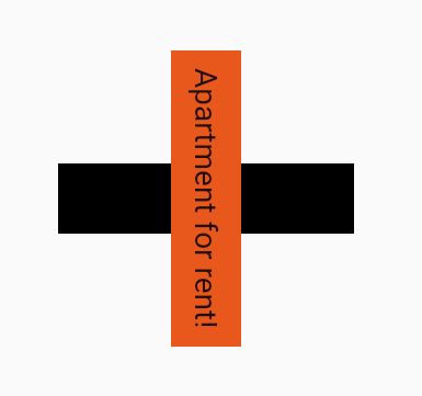
3.3 旋转(Transform.rotate)
Transform.rotate需要传入一个弧度值:
Padding(padding: EdgeInsets.all(100),child: DecoratedBox(decoration: BoxDecoration(color: Colors.black),child: Transform.rotate(angle: pi/2,child: Container(padding: const EdgeInsets.all(8.0),color: const Color(0xFFE8581C),child: const Text('Apartment for rent!'),),),),
);
效果:
4.容器(Container)
Container为一个组合了ConstrainedBox、DecorateBox、Transform、Padding、Align的容器组件,之前我们定义一个有颜色的固定大小的Box,需要将SizedBox和DecorateBox组合使用,Container帮我们进行了封装后,就只需要使用Container就可以实现,其构造如下
Container({super.key,this.alignment,// 子组件对齐方式this.padding,// padding 内边距this.color,// 容器颜色this.decoration,// 容器背景修饰this.foregroundDecoration,// 前景修饰double? width,// 固定宽度double? height,// 固定高度BoxConstraints? constraints,// 传递约束this.margin,// 外边距this.transform,// transform 变换效果this.transformAlignment,// 变换时原点相对于容器位置,默认为容器左上角this.child,this.clipBehavior = Clip.none,})
简单使用:
Container(width: 100,height: 30,color: Colors.red,padding: EdgeInsets.all(100),transform: Transform.rotate(angle: pi / 2).transform,transformAlignment: Alignment.center,
);
效果:
5.其他Box类型容器
除了上面介绍的ConstrainedBox、DecorateBox、SizedBox,还有几个Box类型的容器
5.1 自适应容器(FittedBox)
FittedBox允许子组件打破约束,和Transform一样,组件的实际大小并不会发生变化,仅仅是视觉上的改变。通过fit参数指定BoxFit模式,来达到不同的效果,默认等比例缩放到合适的宽高后,显示在父容器中
下面我们固定一个50*50的Box,使用FittedBox的子组件却是60*70的大小:
Container(width: 50,height: 50,margin: EdgeInsets.all(20),color: Colors.red,child: FittedBox(child: Container(width: 60,height: 70,color: Colors.amber,),),
);
效果:
我们将模式改为BoxFit.none,该模式会无视父组件传递的约束:
Container(width: 50,height: 50,margin: EdgeInsets.all(20),color: Colors.red,child: FittedBox(fit: BoxFit.none,child: Container(width: 60,height: 70,color: Colors.amber,),),
);
效果:
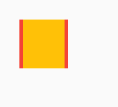
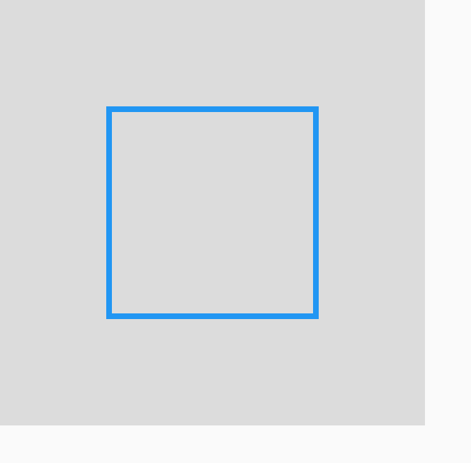
5.2 权重容器(FractionallySizedBox)
FractionallySizedBox可以指定宽和高占整个父容器的比例
Container(width: 300,height: 300,color: Colors.black12,child: FractionallySizedBox(widthFactor: 0.5,heightFactor: 0.5,alignment: FractionalOffset.center,child: DecoratedBox(decoration: BoxDecoration(border: Border.all(color: Colors.blue,width: 4,),),),),
);
效果:
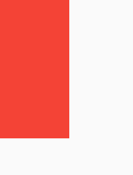
5.3 旋转容器(RotatedBox)
RotatedBox就是一个带旋转的Box,参数quarterTurns表示子组件应该顺时针旋转四分之一圈的次数
RotatedBox(quarterTurns: 1,child: Container(width: 100,height: 50,color: Colors.red,),
);
效果:
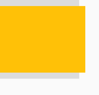
5.4 重置约束容器(OverflowBox)
OverflowBox可以将父容器的约束取消,重新设置子组件的约束:
Container(width: 130,height: 130,color: Colors.black12,child: OverflowBox(maxWidth: 150,maxHeight: 110,minWidth: 150,minHeight: 110,child: Container(color: Colors.amber,),),
);
效果:
6.隐藏容器(Offstage)
Offstage是一个可以隐藏子组件的容器,但组件的位置还是在的,通过offstage参数来是否显示子组件
return Column(children: [Container(color: Colors.black12,width: 100,height: 100,),Expanded(child: Offstage(child: Container(color: Colors.amber,width: 100,),),),Container(color: Colors.black12,width: 100,height: 100,),],
);
效果:
7.骨架(Scaffold)
Scaffold定义了一个APP显示的骨架,它内置了一些固定的槽位(位置)来摆放特定的组件,构造如下:
const Scaffold({super.key,this.appBar,// 顶部导航this.body,// 主体this.floatingActionButton,// FABthis.floatingActionButtonLocation,// fab位置this.floatingActionButtonAnimator,// fab位置改变时的移动动画this.persistentFooterButtons,// 底部按钮组this.persistentFooterAlignment = AlignmentDirectional.centerEnd,// 底部按钮组对齐方式this.drawer,// 抽屉栏this.onDrawerChanged,// 抽屉展开和收起的监听this.endDrawer,// 反向的抽屉this.onEndDrawerChanged,this.bottomNavigationBar,// 底部导航栏this.bottomSheet,// 底部组件this.backgroundColor,// 背景this.resizeToAvoidBottomInset,// 键盘弹出时,是否调整组件位置this.primary = true,// 是否显示在屏幕顶层this.drawerDragStartBehavior = DragStartBehavior.start,this.extendBody = false,// 主体是否延伸到底部 默认不延伸this.extendBodyBehindAppBar = false,// 主体是否延伸到appbar的顶部,默认不延伸this.drawerScrimColor,// 当抽屉打开时,用于遮盖主要内容的幕布颜色this.drawerEdgeDragWidth,// 水平滑动多少距离打开抽屉this.drawerEnableOpenDragGesture = true,// 是否支持拖拽手势打开抽屉this.endDrawerEnableOpenDragGesture = true,// 是否支持拖拽手势打开反向抽屉this.restorationId,})
下面是使用一些槽位的Scaffold:
// 主函数
void main() {// 调用runApp 构建apprunApp(MaterialApp(title: 'Flutter Tutorial',home: Scaffold(appBar: AppBar(// 导航栏title: Text("hi"),actions: <Widget>[//导航栏右侧菜单IconButton(icon: Icon(Icons.settings), onPressed: () {}),],),floatingActionButton: FloatingActionButton(// fabonPressed: () {},child: Icon(Icons.add, semanticLabel: "add"),),drawer: MyDrawer(), // 抽屉栏bottomNavigationBar: MyBottomNavigationBar(),),),);
}
效果:
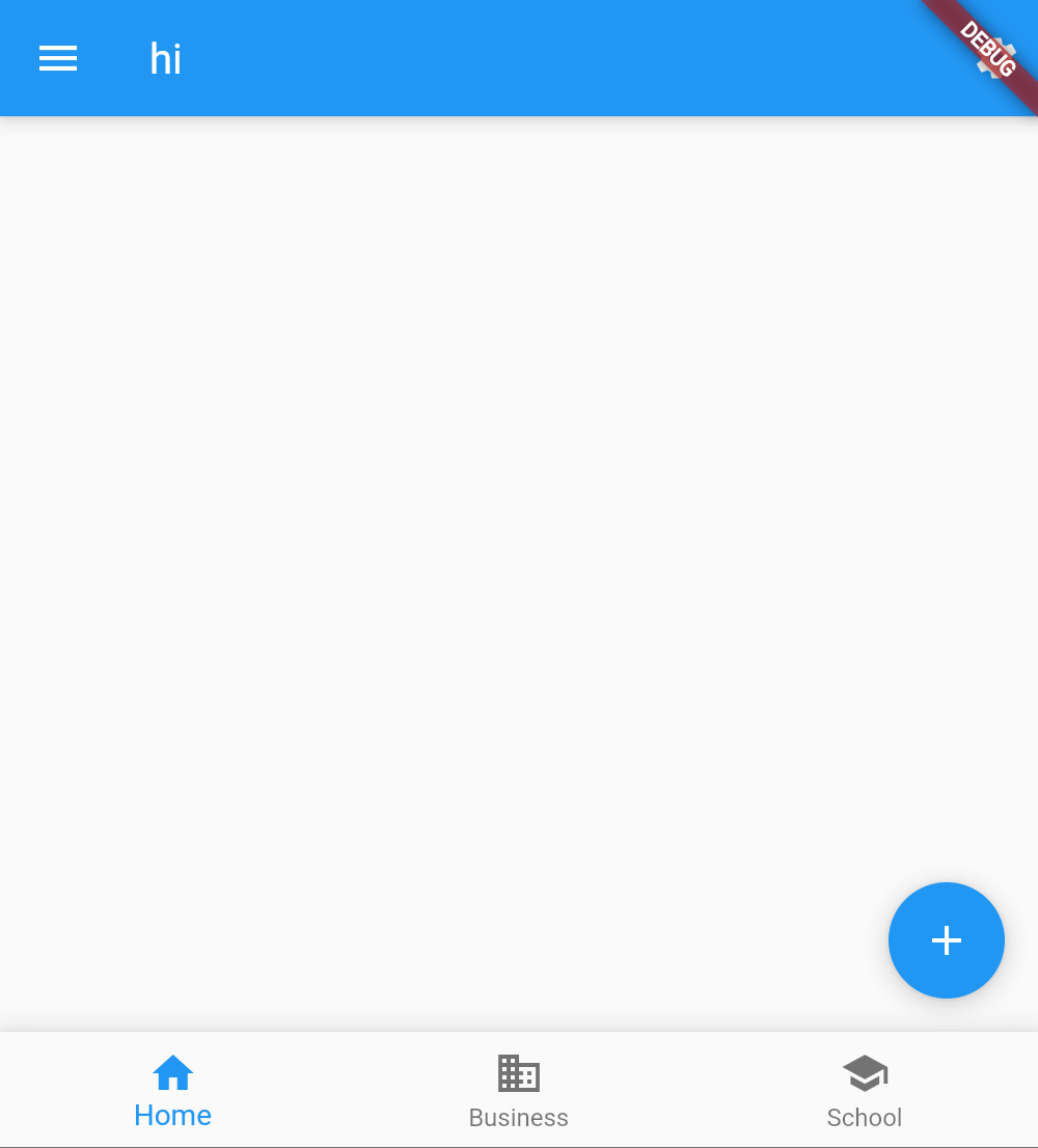
抽屉栏和底部导航的代码如下:
// 抽屉栏
class MyDrawer extends StatelessWidget {const MyDrawer({super.key});Widget build(BuildContext context) {return Drawer(child: Text("hi"),);}
}// 底部导航
class MyBottomNavigationBar extends StatefulWidget {const MyBottomNavigationBar({super.key});State<StatefulWidget> createState() {return _MyBottomNavigationBar();}
}class _MyBottomNavigationBar extends State<MyBottomNavigationBar> {int _selectedIndex = 0;Widget build(BuildContext context) {return BottomNavigationBar(// 底部导航items: <BottomNavigationBarItem>[BottomNavigationBarItem(icon: Icon(Icons.home), label: "Home"),BottomNavigationBarItem(icon: Icon(Icons.business), label: "Business"),BottomNavigationBarItem(icon: Icon(Icons.school), label: "School"),],currentIndex: _selectedIndex,fixedColor: Colors.blue,onTap: (index) {setState(() {_selectedIndex = index;});},);}
}