flex布局

只设置一个display:flex,此时存在的隐藏的默认属性有:
| 属性名 | 默认属性 | 样式 |
| flex-direction | row | 沿主轴方向排布 |
| flex-wrap | nowrap | 单行排列 |
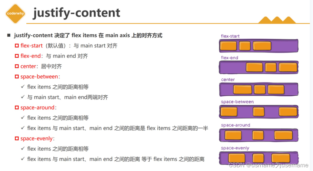
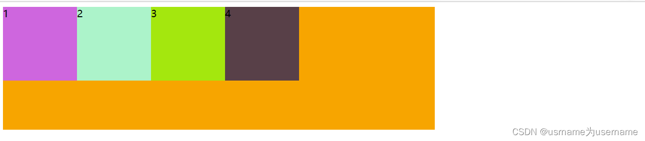
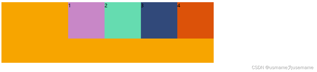
| justify-content | flex-start | 与主轴方向对齐排布 |
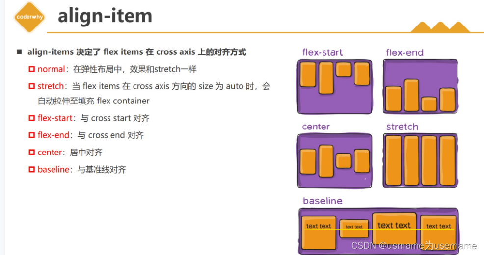
| align-item | normal/stretch |
如果交叉轴方向高度为auto,拉伸到与container同一高度 |
| align-content | stretch | ? |
| order | 0 | 按照文档中出现顺序排列 |
| align-self | auto | 遵循align-items的设置 |
| flex-grow | 0 |
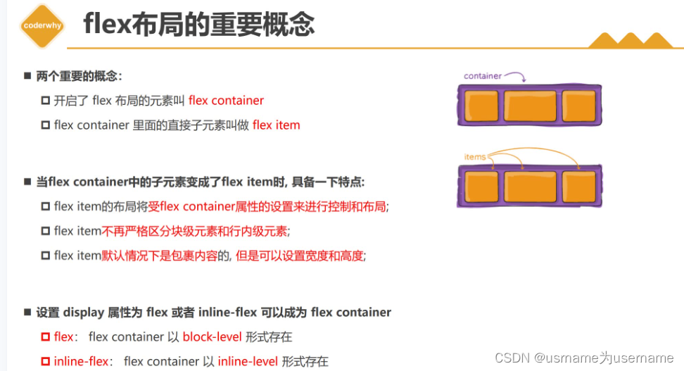
设置display属性为flex或者inline-flex可以成为flex container
flex:flex container以block-level形式存在
inline-flex:flex container以inline-level形式存在
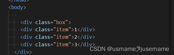
 对box设置display:flex

display: inline-flex;

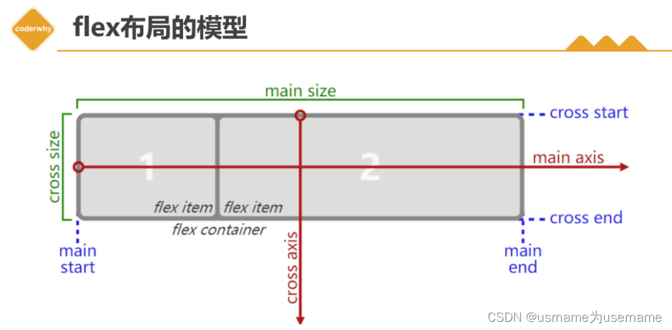
主轴与交叉轴
主轴从左到右,交叉轴从上到下
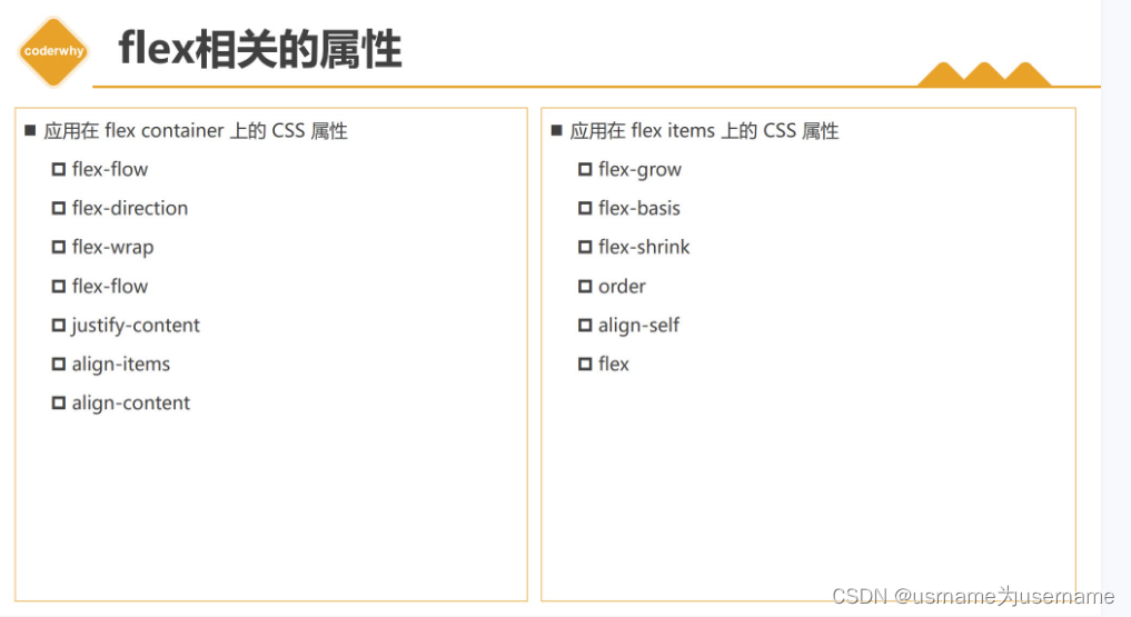
flex相关的属性
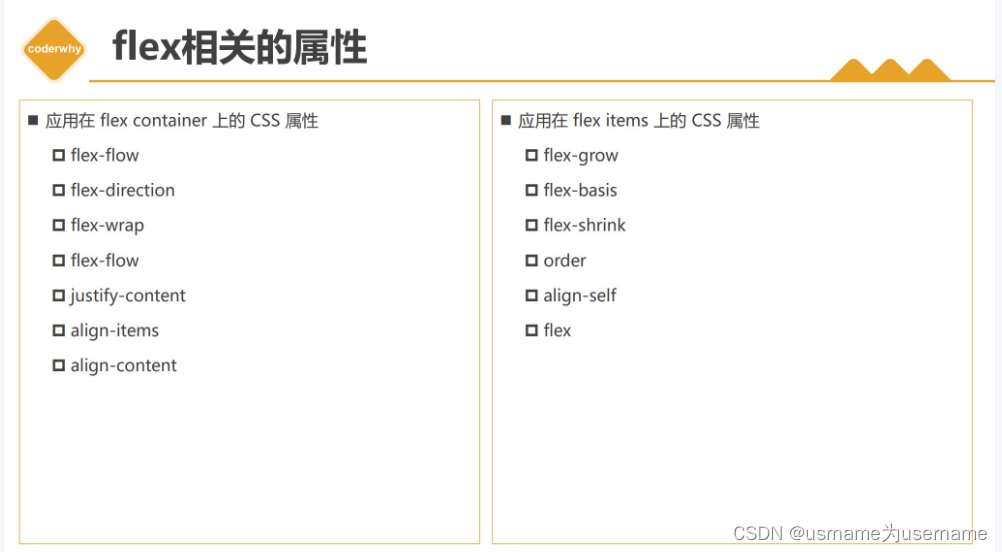
flex-direction(是否沿主轴/交叉轴)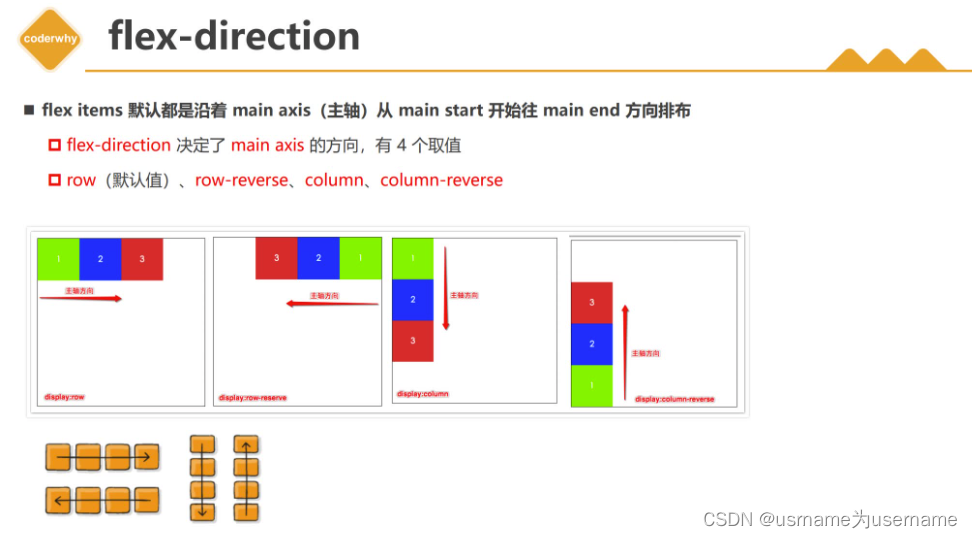
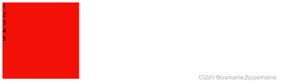
row(沿主轴方向,默认)
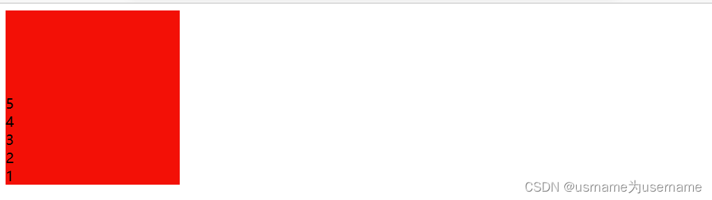
row-reverse (逆主轴)
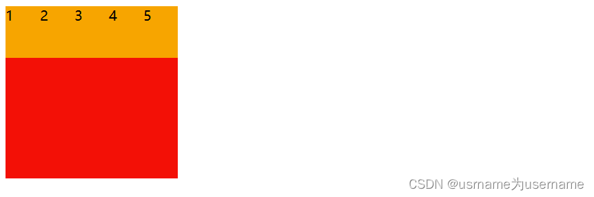
column(交叉轴)
column-reverse(逆交叉轴)
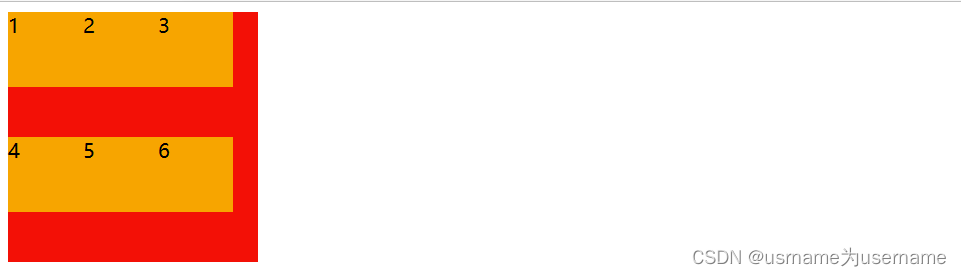
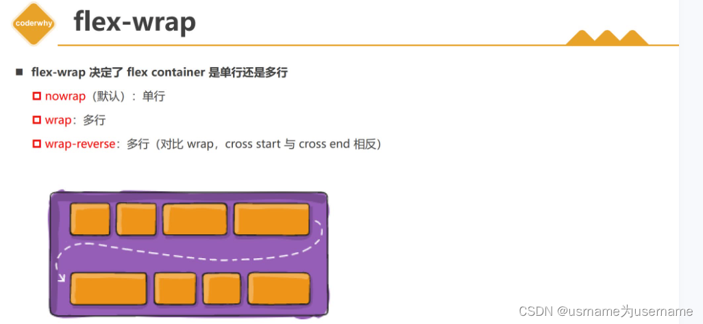
 flex-wrap(单行还是多行)
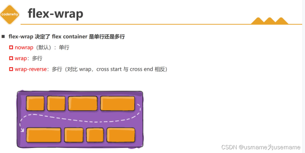
默认是单行,如果添加盒子,无视内部item已经设置好的宽度,无限压缩
flex-wrap: wrap;
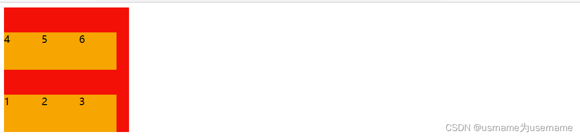
wrap-reverse
 flex-flow(flex-direction与flex-wrap的缩写)
flex-flow(direction+wrap)
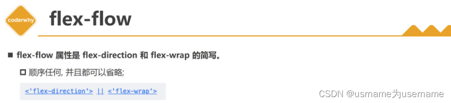
顺序都可
flex-flow: wrap row-reverse;justify-content(主轴上对齐方式)

align-item(交叉轴上的对齐方式)
非normal/stretch情况下,不设置高度,则自动根据内容撑起高度
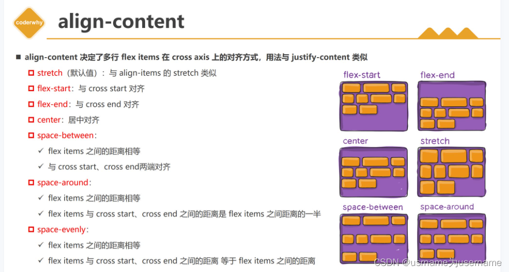
 align-content(多行内容主轴对齐)
flex-item的属性order(手动设置排列顺序,从小到大分布)
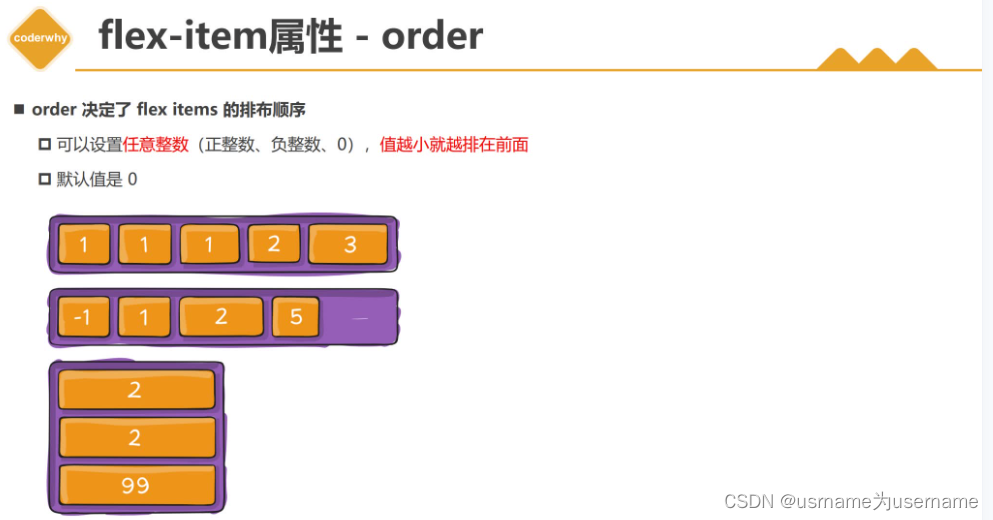
.item1 {order: 5;}.item2 {order: 3;}.item3 {order: 9;}
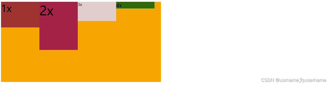
flex-item的属性align-self (内部交叉轴对齐方式)
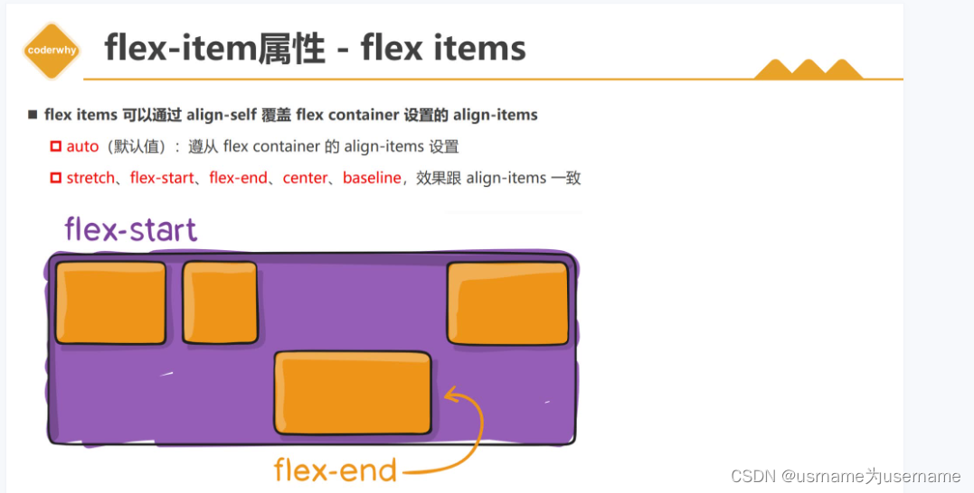
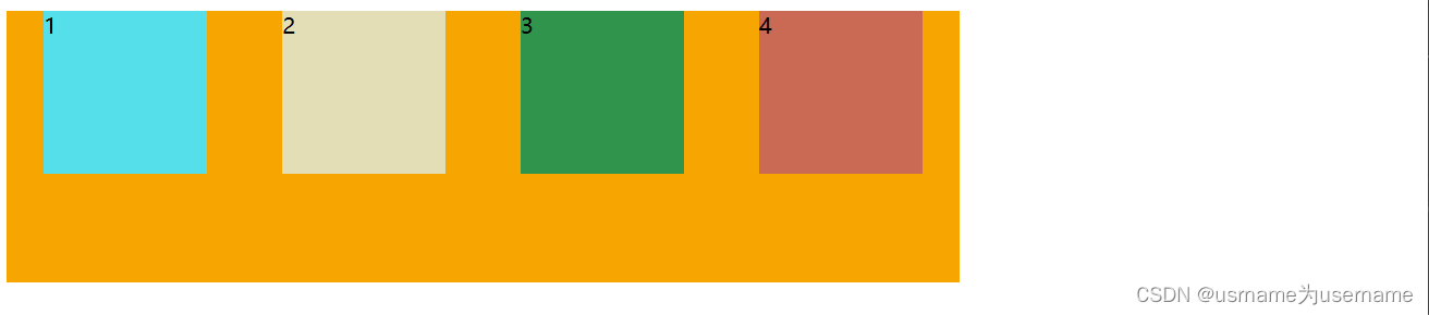
.container {width: 500px;height: 500px;background-color: orange;display: flex;align-items: center;}.item {width: 120px;/* height: 120px; */}.item1 {height: 90px;}.item2 {height: 150px;align-self: flex-start;}.item3 {height: 120px;}
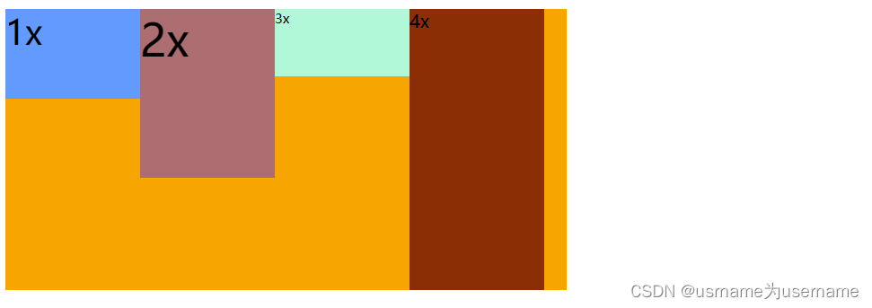
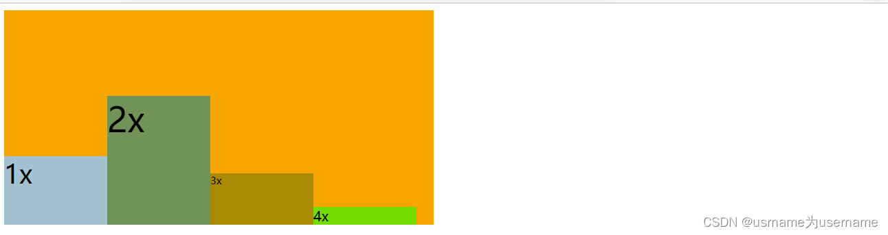
flex-item的属性flex-grow(如何拉伸??)
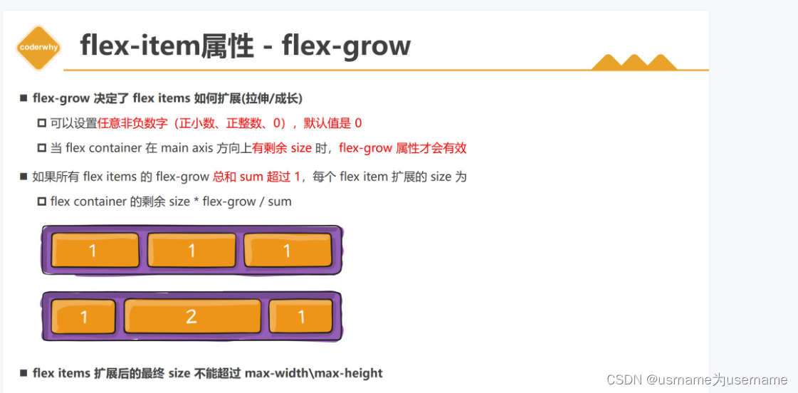
当大于0时,且主轴有剩余,拉伸
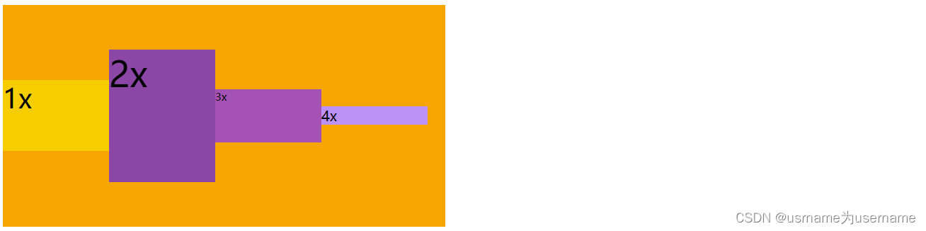
flex-item属性flex-shrink(如何收缩?)
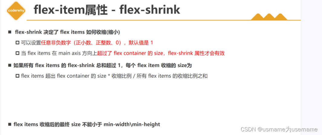
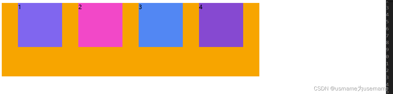
.container {width: 500px;height: 500px;background-color: orange;display: flex;}.item {width: 120px;height: 120px;flex-shrink: 0;}.item1, .item2 {flex-shrink: 1;}.item1 {min-width: 100px;}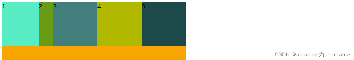
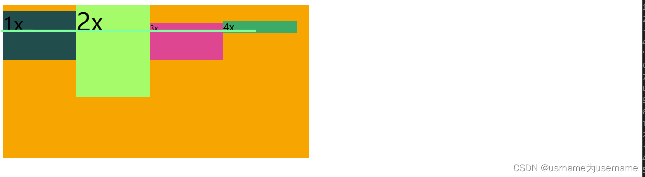
flex-item属性-flex-basis(?)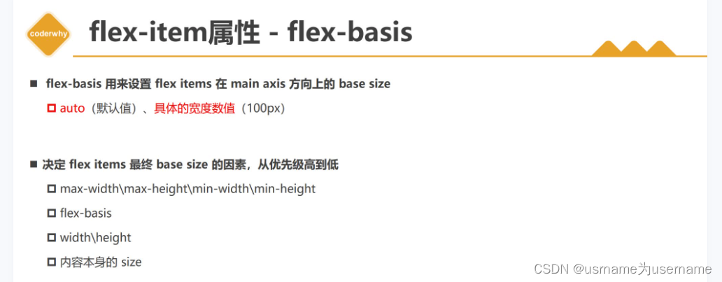
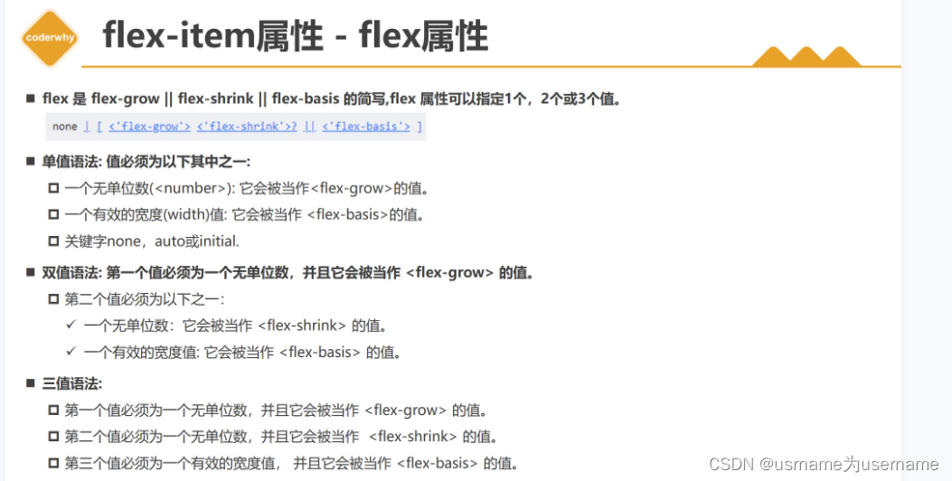
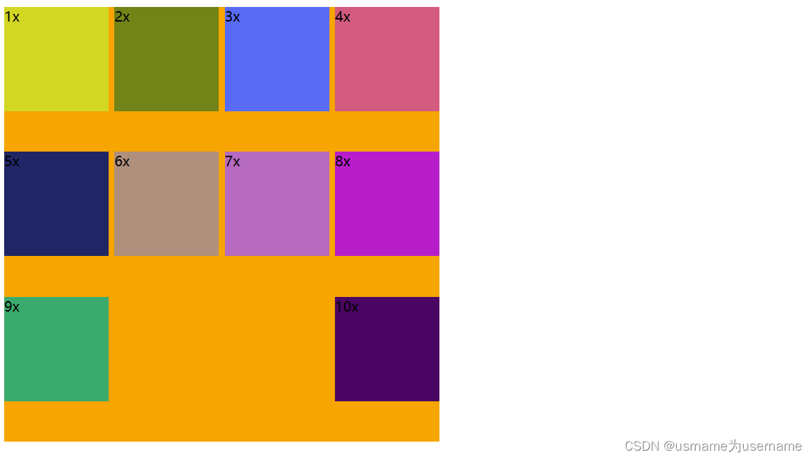
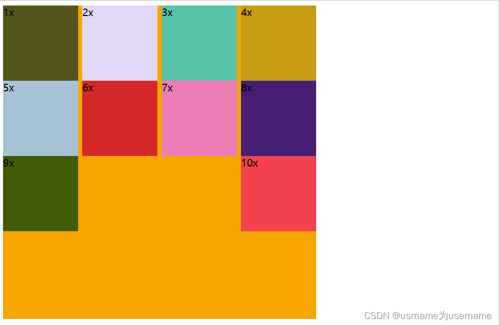
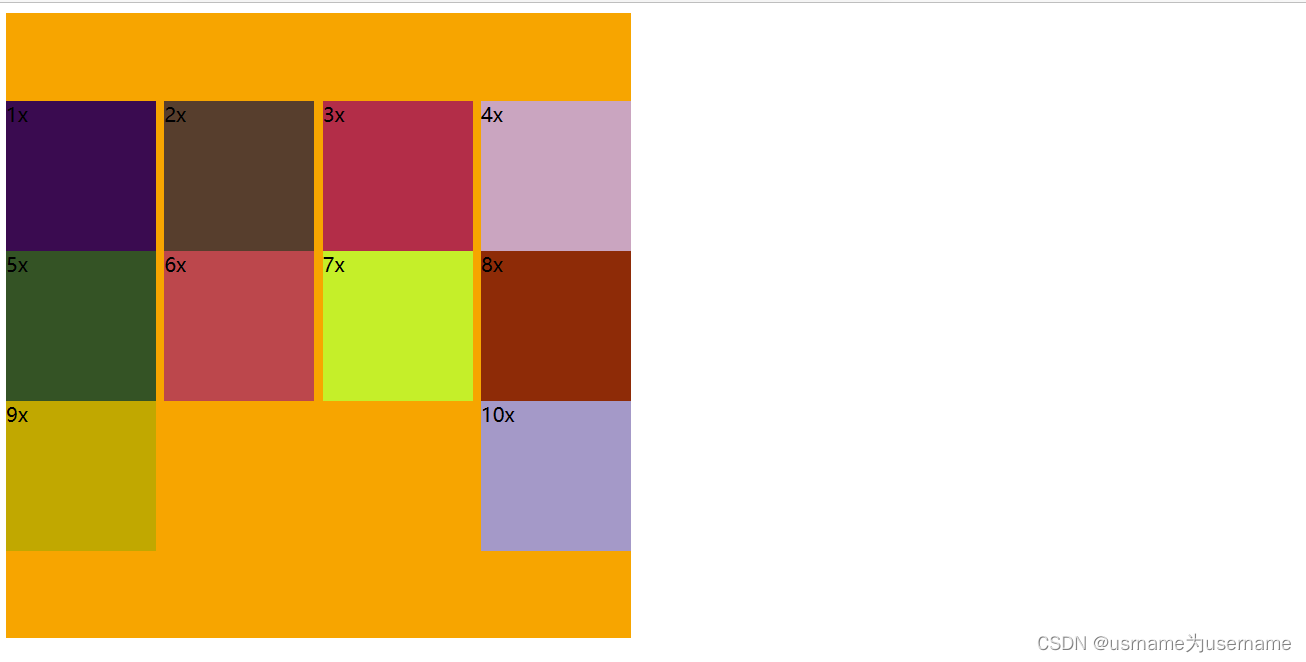
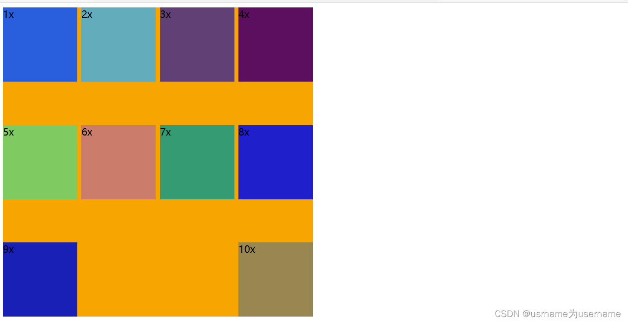
解决space-between最后一行的问题
前:
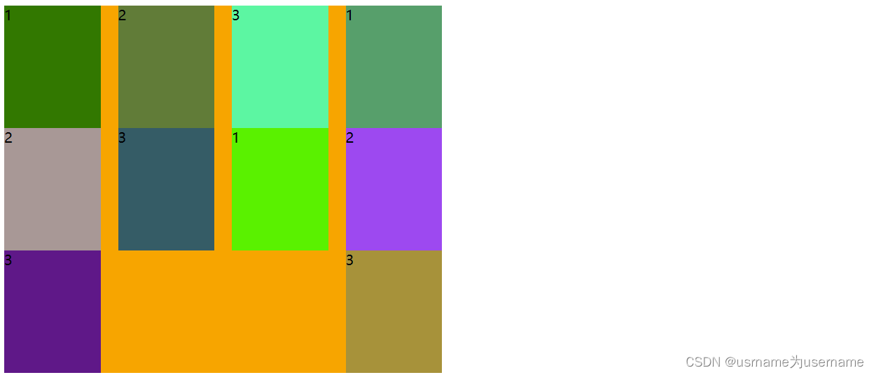
后:
  .container {width: 500px;background-color: orange;display: flex;flex-wrap: wrap;justify-content: space-between;}.item {width: 110px;height: 140px;/* margin-right: 20px; */}.container > i {width: 110px;}/* .item:nth-child(4n) {margin-right: 0;} */</style>
</head>
<body><div class="container"><div class="item item1">1</div><div class="item item2">2</div><div class="item item3">3</div><div class="item item1">1</div><div class="item item2">2</div><div class="item item3">3</div><div class="item item1">1</div><div class="item item2">2</div><div class="item item3">3</div><div class="item item3">3</div><!-- 添加span的个数是列数减-2 --><i></i><i></i></div>