主题风格配置开发

场景:
1)同一产品,根据不同甲方配置不同主题风格,大多都是主题色的修改
2)产品需求需要有主题设置功能,基本也是主题色的修改
下面主要说的颜色的修改,当然实际应用中少量图片也是有修改,这部分就不说了,差不多就是一个判断引入地址不一样。
实现方式1:通过sass变量实现统一主题
该方法也可通过js动态改变主题,参考elementUI的color-picker 组件
variables.scss
$themeColor:red;
$themeColor1:mix(#ffffff,$themeColor,10%);
$themeColor2:mix(#ffffff,$themeColor,20%);
$themeColor3:mix(#ffffff,$themeColor,30%);
$themeColor4:mix(#ffffff,$themeColor,40%);
$themeColor5:mix(#ffffff,$themeColor,50%);
$themeColor6:mix(#ffffff,$themeColor,60%);
$themeColor7:mix(#ffffff,$themeColor,70%);
$themeColor8:mix(#ffffff,$themeColor,80%);
$themeColor9:mix(#ffffff,$themeColor,90%);
然后,可以通过文件引入variables.scss使用上面变量,也可通过配置为全局变量使用。
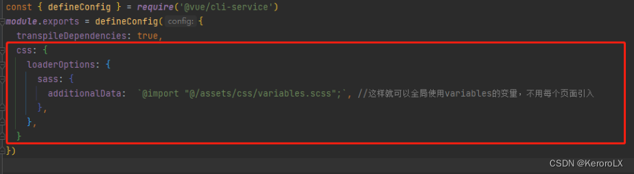
在vue中配置vue.config.js
组件使用:
<template><div>{{des}}</div>
</template>
<script>
export default{name:'MyButton',props:{des:String}
}
</script>
<style scoped lang="scss">
@import '../assets/variables.scss';div{margin: 30px;border: 1px solid $themeColor6;background-color: $themeColor9;color: $themeColor;text-align: center;}
</style>
实现方式2:通过:root设置统一主题
可通过js改变变量实现动态改变主题
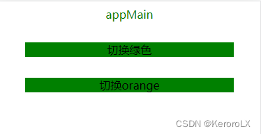
<template><div id="appMain">appMain</div><MyButton des="切换绿色"  @click="toggleTheme('green')"/><MyButton des="切换orange" @click="toggleTheme('orange')"/>
</template><script>
import MyButton from './components/MyButton.vue'
export default {name: 'App',components:{MyButton},methods:{//js改变:root中变量toggleTheme(color){document.documentElement.style.setProperty('--themeColor',color)}}
}
</script><style lang="scss">
:root{--themeColor:red;
}
#appMain {text-align: center;color: var(--themeColor);
}
</style>
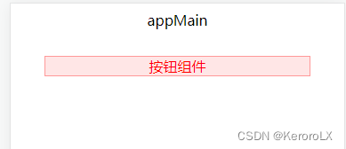
按钮组件:
div{margin: 30px;background-color: var(--themeColor);text-align: center;}
默认红色

点击按钮改变主题色
实现方法3:定义几套主题,通过对最外层dom进行class切换实现
theme.css
@mixin applyStyle($themeColor,$subThemeC){$themeColor1:mix(#ffffff,$themeColor,10%);$themeColor2:mix(#ffffff,$themeColor,20%);$themeColor3:mix(#ffffff,$themeColor,30%);$themeColor4:mix(#ffffff,$themeColor,40%);$themeColor5:mix(#ffffff,$themeColor,50%);$themeColor6:mix(#ffffff,$themeColor,60%);$themeColor7:mix(#ffffff,$themeColor,70%);$themeColor8:mix(#ffffff,$themeColor,80%);$themeColor9:mix(#ffffff,$themeColor,90%);.themeColor{color: $themeColor;}.themeBtn.plain{background-color: $themeColor9;border: 1px solid $themeColor5;color: $themeColor;}.subThemeC{color: $subThemeC;}
}
.redApp{$themeColor:red;$subThemeC:blue;@include applyStyle($themeColor,$subThemeC)
}
.greenApp{$themeColor:green;$subThemeC:orange;@include applyStyle($themeColor,$subThemeC)
}
在main.js引入theme.scss
App.vue中
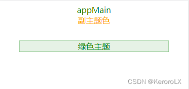
<template><div id="appMain" :class="[className]"><div class="themeColor">appMain</div><div class="subThemeC">副主题色</div><MyButton des="绿色主题" @click="toggleTheme('greenApp')"/></div></template><script>
import MyButton from './components/MyButton.vue'
export default {name: 'App',data(){return {className:'redApp'}},components:{MyButton},methods:{toggleTheme(name){this.className=name}}
}
</script><style lang="scss">
#appMain {text-align: center;
}
</style>
MyButton.vue
<template><div class="themeBtn plain">{{des}}</div>
</template>
<script>
export default{name:'MyButton',props:{des:String}
}
</script>
<style scoped lang="scss">div{margin: 30px;text-align: center;}
</style>
方式3虽然写死主题不灵活,但是对于Ui设计中有多种不同于主题色的颜色存在的设计,且不可设置基本色只能切换主题风格的项目是比较适用的。
上述几种方式均可实现主题切换,根据项目需求选择吧。