BootStrap4:栅格系统

1、container容器
- container:固定宽度的容器
- container-fluid:响应式容器
2、栅格选项
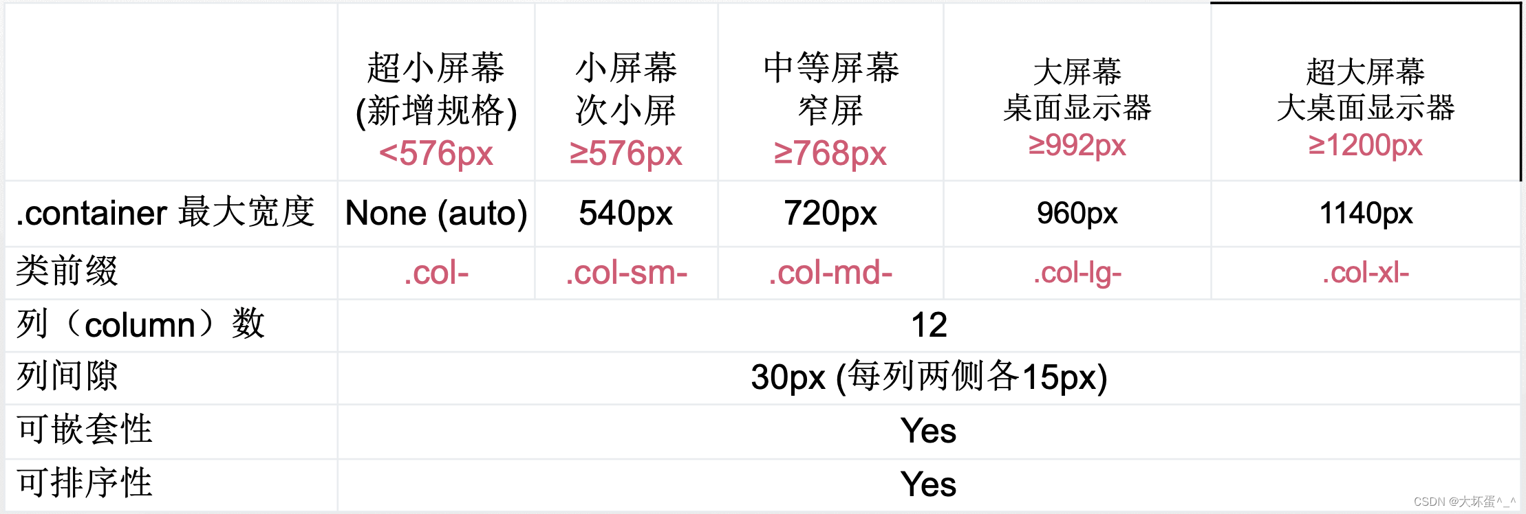
Bootstrap4 总共有五个栅格等级,每个响应式分界点隔出一个等级
Ps:.row上带有margin-left: -15px;margin-right: -15px;属性,你可以在.row上上定义.no-gutters属性,从而消除这个属性
实例一:等宽布局
<body> <div class="container"> <div class="row"> <div class="col"> 1 of 2 </div> <div class="col"> 2 of 2 </div> </div> <div class="row"> <div class="col"> 1 of 3 </div> <div class="col"> 2 of 3 </div> <div class="col"> 3 of 3 </div> </div> </div>
</body>
实例二:等宽多行
<body> <div class="container"><div class="row"><div class="col">Column</div><div class="col">Column</div><!-- 引用.w-100进行切割分行--><div class="w-100"></div><div class="col">Column</div><div class="col">Column</div></div></div>
</body>
3、栅格对齐(垂直对齐)
- align-items-start:垂直居上
- align-items-center:垂直居中
- align-items-center:垂直居下
示例:垂直对齐
样式效果:
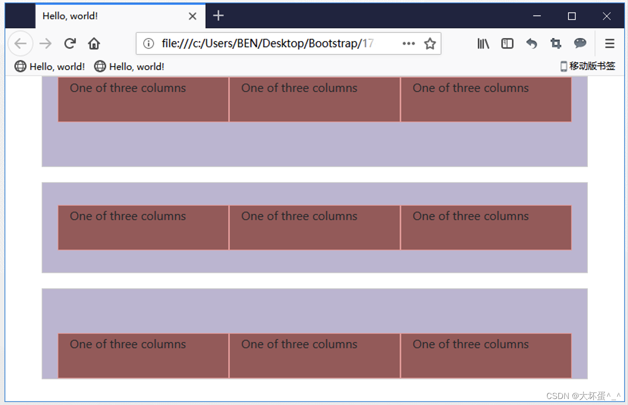
源代码:
<body> <div class="container"><div class="row align-items-start "><div class="col">One of three columns</div><div class="col">One of three columns</div><div class="col">One of three columns</div></div><div class="row align-items-center "><div class="col">One of three columns</div><div class="col">One of three columns</div><div class="col">One of three columns</div></div><div class="row align-items-end"><div class="col">One of three columns</div><div class="col">One of three columns</div><div class="col">One of three columns</div></div></div>
</body>
4、栅格对齐(水平对齐)
- justify-content-start:左对齐
- justify-content-center:居中对齐
- justify-content-end:右对齐
样式效果:
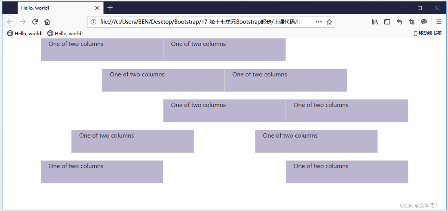
源代码:
<div class=“container”><div class="row justify-content-start"><div class="col-4"> One of two columns </div><div class="col-4"> One of two columns </div></div><div class="row justify-content-center"><div class="col-4"> One of two columns </div><div class="col-4"> One of two columns </div></div><div class="row justify-content-end"><div class="col-4"> One of two columns </div><div class="col-4"> One of two columns </div></div><div class="row justify-content-around"><div class="col-4"> One of two columns </div><div class="col-4"> One of two columns </div></div><div class="row justify-content-between"><div class="col-4"> One of two columns </div><div class="col-4"> One of two columns </div></div>
</div>
5、列偏移
使用响应式的.offset-*栅格偏移方法。
样式效果:
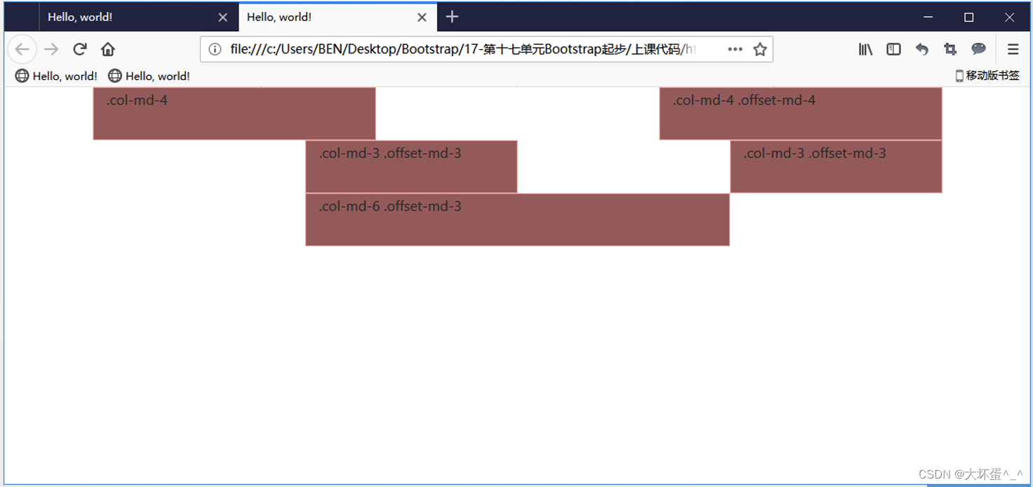
参考代码:
<div class=“container”><div class="row"><div class="col-md-4 b">.col-md-4</div><div class="col-md-4 offset-md-4 ">.col-md-4 .offset-md-4</div></div><div class="row"><div class="col-md-3 offset-md-3 ">.col-md-3 .offset-md-3</div><div class="col-md-3 offset-md-3 ">.col-md-3 .offset-md-3</div></div><div class="row"><div class="col-md-6 offset-md-3 ">.col-md-6 .offset-md-3</div></div>
</div>
6、列嵌套
可以通过添加一个新的 .row 元素和一系列 .col-sm-* 元素到已经存在的 .col-sm-* 元素内
样式效果:
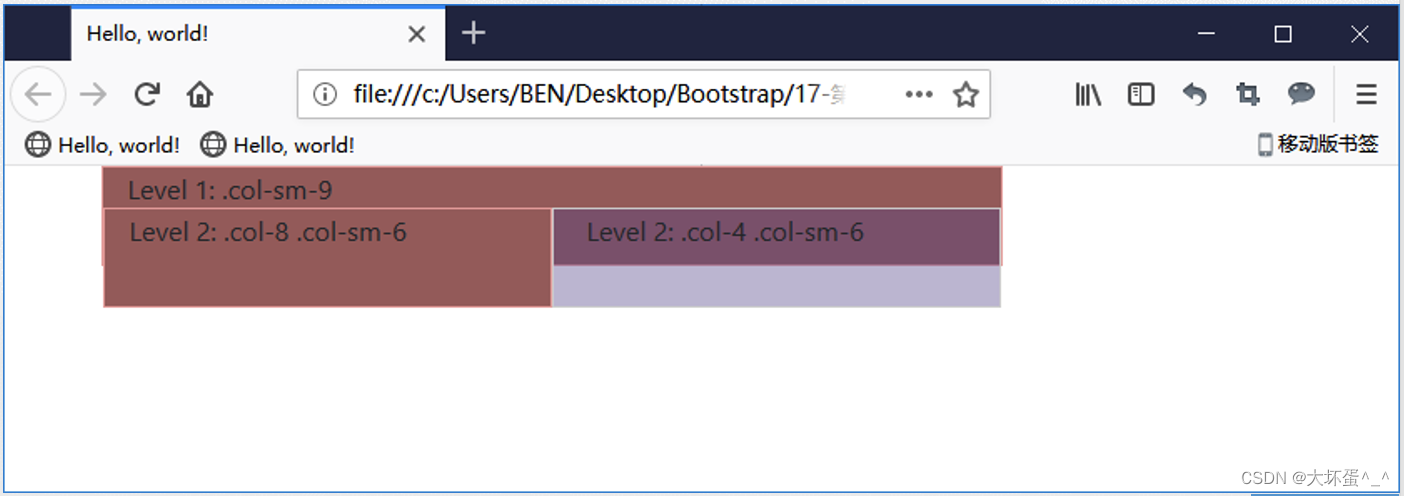
源代码:
<div class=“container”><div class="row"><div class="col-sm-9 ">Level 1: .col-sm-9<div class="row"><div class="col-8 col-sm-6 ">Level 2: .col-8 .col-sm-6</div><div class="col-4 col-sm-6 ">Level 2: .col-4 .col-sm-6</div></div></div></div>
</div>