小程序 table组件

最近有在小程序中用table的需求,但是没有找到有符合要求的组件,所以自己弄了一个,能满足基本需求。
组件下载:https://download.csdn.net/download/weixin_67585820/85047405
引入
"usingComponents": {"table": "/components/table/table"}
文档
props
| 参数 | 说明 | 类型 | 默认值 |
|---|---|---|---|
| header | 表格头,下面详细说明 | Array | [ ] |
| list | 内容列表 | Array | [ ] |
| show-active | 当点击或长按时 选中的行是否显示背景颜色 | Boolean | true |
| active-color | 当show-active为true时有效;选中行的颜色 | Boolean | #d6e8ff |
| is-sroll | 表格是否能横向滚动 | Boolean | false |
| col-width | is-sroll为true时有效;单位:rpx;平均每列的宽度 | Number | 假设有n列,n<3 ? 730/n : 300 |
| max-line | 最多显示几行文字,超出隐藏 | Number | 2 |
header props
header 为一个对象数组,数组中的每一个对象包含以下 key。
| 参数 | 说明 |
|---|---|
| key | list中要显示的列对应key |
| title | 表格中显示的文字 |
| renderBody | 是个function;优先级高于key,可以根据内容渲染显示文字 |
| renderColor | 是个function;可以根据内容渲染文字颜色 |
header的用法会有示例
外部样式
不再针对每一个详细说明,类名已经很明显了,大家这么聪明一看就懂
‘table-class’, ‘tr-class’, ‘td-class’, ‘th-class’, ‘tr-class_even’, ‘tr-class_odd’
events
| 事件名 | 说明 |
|---|---|
| bind:onClick | 点击行,从返回参数的 detail 中获取到index,data;index:点击的那一行,data:这一行的数据 |
| bind:onLongPress | 长按行,参数同上 |
示例
header的用法
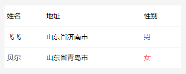
wxml:
<table header="{{header}}" list="{{list}}"/>
js:
Page:({data: {list: [{name: '飞飞',address: '山东省济南市',gender: 0},{name: '贝尔',address: '山东省青岛市',gender: 1}],header: [{key: 'name',title: '姓名',}, {key: 'address',title: '地址'},{title: '性别',renderBody: (item, index) => {return Number(item.gender) ? '女' : '男';},renderColor: (item, index) => {return Number(item.gender) ? '#fd4949' : '#1a84f1';},}]},
})
左右滑动
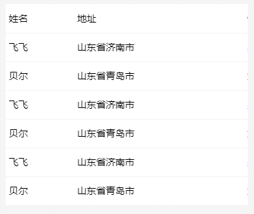
<table header="{{header}}" list="{{list}}" is-scroll></table>
自定义样式
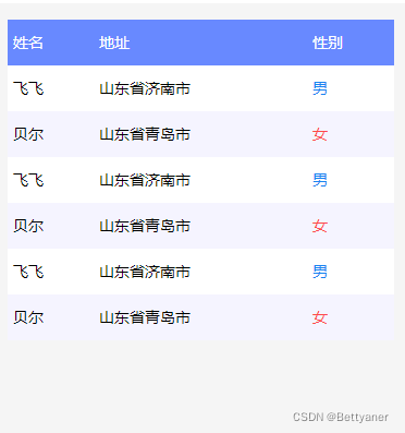
<table header="{{header}}" list="{{list}}" th-class="th" td-class="td" tr-class_odd="tr-odd""></table>.tr-odd {background-color: #f5f4ff;
}/*去掉边框*/
.td::before {display: none;
}.th {background-color: #6889ff;color: #fff;
}
table组件目前是这样,后面还会加新的功能