【python】采集天气数据并作可视化,怀念一下之前得好天气

前言
这几天,长沙得天气突然爆冷,每天上班跟渡劫一样
生怕一不小心,风就把伞吹跑了,人湿点无所谓,但是我得伞不能有事
现在得我无比怀念之前得好天气,今天我就来采集一下天气数据并作个可视化怀念一下它~
开发环境
-
Python 3.8 / 编译器
-
Pycharm 2021.2版本 / 编辑器
Echarts是一个开源的数据可视化JS库,
pyecharts是一款将python与echarts结合的强大的数据可视化工具
先来获取我们想要的天气数据
请求数据
因为是静态网站,所以数据还是很好找到的,F12打开开发者工具,刷新下网站就行了
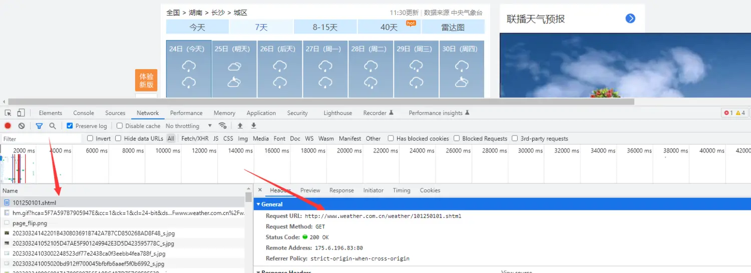
url = 'http:///weather1d/101250101.shtml'
headers = {'user-agent': 'Mozilla/5.0 (Windows NT 10.0; WOW64) AppleWebKit/537.36 (KHTML, like Gecko) Chrome/101.0.0.0 Safari/537.36'
}
response = requests.get(url=url, headers=headers)
解析数据
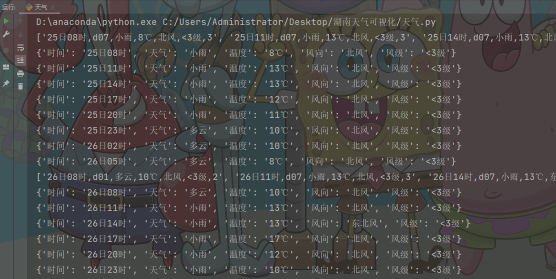
用正则可以直接匹配我我们想要的数据
html_data = re.findall('var hour3data=(.*)', response.text)[0]
json_data = json.loads(html_data)
print(json_data)
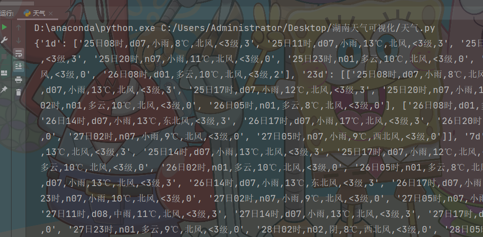
提取数据
for index in json_data['7d']:print(index)for i in index:dit = {'时间': i.split(',')[0],'天气': i.split(',')[2],'温度': i.split(',')[3],'风向': i.split(',')[4],'风级': i.split(',')[5],}print(dit)
保存数据
把数据保存到csv文件里,而且数据很干净,后面做可视化不用再进一步进行清洗
f = open('data.csv', mode='a', encoding='utf-8', newline='')
csv_writer = csv.DictWriter(f, fieldnames=['时间','天气','温度','风向','风级'
])
csv_writer.writeheader()
数据可视化
我们都知道python上的一款可视化工具matplotlib,
而前些阵子做一个Spark项目的时候用到了百度开源的一个可视化JS工具-Echarts,
可视化类型非常多,但是得通过导入js库在Java Web项目上运行,
平时用Python比较多,于是就在想有没有Python与Echarts结合的轮子。
Google后,找到一个国人开发的一个Echarts与Python结合的轮子:pyecharts
城市温度变化柱状图(一周气温变化)
x = Faker.choose()
tl = Timeline()
time_list = [i for i in range(23, 32)]
for i, date, temperature in zip(time_list, date_list, temperature_list):bar = (Bar().add_xaxis(date).add_yaxis("长沙温度", temperature).set_global_opts(title_opts=opts.TitleOpts("长沙3月{}日温度".format(i)),graphic_opts=[opts.GraphicGroup(graphic_item=opts.GraphicItem(rotation=JsCode("Math.PI / 4"),bounding="raw",right=100,bottom=110,z=100,),children=[opts.GraphicRect(graphic_item=opts.GraphicItem(left="center", top="center", z=100),graphic_shape_opts=opts.GraphicShapeOpts(width=400, height=50),graphic_basicstyle_opts=opts.GraphicBasicStyleOpts(fill="rgba(0,0,0,0.3)"),),opts.GraphicText(graphic_item=opts.GraphicItem(left="center", top="center", z=100),graphic_textstyle_opts=opts.GraphicTextStyleOpts(text="长沙3月{}日温度".format(i),font="bold 26px Microsoft YaHei",graphic_basicstyle_opts=opts.GraphicBasicStyleOpts(fill="#fff"),),),],)],))tl.add(bar, "3月{}日".format(i))tl.render_notebook()

全省每小时温度分布图(3天气温变化)
file = "weather_henan_allcities.xlsx"
data = pd.read_excel(file) #reading file
time_line_final = list(data['小时'].iloc[0:24])from pyecharts import options as opts
from pyecharts.charts import Map,Timeline
#定义一个timeline和map的组合图
def timeline_map(data):tl = Timeline().add_schema(play_interval =300,height=40,is_rewind_play=False,orient = "horizontal",is_loop_play = True,is_auto_play=False)#设置播放速度、是否循环播放等参数for h in time_line_final:x =data[data["小时"]==h]['城市'].values.tolist() #选取指定城市y=data[data["小时"]==h]['温度'].values.tolist() #选取时间的温度map_shape = (Map().add("{}h时气温(℃)".format(h),[list(z) for z in zip(x, y)],"湖南") #打包输入地区及对应降温度数据.set_series_opts(label_opts=opts.LabelOpts("{b}")) #配置系列参数,{b}为显示地区数据.set_global_opts(title_opts=opts.TitleOpts(title="每小时气温分布"), #全局参数中设置标题visualmap_opts=opts.VisualMapOpts(max_=300,  #设置映射配置项的最大值is_piecewise=True, #设置是否为分段显示pos_top = "60%", #映射配置项距图片上部的距离pieces=[{"min": 13, "label": '>13℃', "color": "#FF0000"},  # 分段指定颜色及名称{"min": 10, "max": 12, "label": '10-13℃', "color": "#FF3333"},{"min": 7, "max": 9, "label": '7-9℃', "color": "#FF9999"},{"min": 0, "max": 6, "label": '0-6℃', "color": "#FFCCCC"}])))tl.add(map_shape, "{}h".format(h)) #将不同日期的数据加入到timeline中return tl
timeline_map(data).render("rainfall.html")

尾语
大家觉得有用的话可以来个免费的点赞+收藏+关注,
防止下次我悄悄更新了好东西你却不知道 !!!
希望本篇文章有对你带来帮助 🎉,有学习到一点知识~
躲起来的星星🍥也在努力发光,你也要努力加油(让我们一起努力叭)。