【Python基础绘图】自定义函数,一键标注相关性热力图的显著性

相关性热力图标自动注显著性

01 引言
很早之前其实就写过一篇博客【python相关性热力图自动标记显著性】介绍如何在相关性热力图上自动标注显著性,不过收到好多同学私信问我数据源是啥样的,怎么计算的啊等等问题。所以今天打算重新写篇,并附上样例数据供大家参考学习。
02 读取数据 :
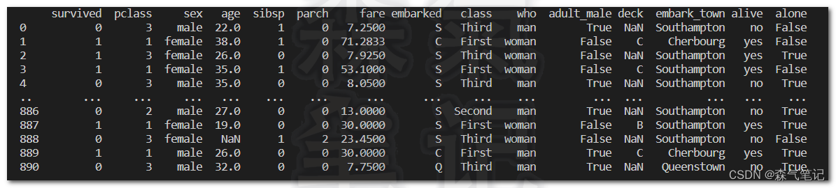
这次借助seaborn自带数据集的数据给大家来做演示,这边请忽略数据是否适用pearson相关性分析哈,实在是样例数据不太好找。你们自己整理数据,就整理成每列表示一个变量,这样就可以了。
df = sns.load_dataset('titanic')
print(df)
03计算相关性显著性:
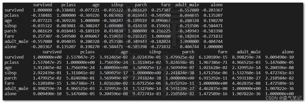
r_matrix = df.corr(method=lambda x, y: pearsonr(x, y)[0])
print(r_matrix)
p_matrix = df.corr(method=lambda x, y: pearsonr(x, y)[1])
print(p_matrix)
04可视化
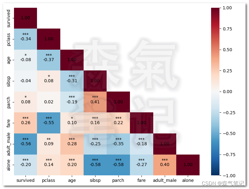
fig,ax = plt.subplots(figsize=(8,6))
mask = np.tril(np.ones(r_matrix.values.shape, dtype=int))
mask = np.where(mask==1,0,1)
print(mask)
im1 = sns.heatmap(r_matrix,annot=True,cmap="RdBu_r"
, mask=mask#构造mask,去除重复数据显示
,vmax=1,vmin=-1
, fmt='.2f',ax = ax
, annot_kws={"color": "k"}
)
plt.show()

05标注显著性
widthx = 0
widthy = -0.15for m in ax.get_xticks():for n in ax.get_yticks():pv = (p_matrix.values[int(m),int(n)])if mask[int(m),int(n)]<1.:if  pv< 0.05 and pv>= 0.01:ax.text(n+widthx,m+widthy,'*',ha = 'center',color = 'k')if  pv< 0.01 and pv>= 0.001:ax.text(n+widthx,m+widthy,'',ha = 'center',color = 'k')if  pv< 0.001:ax.text(n+widthx,m+widthy,'*',ha = 'center',color = 'k')
完整代码(封装函数)
# -*- encoding: utf-8 -*-
'''
@File    :   相关性.py
@Time    :   2023/04/22 20:43:25
@Author  :   HMX
@Version :   1.0
@Contact :   kzdhb8023@163.com
'''# here put the import lib
import os
import numpy as np
import matplotlib.pyplot as plt
import seaborn as sns
from scipy.stats import pearsonr
import pandas as pddef plot_p(df,pngpath,x=8,y=6,widthx = 0, widthy = -0.15):'''df:dataframe类型的数据pngpath:输出图片的路径x,y:图表的长宽width,widthy:调节显著性标记点距离网格中心点的位移,一般默认就行,如发生与相关性系数有重叠或者遮挡的情况时可以手动调整'''# 计算相关性r_matrix = df.corr(method=lambda x, y: pearsonr(x, y)[0])# print(r_matrix)# 计算显著性p_matrix = df.corr(method=lambda x, y: pearsonr(x, y)[1])# print(p_matrix)# 可视化fig,ax = plt.subplots(figsize=(x,y))# 构造maskmask = np.tril(np.ones(r_matrix.values.shape, dtype=int))mask = np.where(mask==1,0,1)# 可视化相关性im1 = sns.heatmap(r_matrix,annot=True,cmap="RdBu_r", mask=mask#构造mask,去除重复数据显示,vmax=1,vmin=-1, fmt='.2f',ax = ax, annot_kws={"color": "k"})# 标注显著性for m in ax.get_xticks():for n in ax.get_yticks():pv = (p_matrix.values[int(m),int(n)])if mask[int(m),int(n)]<1.:if  pv< 0.05 and pv>= 0.01:ax.text(n+widthx,m+widthy,'*',ha = 'center',color = 'k')if  pv< 0.01 and pv>= 0.001:ax.text(n+widthx,m+widthy,'',ha = 'center',color = 'k')if  pv< 0.001:ax.text(n+widthx,m+widthy,'*',ha = 'center',color = 'k')plt.tight_layout()plt.savefig(pngpath,dpi = 600)if __name__ == '__main__':df = sns.load_dataset('titanic')print(df)pngpath = r'D:\\ForestMeteorology\\Study\\相关性\\GZH.png'plot_p(df,pngpath)plt.show()
热力图的其他设置请参考seaborn官网。
以上就是本期推文的全部内容了,如果对你有帮助的话,请‘点赞’、‘收藏’,‘关注’,你们的支持是我更新的动力。