一种图片展示的完美方案,图片展示,object-fill

通常一般的处理
<style>.img-container {width: 300px;height: 200px;background: #f60;}img {width: 100%;height: 100%;}</style>
</head>
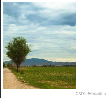
<body><div class="img-container"><img src="./行道树.png" alt=""></div>
</body>
但是如果照片尺寸不符合这个容器的长宽比例,就裂开了
<style>.img-container {width: 100px;height: 200px;background: #f60;}img {width: 100%;height: 100%;}</style>
</head>
<body><div class="img-container"><img src="./行道树.png" alt=""></div>
</body>
解决图片现实的困局,使用object-fit属性:
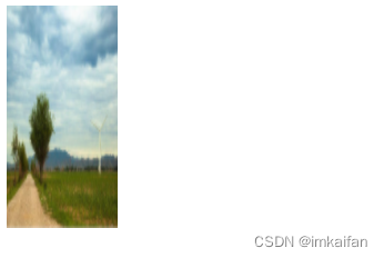
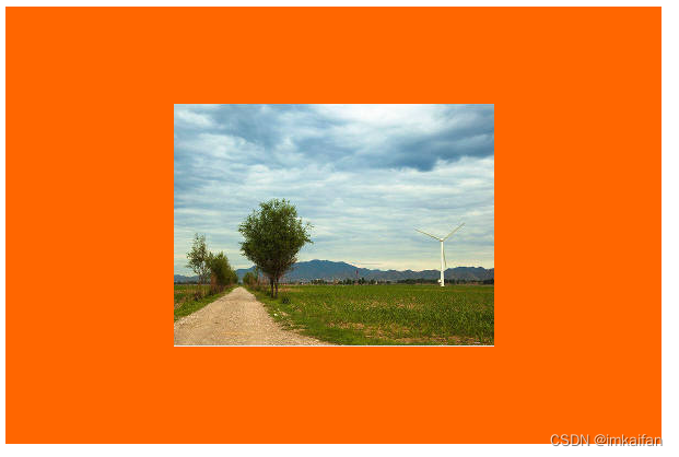
contain
被替换的内容将被缩放,以在填充元素的内容框时保持其宽高比。整个对象在填充盒子的同时保留其长宽比,因此如果宽高比与框的宽高比不匹配,该对象将被添加“黑边”。
将会被缩放,在填充的时候会保证宽高比,保证保持宽高比的情况下会添加"黑边"(优点:图片一定会被全貌展示;缺点:黑边的宽度把握不住)
<style>.img-container {width: 150px;height: 300px;background: #f60;}img {width: 100%;height: 100%;object-fit: contain;}</style>
</head>
<body><div class="img-container"><img src="./行道树.png" alt=""></div>
</body>
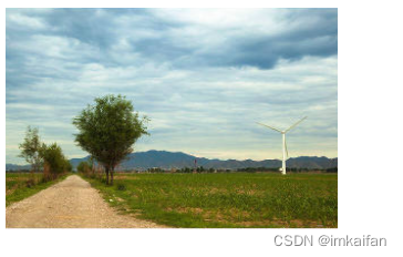
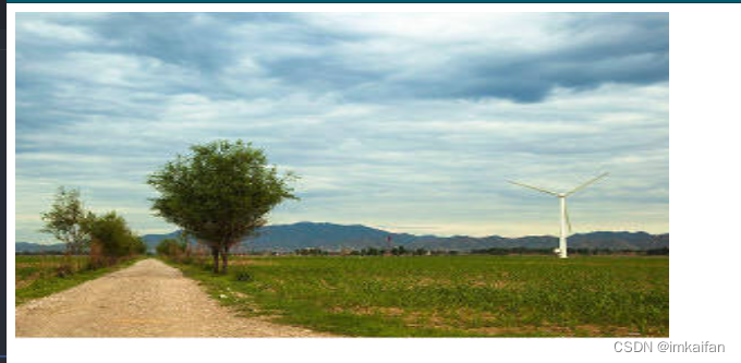
cover
保证图片宽高比的同时,会充满整个内容区域,会进行裁剪。不会全貌展示,但是看着比较舒适,具体展示哪一部分,裁剪哪一部分,不可控
<style>.img-container {width: 200px;height: 300px;background: #f60;}img {width: 100%;height: 100%;object-fit: cover;}</style>
</head>
<body><div class="img-container"><img src="./行道树.png" alt=""></div>
</body>
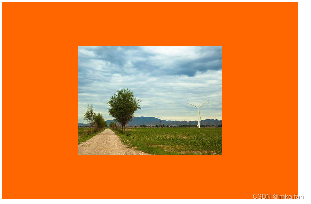
fill
充满整个内容区域,如果宽高比与内容框不相匹配,那就拉伸图片,以适应内容区(这个属性比较鸡肋,跟裂开的代码别无而致)
<style>.img-container {width: 600px;height: 300px;background: #f60;}img {width: 100%;height: 100%;object-fit: fill;}</style>
</head>
<body><div class="img-container"><img src="./行道树.png" alt=""></div>
</body>
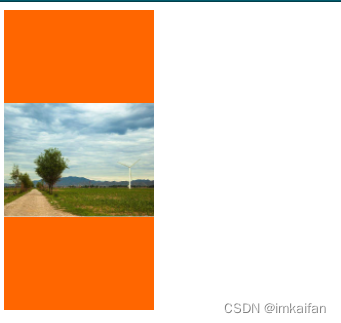
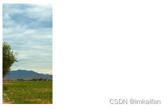
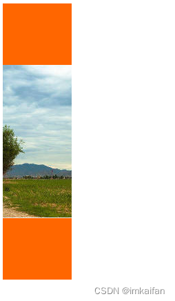
none
被替换内容将==维持原有的尺寸==。当内容大于容器的时候回进行裁剪,当内容小于容器的时候,会进行居中显示
<style>.img-container {width: 100px;height: 200px;background: #f60;}img {width: 100%;height: 100%;object-fit: none;}</style>
</head>
<body><div class="img-container"><img src="./行道树.png" alt=""></div>
</body>
 <style>.img-container {width: 600px;height: 400px;background: #f60;}img {width: 100%;height: 100%;object-fit: none;}</style>
</head>
<body><div class="img-container"><img src="./行道树.png" alt=""></div>
</body>
<style>.img-container {width: 100px;height: 400px;background: #f60;}img {width: 100%;height: 100%;object-fit: none;}</style>
</head>
<body><div class="img-container"><img src="./行道树.png" alt=""></div>
</body>
scale-down
这个相当于是container 和none 两者的属性,具体使用哪一个,看哪一个的占地内容较少
 <style>.img-container {width: 600px;height: 400px;background: #f60;}img {width: 100%;height: 100%;object-fit: contain;}</style>
</head>
<body><div class="img-container"><img src="./行道树.png" alt=""></div>
</body>
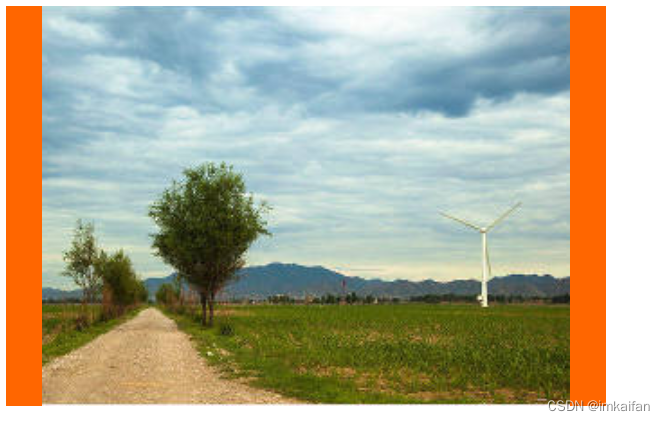
 <title>Document</title><style>.img-container {width: 600px;height: 400px;background: #f60;}img {width: 100%;height: 100%;object-fit: scale-down;}</style>
</head>
<body><div class="img-container"><img src="./行道树.png" alt=""></div>
</body>