CSS学习(5) - 布局

文章首发于我的个人博客:欢迎大佬们前来逛逛
文章目录
- CSS布局
-
- display属性
- width和max-width
- position 属性
- 溢出
- 浮动和清除
-
- float
- clear
- 布局案例
CSS布局
display属性
display 属性是CSS布局的最重要的属性。
display属性规定是否/如何显示元素。
display元素通常与 javascript 一起使用,用于显示或者隐藏元素。
默认情况下, javascript: none
修改默认的display值:
- inline: 行内元素形式
- block: 块级元素形式
- none: 隐藏属性并且不占用任何空间(
visibility:hidden也可以隐藏元素,但仍会影响布局)
案例:HTML+CSS+Javascript 实现对display的控制:
.imgbox{padding: 10px;margin: 5;border: 2px solid black;display: inline;float: left;text-align: center;
}button{background-color: gainsboro;
}
<!DOCTYPE html>
<html><head><link rel="stylesheet" type="text/css" href="5.css"></head><body><h1>这是一个标题</h1><div class="imgbox" id="1"><img src="https://www.w3school.com.cn//i/css/imgbox-1.gif" alt="1.img" ><button onclick="onHiddenimg()">隐藏图片</button></div><div class="imgbox" id="2"><img src="https://www.w3school.com.cn//i/css/imgbox-2.gif" alt="2.img"><button onclick="onDelimg()">删除图片</button></div><div class="imgbox" id="3"><img src="https://www.w3school.com.cn//i/css/imgbox-3.gif" alt="3.img"><button onclick="onReset()">重置图片</button></div><script>function onHiddenimg(){document.getElementById('1').style.display = "none";}function onDelimg(){document.getElementById('2').style.visibility = "hidden";}function onReset(){document.getElementById('1').style.display = "block";document.getElementById('2').style.visibility = "visible";}</script></body>
</html>
width和max-width
块级元素始终占用可用的全部宽度
设置 width 以防止其扩展到容器边缘,然后将 margin 设置为auto可以使其水平居中,元素将占用指定的宽度,剩余空间将在两个外边距之间平均分配。
使用 max-width 使得适应小窗口的处理,可以使得在小窗口的情况下可以自动收缩,否则会产生一个滑动条。
position 属性
position应用于元素的定位方法。
有五个不同的位置值:
- static
- relative
- fixed
- absolute
- sticky
static
设置了此属性后,我们如果再指定其四个方位的边距,left,right top bottom等,则将不会有任何改变,相当于static就已经固定了位置。
relative
设置了此属性后,设置相对定位的元素的 top、right、bottom 和 left 属性将导致其偏离其正常位置进行调整。
fixed
设置了此属性后,则会按照四个方位的属性值进行位置的固定。即如果我们滑动了窗口,这个元素也是固定在此位置的。
absolute
设置了此属性后,将会设置为相对于其最近的父窗口进行定位。
然而,如果绝对定位的元素没有祖先,它将使用文档主体(body),并随页面滚动一起移动。
sticky
根据用户的滚动位置进行定位,相当于在 excel 中固定单元格
首先是 相对relative,然后当窗口滑动超过时,切换为 固定fixed定位。
-
注意:
Internet Explorer、Edge 15 以及更早的版本不支持粘性定位。 Safari 需要 -webkit- 前缀,您还必须至少指定
top,right,bottom,left之一,以便粘性定位起作用。
div.sticky{position: -webkit-sticky;position: sticky;top: 0px;background-color: green;border: 2px solid black;text-align: center;padding: 10px;
}
如果设置位置的时候元素出现重叠,则可以指定z-index 表示元素的覆盖顺序,数字越大的越靠前。
溢出
overflow 用于处理内容太大而无法放入指定区域时是剪裁内容还是添加滚动条。
- visible:可见的,如果超过了元素框,则文本内容接着显示
- hidden:隐藏内容,切断多余的内容
- scroll:切断,但是有一个滑动条
- auto:相当于scroll,但是它仅在必要时添加滚动条:
overflow-x 和 overflow-y 控制水平还是垂直更改内容的溢出。
浮动和清除
float
控制元素如何浮动。
- left:元素浮动到容器左侧
- right:元素浮动到容器右侧
- none:元素不会浮动
- inherit
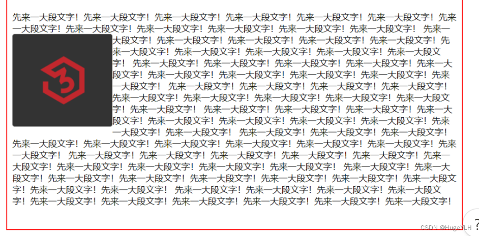
最简单的总结:float可以实现报纸上文字包围图片的效果。
测试:
img.left{float: left;
}
img.right{float: right;
}
img.none{float: none;
}
clear
可以指定元素浮动于被清除元素的旁边以及哪一侧
- none:两侧都可以有浮动
- left,right:左侧或者右侧不允许浮动
- both:左右侧都不允许
- inherit
在使用此属性的时候,要与 float 一起使用。
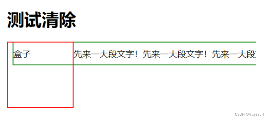
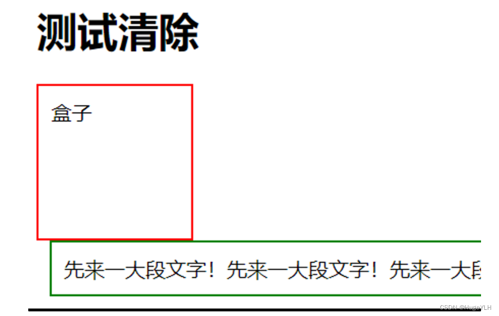
如果一个元素浮动到了左侧,则应该清除左侧,这样浮动的元素会继续浮动,而清除的元素会显示在下面。
div.box{height: 100px;width: 100px;border: 2px solid red;padding: 10px;float: left;
}
/*没有clear*/
div.noclear{border: 2px solid green;padding: 10px;margin: 10px;
}
/*有clear*/
div.clear{clear: left;border: 2px solid green;padding: 10px;margin: 10px;
}
-
效果展示:
不存在清除:
存在清除:
clearfix 清除浮动! 这是一段很有用的代码!
.clearfix::after {content: "";clear: both;display: table;
}
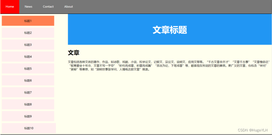
布局案例
一个较简单的Web网页的实现:
*{box-sizing: border-box;
}body{background-color: rgb(255,255,238);margin: 0;
}.topMenu ul{background-color: rgb(119,119,119);border: 2px solid black;padding: 0px;margin: 0px;overflow: hidden;list-style-type: none;
}/*列表项不要设置边距:因为一个列表项就是一个a标签,所以直接在a标签内设置边距*/
.topMenu li{float: left;
}.topMenu li a{color: white;text-decoration: none;text-align: center;padding: 30px; /*设置列表项的内边距以调整顶部菜单的大小*/display: table;
}.topMenu a.active{background-color: red;
}.topMenu a:hover{background-color: blueviolet;
}/*左侧边栏*/
.sideMenu{width: 25%;
}.sideMenu ul{margin: 10px;padding: 0px;list-style-type: none;
}.sideMenu li a{background-color: rgb(255,238,238);color: black;text-decoration: none;text-align: center;padding: 5% 35%;display: table;margin-bottom: 10px;
}      .sideMenu a.active{background-color: coral;
}.sideMenu a:hover{background-color: aquamarine;
}/*这一段不太懂*/
.clearfix::after {content: "";clear: both;display: table;
}/*水平分割*/
.column{float: left;
}/*正文标题*/
.mainTop{background-color: #2196F3;color: white;text-align: center;font-size: 150%;padding: 2%;
}/*文本内容*/
.content{width: 75%;  /*sideMenu:25% content: 75%*/
}/*底部*/
.footer{background-color: black;padding: 15px;color: white;text-align: center;font-size: larger;
}
<!DOCTYPE html>
<html><head><link rel="stylesheet" type="text/css" href="flaotWebpage.css"></head><body><!-- 顶部菜单 --><div class="topMenu"><ul><li><a href="https://helloylh.com" class="active">Home</a></li><li><a href="https://helloylh.com">News</a></li><li><a href="https://helloylh.com">Contact</a></li><li><a href="https://helloylh.com">About</a></li></ul></div><!-- 侧边栏菜单 --><div class="clearfix"><div class="column sideMenu"><ul><li><a href="https://helloylh.com" class="active">标题1</a></li><li><a href="https://helloylh.com">标题2</a></li><li><a href="https://helloylh.com">标题3</a></li><li><a href="https://helloylh.com">标题4</a></li><li><a href="https://helloylh.com">标题5</a></li><li><a href="https://helloylh.com">标题6</a></li><li><a href="https://helloylh.com">标题7</a></li><li><a href="https://helloylh.com">标题8</a></li><li><a href="https://helloylh.com">标题9</a></li><li><a href="https://helloylh.com">标题10</a></li><li><a href="https://helloylh.com">标题11</a></li><li><a href="https://helloylh.com">标题12</a></li></ul></div><!-- 文本内容 --><div class="column content"><div class="mainTop"><h1>文章标题</h1></div><h1>文章</h1><p>文章包括各种文体的著作、作品,如诗歌、戏剧、小说、科学论文,记叙文、议论文、说明文、应用文等等。“千古文章未尽才”“文章千古事”“文章憎命达”“板凳要坐十年冷、文章不写一字空”“积句而成章,积章而成篇”“言出为论,下笔成章”等,都是现在所说的文章的意思。更广义的文章,也包含“学问”“奥秘”等意思,如“洞明世事皆学问,人情练达即文章”就是。</p></div></div><!-- 底部 --><div class="footer"> <p>Fooder Text</p></div></body>
</html>
实现如下: