前端透明分栏设计

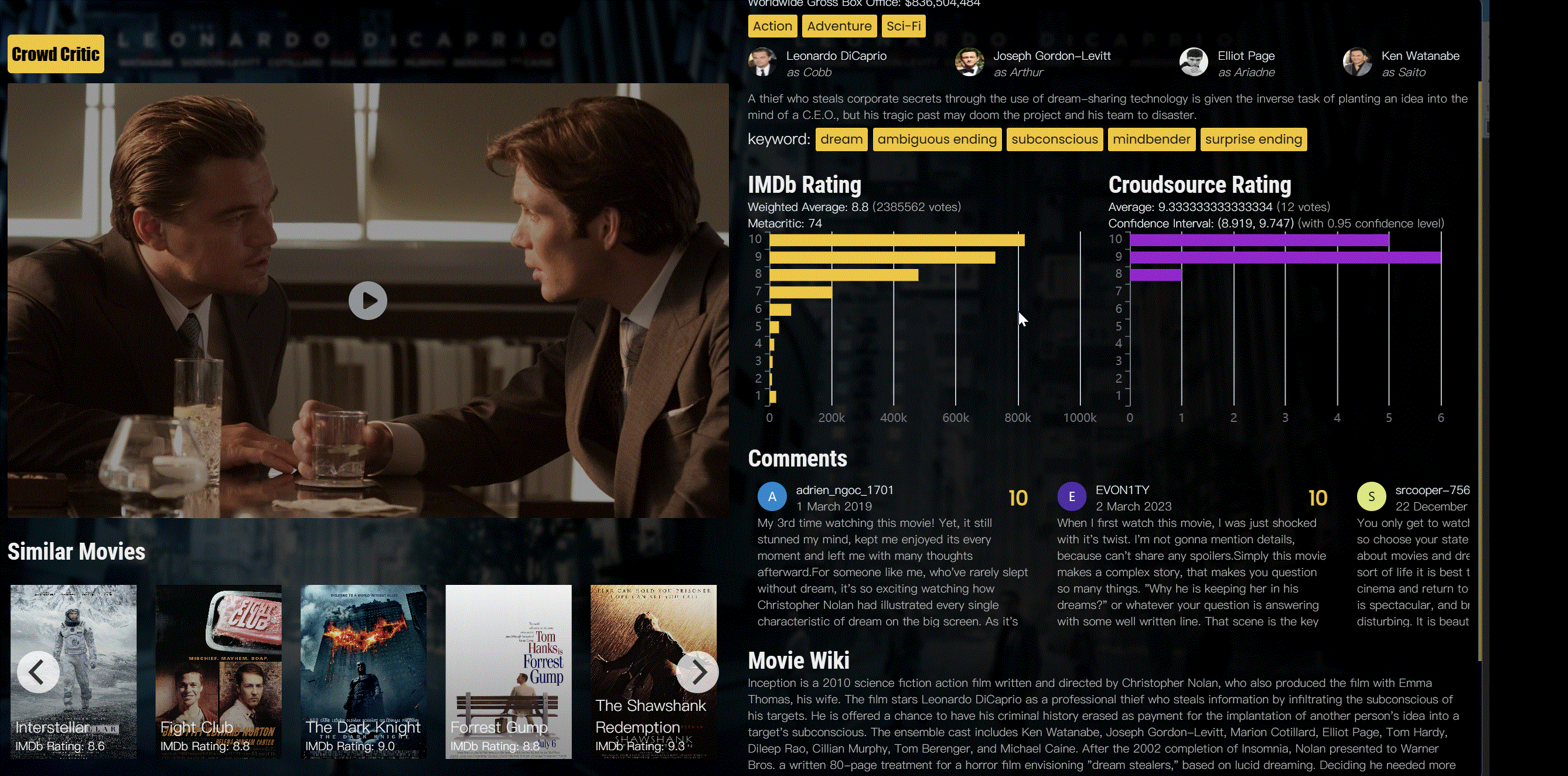
目前在开发一个基于众包的打分网站,前端遇到的一个需求是:
- 背景是电影的海报,且不能随着scroll-bar滚动,需要一个蒙版
- 分为两栏,左侧是影视的媒体信息,不随页面滚动
- 右侧是影视的基本信息和评分信息,要可以随着页面滚动
首先规划一个简单的页面框架
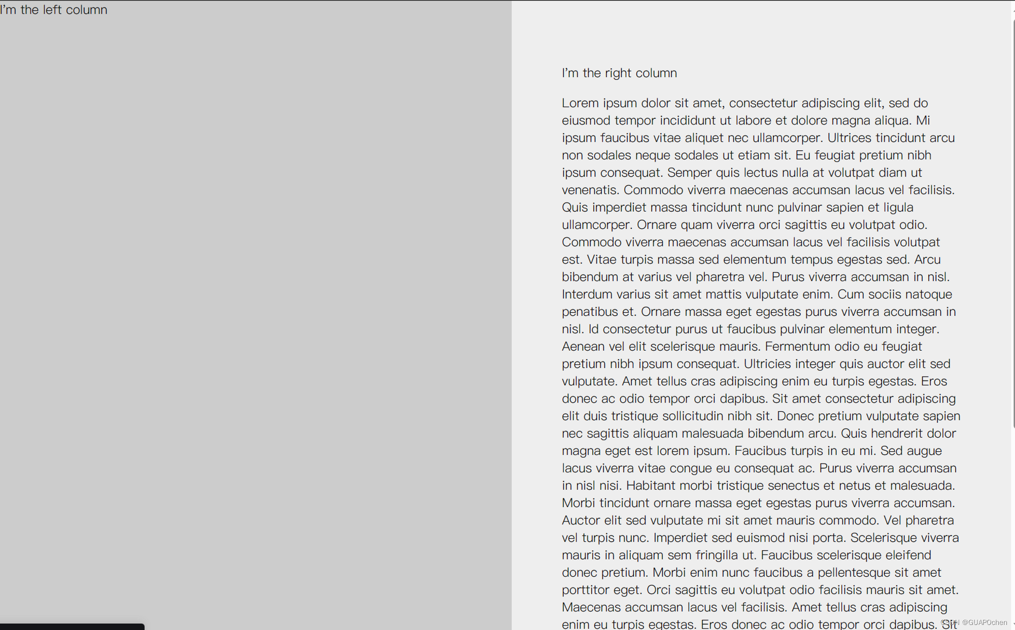
<div class="container"><div class="left-column">I'm the left column</div><div class="right-column"><p>I'm the right column</p><p>Lorem ipsum </p></div>
</div>
增加css
html, body {margin: 0;padding: 0;height: 100%;
}.container {display: flex;height: 100%;
}.left-column {width: 50%;position: fixed;top: 0;bottom: 0;background-color: #ccc;
}.right-column {width: 50%;height: 100%;overflow-y: scroll;background-color: #eee;margin-left: 50%; /* add this to push it to the right *//* add some padding */box-sizing: border-box;padding: 4rem;
}
代码定义了一个包含左右两个列的布局,其中左侧固定宽度为50%,右侧占据剩余宽度。下面是各个属性的解释:
html, body {margin: 0;padding: 0;height: 100%;
}
这部分代码将html和body元素的外边距和内边距设置为0,并将它们的高度设置为100%,以确保整个页面占据整个浏览器窗口。
.container {display: flex;height: 100%;
}
.container类被定义为一个flex容器,它将包含左右两个列。它的高度也被设置为100%,以确保它占据整个父元素(body)的高度。
.left-column {width: 50%;position: fixed;top: 0;bottom: 0;background-color: #ccc;
}
.left-column类定义了左侧固定宽度为50%的列。position属性被设置为fixed,意味着它将固定在浏览器窗口中,并且它的顶部和底部都被设置为0,以使它占据整个可见高度。
 .right-column {width: 50%;height: 100%;overflow-y: scroll;background-color: #eee;margin-left: 50%; /* add this to push it to the right *//* add some padding */box-sizing: border-box;padding: 4rem;
}
.right-column类定义了右侧占据剩余宽度的列。它的高度被设置为100%,以确保它占据整个父元素的高度。overflow-y属性设置为scroll,以在内容超出列高度时提供纵向滚动条。
margin-left属性设置为50%,以将右侧列推到左侧列的右侧。box-sizing属性设置为border-box,以确保padding不会增加元素的宽度。padding属性设置为4rem,为列内容添加内边距。
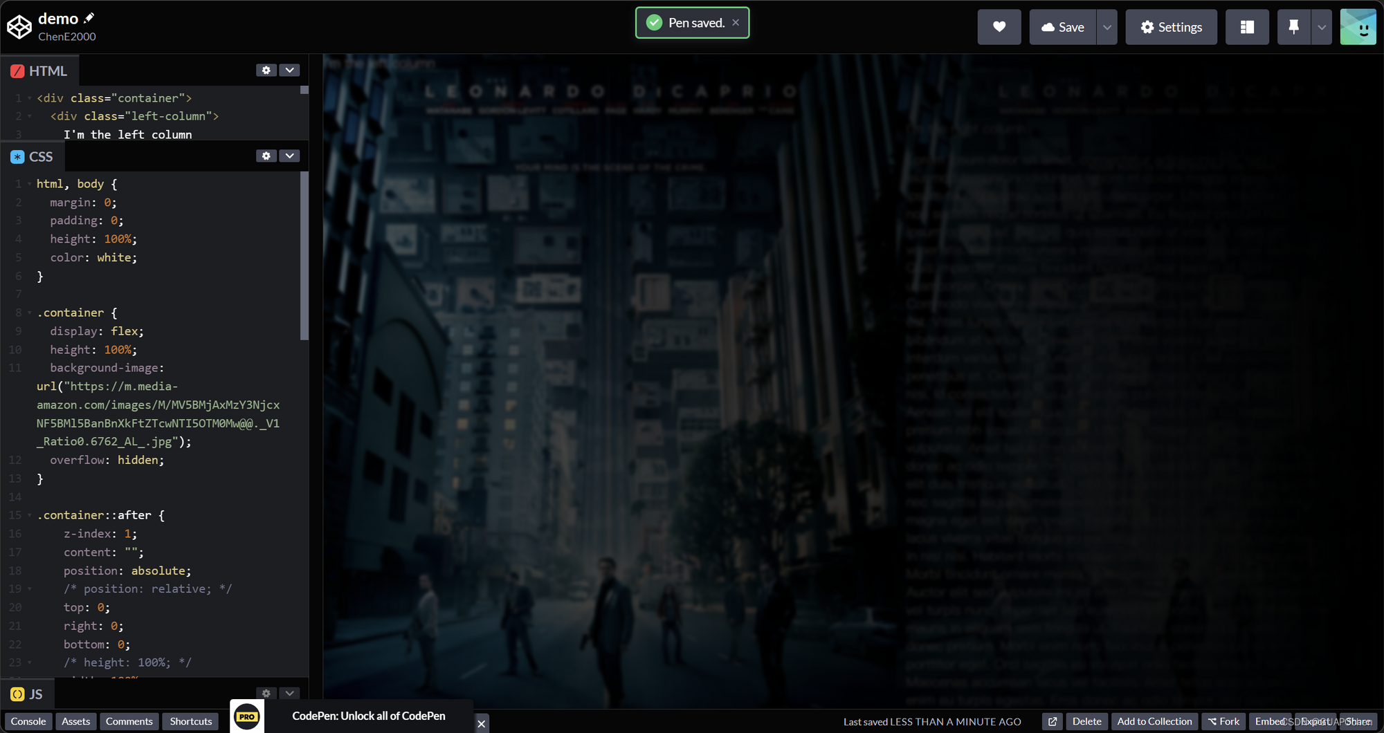
下一步去掉两个column的背景颜色,为container增加一个背景
.container {display: flex;height: 100%;background-image: url("https://m.media-amazon.com/images/M/MV5BMjAxMzY3NjcxNF5BMl5BanBnXkFtZTcwNTI5OTM0Mw@@._V1_Ratio0.6762_AL_.jpg"); overflow: hidden;
}
用伪选择器增加一个蒙版
.container::after {z-index: 1;content: "";position: absolute;/* position: relative; */top: 0;right: 0;bottom: 0;/* height: 100%; */width: 100%;/* 设置伪元素宽度为div宽度的一半 */background: linear-gradient(269.83deg, #000000 0.42%, rgba(0, 0, 0, 0.767545) 70%, rgba(0, 0, 0, 0.418) 130%);background-attachment: fixed;backdrop-filter: blur(2px);
}
发现column的内容也模糊了,这是因为我们的蒙版目前高于column的内容。
设置一个z-index
.left-column {z-index: 2;width: 50%;position: fixed;top: 0;bottom: 0;
/*   background-color: #ccc; */
}.right-column {z-index: 2;width: 50%;height: 100%;overflow-y: scroll;
/*   background-color: #eee; */margin-left: 50%; /* add this to push it to the right */box-sizing: border-box;padding: 4rem;
}
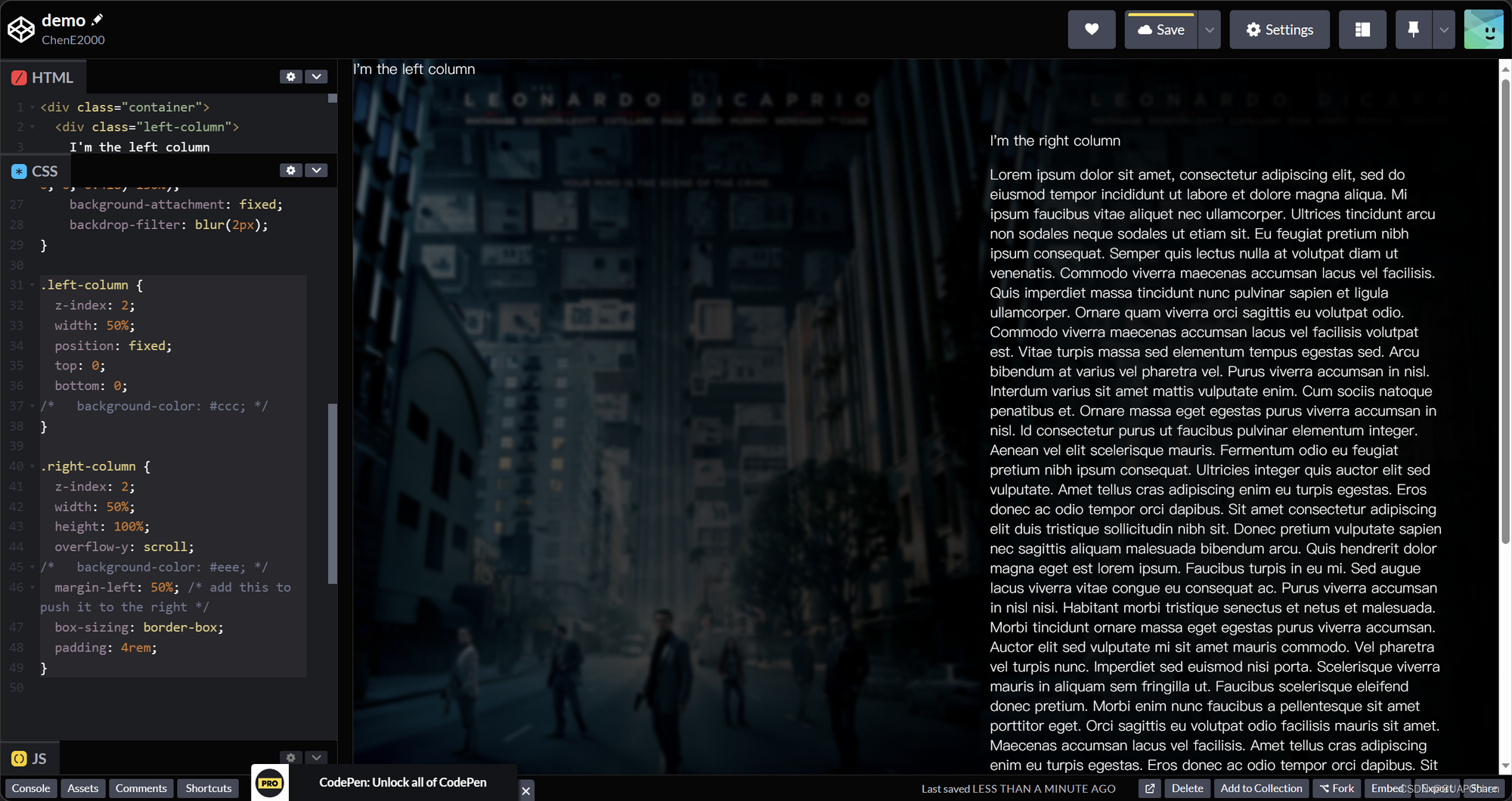
✅ 完成了预期的效果,后续可以根据内容进行开发
完整代码见
https://codepen.io/chene2000/pen/RwewKRd