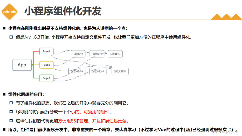
小程序的组件化开发

目录:
1 小程序组件化思想
2 自定义组件的过程
3 组件样式实现细节
4 组件使用过程通信
5 组件插槽定义使用
6 Component构造器
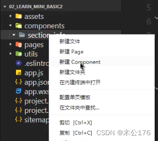
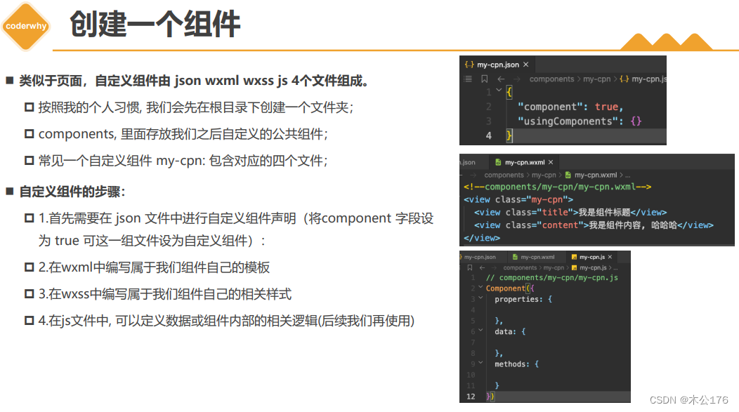
在小程序里面需要创建组件的话需要在最外层建component包,然后在使用新建component来创建类似page的4个文件:
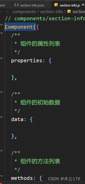
组件和页面的区别就是,组件文件会有额外显示是组件的标致:
js文件由component包裹
json文件里面会有
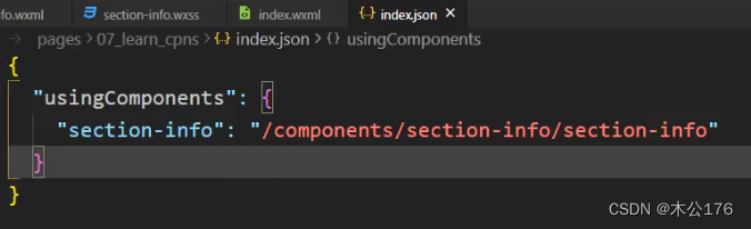
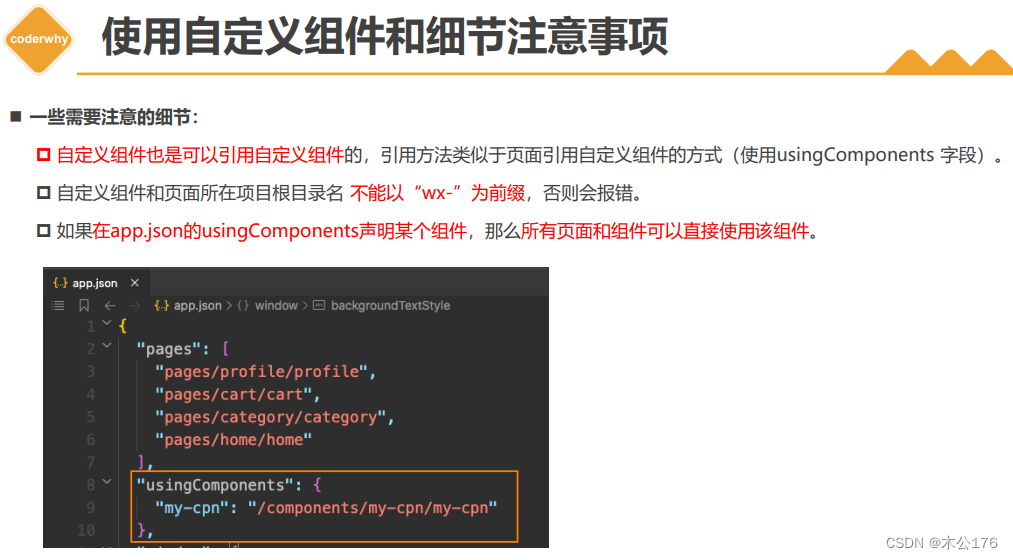
小程序的内置组件是可以直接使用的,但是上面创建的自定义组件是需要我们在使用组件的页面的json文件里面配置注册小程序的自定义组件名称以及路径:
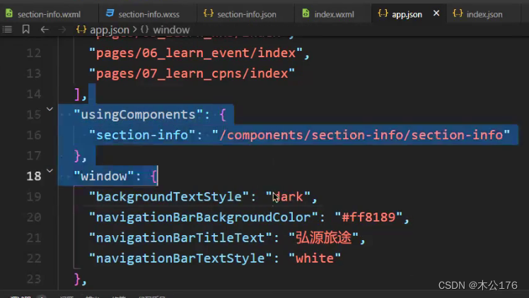
如果某个自定义组件使用的地方很多,需要在很多页面json文件里面注册很麻烦,这时候我们可以在最外层的app.json文件里面注册这个自定义组件,注册的方法和上图一致。直接在app.json里面写
"usingComponents":{"xxx":"xxxxx"},
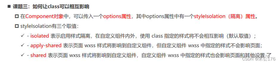
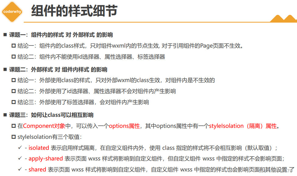
关于组件样式注意点:
1、在组件的css文件中不要使用id选择器、标签选择器、属性选择器,如果你使用了这些选择器,那么这个css样式会影响到其他组件的样式和页面的样式。
2、在组件中使用css样式建议使用class类选择器,此时的类选择器只会作用于组件自身,对使用该组件的页面不生效。
3、使用组件的页面的css样式的id选择器、属性选择器,class类选择器不会影响到组件的样式。但是标签选择器会影响到组件样式。
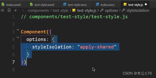
4、有时候确实有需求在页面的class类选择器能够作用于组件样式,那就需要在组件的js文件中写入下图的代码,把隔离的选项改变即可。
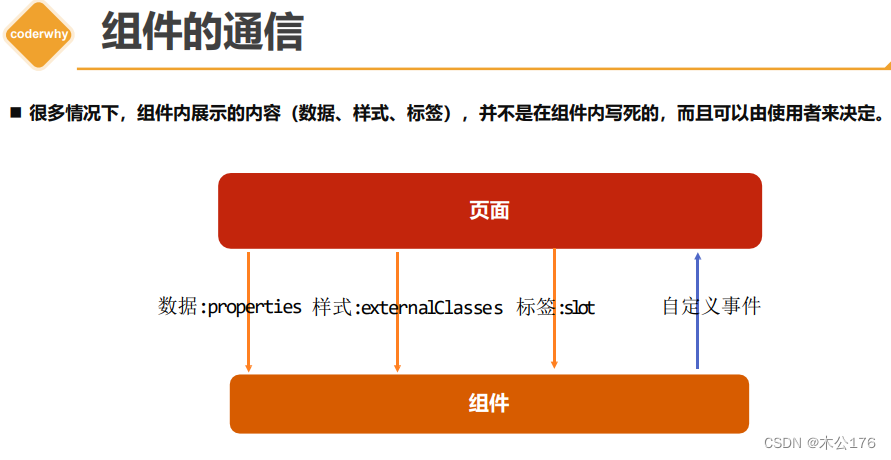
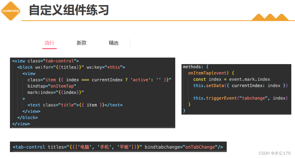
组件的通信包括:传递数据(properties),传递样式(externalClasses),传递标签(插槽slot),传递自定义事件。
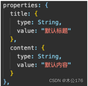
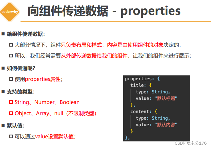
传递数据:
如果type的类型是null,那么就是不限制类型。子组件使用properties来接收父组件传递的参数。
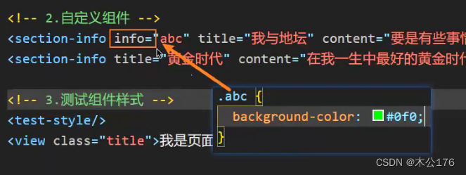
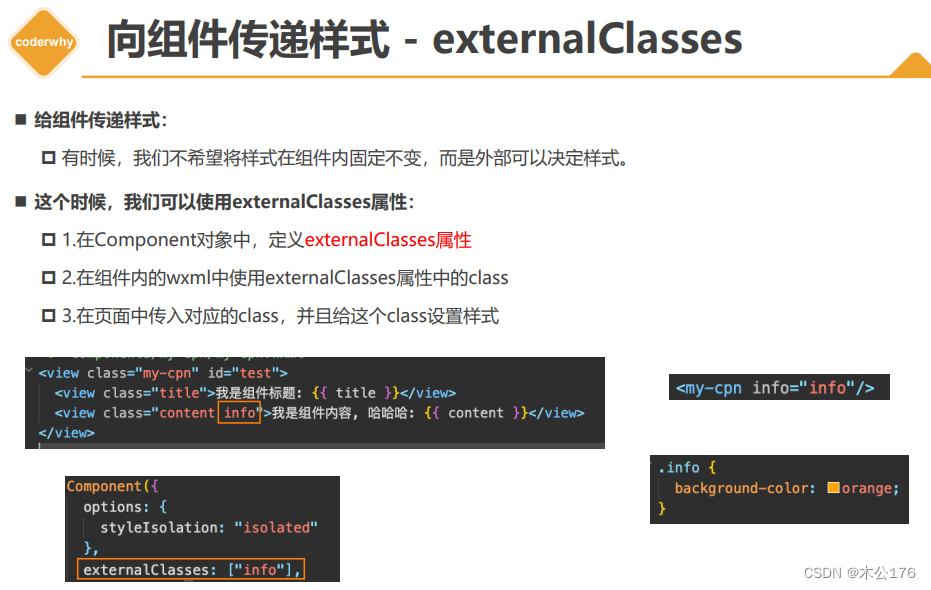
传递样式:
不建议使用这个,组件该什么样式就定义好。传递方式需要在页面的wxss定义好类,然后传递给组件,组件在js文件中接受并在标签中使用该样式。
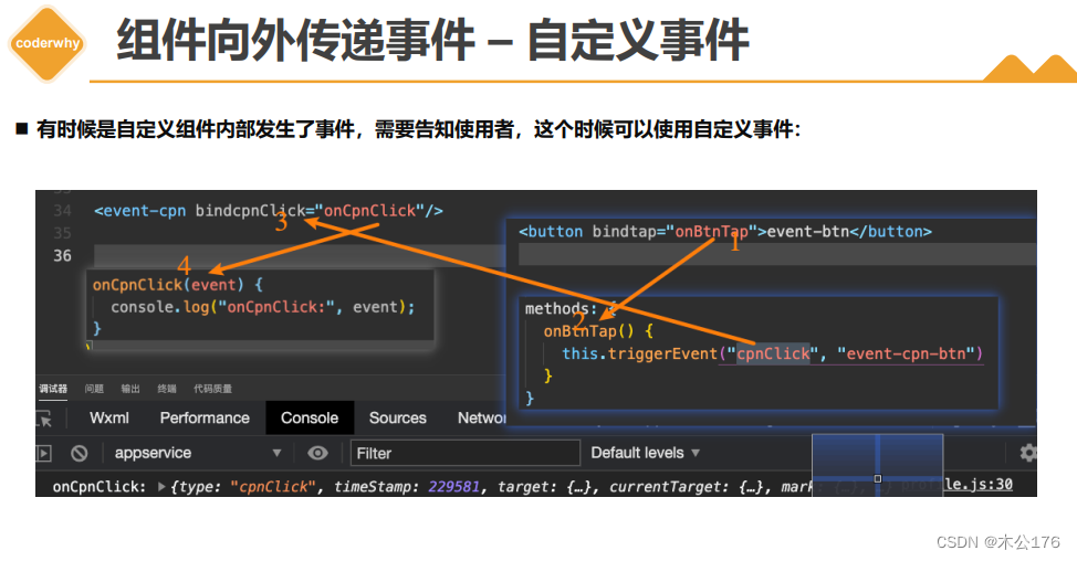
传递自定义事件:
组件中写事件需要写在methods里面,和页面不同,页面的事件函数直接写。子组件通过
可以通过this.triggerEvent("自定义名字","参数")给父组件传递自定义事件 。
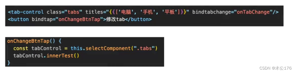
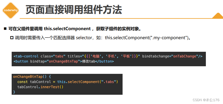
父组件可以直接使用子组件的某个方法、函数:
获取对应的组件实例对象是需要在该组件上使用class命名,然后在js用this.selectComponent(".class名称")来获得组件实例对象。
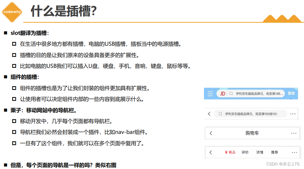
插槽的应用:
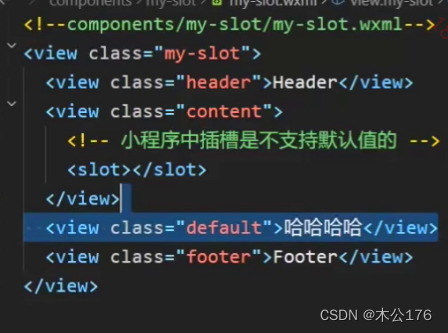
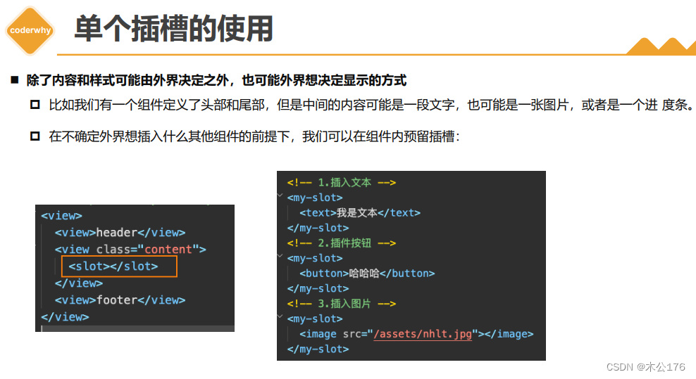
微信小程序的插槽不支持默认值,<slot>hhh</slot>这样子是没有用的,不会页面显示。
解决这个插槽不支持默认值的方法是使用伪类(使用css的方法解决):
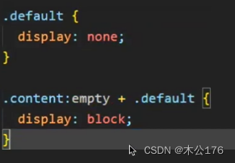
下图的<view class="default">哈哈哈哈</view>就是默认值,通过css的伪类:empty判断插槽是否为空,利用兄弟选择器选择默认值的class赋给display。
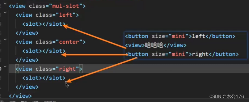
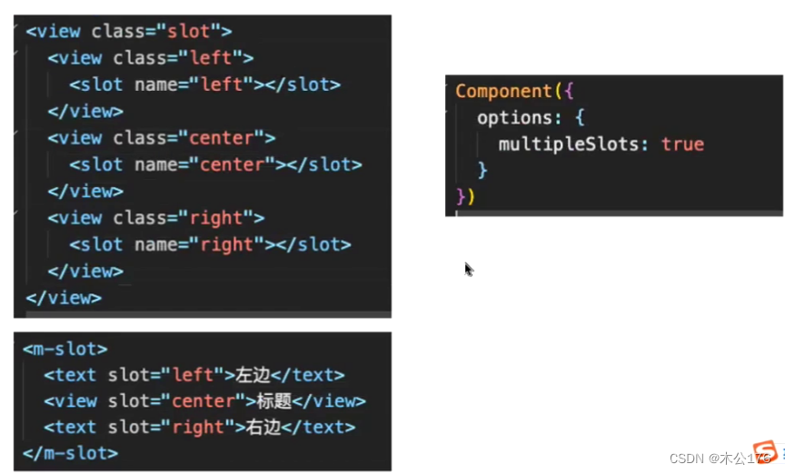
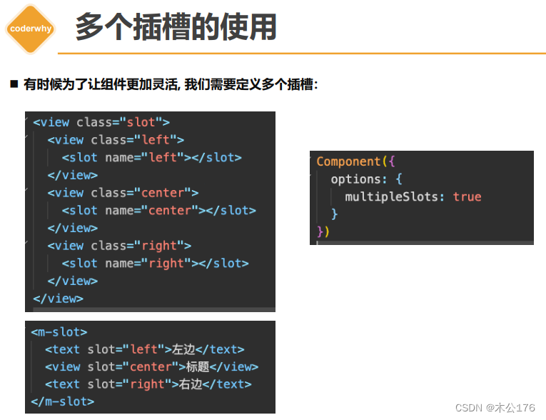
插槽分为单个插槽和多个插槽,
这样子插画入插槽,插槽是不知道你插入的是哪个位置的 ,所以超过一个以上的插槽需要给插槽添加名字并且还要在组件的js文件中option启用多插槽才行。
插槽给予名字和使用多个插槽的方法:
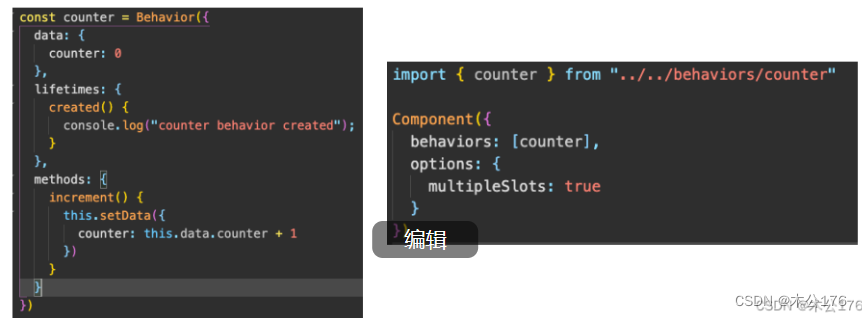
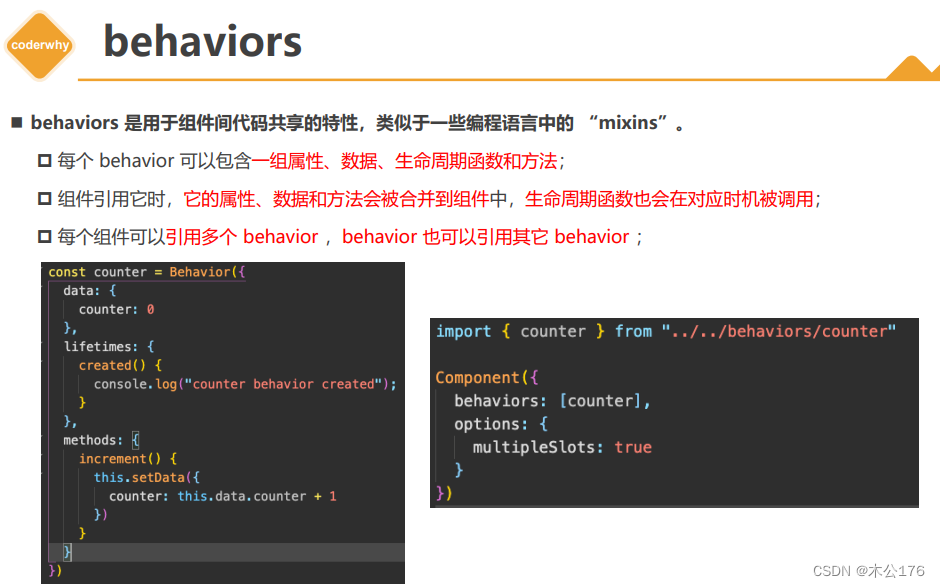
behavior:
类似于vue的mixin混入,就是把options api的内容写在一个单独js文件,这个文件一般创建一个新的叫behavior的包。然后在需要复用这个behavior的内容的组件添加behavior:[ ]
即可。创建和使用如下图,左边是behavior的js文件内容,右边是使用behavior文件的组件。
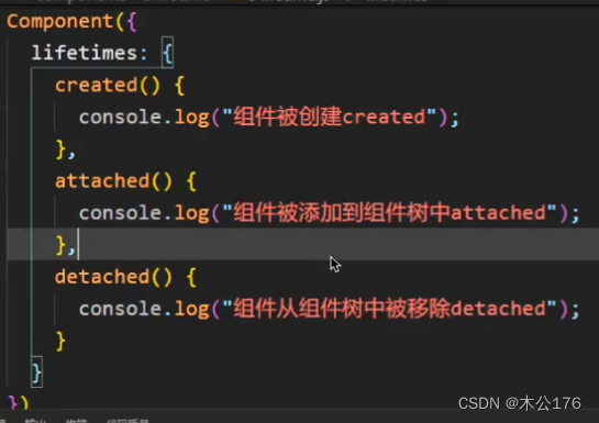
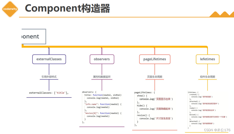
组件的生命周期最重要的三个生命周期(created,attached,detached):
页面的生命周期和组件的生命周期不一样,组件的生命周期是写在lifetime的options里面,而页面的生命周期每一个都是一个options api。
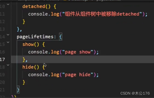
在组件的js逻辑里面也是可以监听使用该组件的页面的生命周期,使用方法就是和lifetime同级别再写一个pagetime:{}即可。
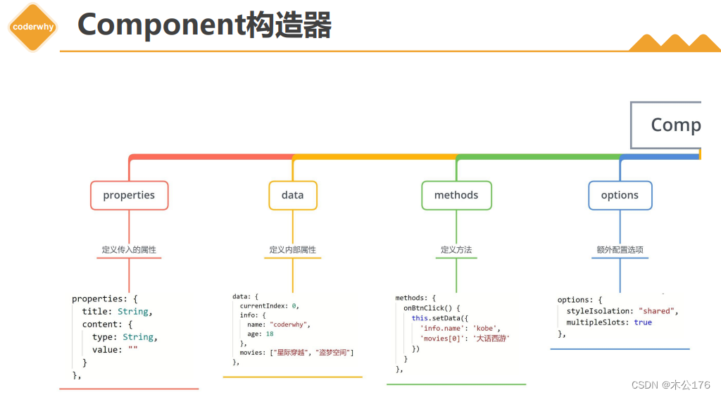
最后就是关于组件的js文件里面的构造器,就是可以使用的东西:
使用组件的页面:
wxml代码:
<!--pages/07_learn_cpns/index.wxml-->
<!-- 1.内置组件 -->
<text>pages/07_learn_cpns/index.wxml</text><!-- 2.自定义组件 bind:原来绑定子组件发送给父组件的自定义事件名称(titleclick)
onSectionTitleClick为父组件定义的函数
下面的info原来传递样式的,abc是该页面定义的一个css样式-->
<section-info info="abc" title="我与地坛" content="要是有些事情我没说, 别以为是我忘记了"bind:titleclick="onSectionTitleClick"
/>
<section-info info="cba" title="黄金时代" content="在我一生中最好的黄金时代, 我想吃, 我想爱"/><!-- 3.测试组件样式 -->
<test-style/>
<view class="title">我是页面的title</view><!-- 4.tab-control的使用 此处是选项卡的选项, -->
<tab-controlclass="tab-control"titles="{{digitalTitles}}"bind:indexchange="onTabIndexChange"
/>
<button bindtap="onExecTCMethod">调用TC方法</button><tab-control titles="{{['流行', '新款', '热门']}}"/>
wxss代码:
/* pages/07_learn_cpns/index.wxss */
.title {background-color: skyblue;
}.abc {background-color: #0f0;
}.cba {background-color: #00f;
}
json代码:
{"usingComponents": {/* 从根目录下的component文件找下列的组件*/"section-info": "/components/section-info/section-info","test-style": "/components/test-style/test-style","tab-control": "/components/tab-control/tab-control"}
}
js代码:
// pages/07_learn_cpns/index.js
Page({data: {digitalTitles: ['电脑', '手机', 'iPad']},onSectionTitleClick(event) {console.log("区域title发生了点击", event.detail);},onTabIndexChange(event) {const index = event.detailconsole.log("点击了", this.data.digitalTitles[index]);},onExecTCMethod() {// 1.获取对应的组件实例对象const tabControl = this.selectComponent(".tab-control")// 2.调用组件实例的方法tabControl.test(2)}
})
组件section-info的代码:
wxml代码:
<!--components/section-info/section-info.wxml-->
<view class="section"><view class="title" bindtap="onTitleTap">{{ title }}</view><view class="content info">{{ content }}</view>
</view>
wxss代码:
/* components/section-info/section-info.wxss */
.section .title {font-size: 40rpx;font-weight: 700;color: red;
}.section .content {font-size: 24rpx;color: purple;
}
js代码:
// components/section-info/section-info.js
Component({properties: {title: {type: String,value: "默认标题"},content: {type: String,value: "默认内容"}},externalClasses: ["info"],methods: {onTitleTap() {console.log("title被点击了~");this.triggerEvent("titleclick", "aaa")}}
})
组件tab-control的代码:
wxml代码:
<!--components/tab-control/tab-control.wxml-->
<view class="tab-control"><block wx:for="{{ titles }}" wx:key="*this"><view class="item {{index === currentIndex ? 'active': ''}}"bindtap="onItemTap"data-index="{{index}}"><text class="title">{{ item }}</text></view></block>
</view>
wxss代码:
/* components/tab-control/tab-control.wxss */
.tab-control {display: flex;height: 40px;line-height: 40px;text-align: center;
}.tab-control .item {flex: 1;
}.tab-control .item.active {color: #ff8189;
}.tab-control .item.active .title {border-bottom: 3px solid #ff8189;padding: 5px;
}
js代码:
// components/tab-control/tab-control.js
Component({properties: {titles: {type: Array,value: []}},data: {currentIndex: 0},methods: {onItemTap(event) {const currentIndex = event.currentTarget.dataset.indexthis.setData({ currentIndex })// 自定义事件this.triggerEvent("indexchange", currentIndex)},test(index) {console.log("tab control test function exec");this.setData({currentIndex: index})}}
})