React styled-components (一) —— 基本使用

https://github.com/styled-components/styled-components
styled-components 基本使用
- 介绍
-
- 优点
- 缺点
- 安装
- 引入
- 使用
-
- 基本用法
- 样式嵌套
介绍
styled-components 是一个针对 React 的 css in js 类库。
和所有同类型的类库一样,styled-components 通过 js 赋能解决了原生 css 所不具备的能力,比如变量、循环、函数等。解决了 css 全局命名空间,避免样式冲突的问题,维护起来更加方便。
优点
- 贯彻
React的everything in JS理念,降低js对css文件的依赖 - 保留前端开发
CSS书写习惯,无学习和迁移成本 - 使用方便,不需要配置
webpack,开箱即用 - 为样式生成唯一的类名,不用再担心样式命名的问题,移除样式与组件之间的对应关系
- 样式可以使用变量,更加灵活
- 组件的逻辑、生命周期、样式、结构完全和其它组件解耦,对组件维护很有帮助
缺点
可读性差,不方便直接看出组件的 html 元素。
安装
npm install styled-components 或
cnpm install styled-components 或
yarn add styled-components
安装完成之后,package.json :
{"dependencies": {"antd": "^4.16.10","axios": "^0.21.1","less": "^4.1.1","less-loader": "4.0.1","react": "^17.0.2","react-dom": "^17.0.2","react-router-dom": "^5.2.0","react-scripts": "4.0.3","styled-components": "5.3.9",
}
引入
import styled from "styled-components"
使用
基本用法
新建 Demo.js 文件:
import React, { Component } from 'react'
import styled from 'styled-components';
// Create a <Title> react component that renders an <h1> which is
// centered, palevioletred and sized at 1.5em
const Title = styled.h1`font-size: 1.5em;text-align: center;color: palevioletred;
`;// Create a <Wrapper> react component that renders a <section> with
// some padding and a papayawhip background
const ContextBox = styled.div`width: 800px;height: 200px;background: orange;margin: 0 auto;
`
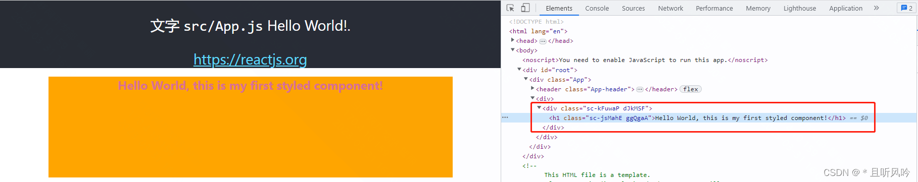
class Home extends Component {render () {return (<div><ContextBox><Title>Hello World, this is my first styled component!</Title></ContextBox></div>)}
}
export default Home
上面例子,styled.div 和 styled.h1 是一个函数,可以进行调用。
注意组件首字母必须大写不然无法识别。
在 App.js 中引入 Demo.js 文件:
// import logo from './assets/images/logo.svg';
import './assets/css/App.css';
import Demo from './components/Demo'function App () {return (<div className="App"><header className="App-header">{/* <img src={logo} className="App-logo" alt="logo" /> */}<p>文字 <code>src/App.js</code> Hello World!.</p><aclassName="App-link"href="https://reactjs.org"target="_blank"rel="noopener noreferrer">https://reactjs.org</a></header><Demo /></div>);
}export default App;
页面效果:

styled-components 的本质是通过函数的调用,最终创建出一个组件:
- 这个组件会被自动添加上一个不重复的
class; styled-components会给该class添加相关的样式。
如下图:
样式嵌套
styled-components 还支持类似于less、scss等css预处理器一样的样式嵌套:
- 支持直接子代选择器或后代选择器,并且 直接编写样式;
- 可以通过&符号获取当前元素;
- 直接伪类选择器、伪元素等。
修改 Demo.js 文件:
import React, { Component } from 'react'
import styled from 'styled-components';
// Create a <Title> react component that renders an <h1> which is
// centered, palevioletred and sized at 1.5em
const Title = styled.h1`font-size: 1.5em;text-align: center;color: palevioletred;
`;// Create a <Wrapper> react component that renders a <section> with
// some padding and a papayawhip background
const ContextBox = styled.div`width: 800px;height: 200px;margin: 0 auto;background: orange;.banner {background: grey;  p {font-size: 24px;color: #fff;text-align: center;&::after {display: block;content: "hello world";font-size: 30px;}      }span {color:red;&.active {color: red;}&:hover {color: green;}&::after {content: 'aaa';}}  }
`
class Home extends Component {render () {return (<div><ContextBox><Title>Hello World, this is my first styled component!</Title><div className='banner'><p>This is p!</p><span>11111111111</span><span>22222222222</span><span>33333333333</span></div></ContextBox></div>)}
}
export default Home
页面效果:
