NumPy 秘籍中文第二版:十二、使用 NumPy 进行探索性和预测性数据分析

原文:NumPy Cookbook - Second Edition
协议:CC BY-NC-SA 4.0
译者:飞龙
在本章中,我们涵盖以下秘籍:
- 探索气压
- 探索日常气压范围
- 研究年度气压平均值
- 分析最大可见度
- 用自回归模型预测气压
- 使用移动平均模型预测气压
- 研究年内平均气压
- 研究气压的极值
简介
数据分析是 NumPy 最重要的用例之一。 根据我们的目标,我们可以区分数据分析的许多阶段和类型。 在本章中,我们将讨论探索性和预测性数据分析。 探索性数据分析可探查数据的线索。 在此阶段,我们可能不熟悉数据集。 预测分析试图使用模型来预测有关数据的某些信息。
数据来自荷兰气象局 KNMI。 特别是 KNMI 总部位于 De Bilt 的气象站。 在这些秘籍中,我们将检查气压和最大可见度。
我修改了文本数据并将其从 KNMI 转换为 NumPy 特定的.npy格式,并保存为40996 x 5数组。 该数组包含五个变量的每日值:
YYYYMMDD格式的日期- 每日平均气压
- 每日最高气压
- 每日最低气压
- 每日最大可见度
探索气压
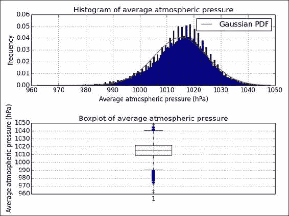
在此秘籍中,我们将查看由 24 小时值计算出的每日平均海平面气压(0.1 hPa)。 这包括打印描述性统计数据和可视化概率分布。 在自然界中,我们经常处理正态分布,因此使用第 10 章,“使用 Scikits 进行正态性检验”会派上用场。
完整的代码在本书代码包的exploring.py文件中:
from __future__ import print_function
import numpy as np
import matplotlib.pyplot as plt
from statsmodels.stats.adnorm import normal_addata = np.load('cbk12.npy')# Multiply to get hPa values
meanp = .1 * data[:,1]# Filter out 0 values
meanp = meanp[ meanp > 0]# Get descriptive statistics
print("Max", meanp.max())
print("Min", meanp.min())
mean = meanp.mean()
print("Mean", mean)
print("Median", np.median(meanp))
std = meanp.std()
print("Std dev", std)# Check for normality
print("Normality", normal_ad(meanp))#histogram with Gaussian PDF
plt.subplot(211)
plt.title('Histogram of average atmospheric pressure')
_, bins, _ = plt.hist(meanp, np.sqrt(len(meanp)), normed=True)
plt.plot(bins, 1/(std * np.sqrt(2 * np.pi)) * np.exp(- (bins - mean)2/(2 * std2)), 'r-', label="Gaussian PDF")
plt.grid()
plt.legend(loc='best')
plt.xlabel('Average atmospheric pressure (hPa)')
plt.ylabel('Frequency')# boxplot
plt.subplot(212)
plt.boxplot(meanp)
plt.title('Boxplot of average atmospheric pressure')
plt.ylabel('Average atmospheric pressure (hPa)')
plt.grid()# Improves spacing of subplots
plt.tight_layout()
plt.show()
准备
如果尚未安装 ,请安装statsmodels以进行正态性测试(请参阅第 10 章,“Scikits 的乐趣”的“安装 scikits-statsmodels”秘籍)。
操作步骤
请按照以下步骤探索每日气压:
-
使用
load()函数加载数据:data = np.load('cbk12.npy') -
通常,数据需要进行处理和清理。 在这种情况下,将这些值相乘以获得
hPa中的值,然后删除与缺失值相对应的0值:# Multiply to get hPa values meanp = .1 * data[:,1]# Filter out 0 values meanp = meanp[ meanp > 0] -
获取描述性统计信息,包括最大值,最小值,算术平均值,中位数和标准差:
print("Max", meanp.max())
print("Min", meanp.min())
mean = meanp.mean()
print("Mean", mean)
print("Median", np.median(meanp))
std = meanp.std()
print("Std dev", std)
您应该看到以下值:
Max 1048.3 Min 962.1 Mean 1015.14058231 Median 1015.8 Std dev 9.85889134337 -
如下应用第 10 章“Scikits 的乐趣”的正态性检验:
print("Normality", normal_ad(meanp))屏幕上显示以下值:
Normality (72.685781095773564, 0.0)用直方图和箱形图可视化值的分布也很好。 最终结果请参考以下图表:
另见
- “使用 Statsmodels”秘籍执行正态性测试,该秘籍来自第 10 章,“Scikits 的乐趣”
- 有关箱形图的说明,请参见第 11 章“最新最强的 NumPy”
load()函数的文档
探索日常气压范围
每日气压范围是每日最高点和最低点之差。 使用实际数据,有时我们会缺少一些值。 在这里,我们可能会缺少给定一天的高压和/或低压值。 可以通过智能算法来填补这些空白。 但是,让我们保持简单,而忽略它们。 在计算了范围之后,我们将进行与前面的秘籍类似的分析,但是我们将使用可以处理NaN值的函数。 另外,我们将研究月份和范围之间的关系。
本书代码包中的day_range.py文件位于对应的代码中:
from __future__ import print_function
import numpy as np
import matplotlib.pyplot as plt
import calendar as caldata = np.load('cbk12.npy')# Multiply to get hPa values
highs = .1 * data[:,2]
lows = .1 * data[:,3]# Filter out 0 values
highs[highs == 0] = np.nan
lows[lows == 0] = np.nan# Calculate range and stats
ranges = highs - lows
print("Minimum daily range", np.nanmin(ranges))
print("Maximum daily range", np.nanmax(ranges))print("Average daily range", np.nanmean(ranges))
print("Standard deviation", np.nanstd(ranges))# Get months
dates = data[:,0]
months = (dates % 10000)/100
months = months[~np.isnan(ranges)]monthly = []
month_range = np.arange(1, 13)for month in month_range:indices = np.where(month == months)monthly.append(np.nanmean(ranges[indices]))plt.bar(month_range, monthly)
plt.title('Monthly average of daily pressure ranges')
plt.xticks(month_range, cal.month_abbr[1:13])
plt.ylabel('Monthly Average (hPa)')
plt.grid()
plt.show()
操作步骤
此秘籍的第一步与先前的秘籍几乎相同,因此我们将跳过它们。 继续分析每日气压范围:
-
我们可以将缺失值保留为当前的
0值。 但是,通常将它们设置为NaN较为安全,以避免造成混淆。 将缺失值设置为NaN,如下所示:highs[highs == 0] = np.nan lows[lows == 0] = np.nan -
使用
nanmin(),nanmax(),nanmean()和nanstd()函数计算范围,最小值,最大值,均值和标准差:ranges = highs - lows print("Minimum daily range", np.nanmin(ranges)) print("Maximum daily range", np.nanmax(ranges))print("Average daily range", np.nanmean(ranges)) print("Standard deviation", np.nanstd(ranges))结果出现在屏幕上:
Minimum daily range 0.4 Maximum daily range 41.7 Average daily range 6.11945360571 Standard deviation 4.42162136692 -
如前所述,日期以
YYYYMMDD格式给出。 有了一点算术,我们就可以轻松地得到几个月。 此外,我们忽略与NaN范围值相对应的月份值:dates = data[:,0] months = (dates % 10000)/100 months = months[~np.isnan(ranges)] -
按月对范围进行平均,如下所示:
monthly = []
month_range = np.arange(1, 13)for month in month_range:indices = np.where(month == months)monthly.append(np.nanmean(ranges[indices]))
在最后一步中,我们绘制了
matplotlib条形图,显示了每日气压范围的每月平均值。 最终结果请参考以下图表: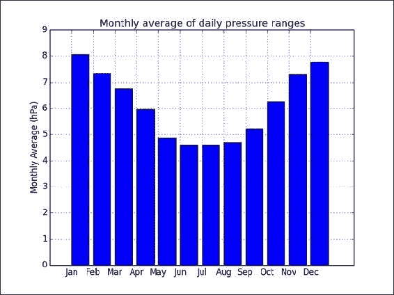
工作原理
我们分析了气压的每日范围。 此外,我们可视化了每日范围的每月平均值。 似乎有一种模式导致夏季的每日气压范围变小。 当然,需要做更多的工作来确定。
另见
- “探索气压”秘籍
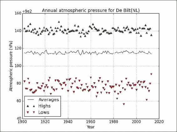
研究年度气压平均值
您可能听说过,全球变暖表明温度逐年稳定上升。 由于气压是另一个热力学变量,因此我们可以预期气压也会跟随趋势。 该秘籍的完整代码在本书代码包的annual.py文件中:
import numpy as np
import matplotlib.pyplot as pltdata = np.load('cbk12.npy')# Multiply to get hPa values
avgs = .1 * data[:,1]
highs = .1 * data[:,2]
lows = .1 * data[:,3]# Filter out 0 values
avgs = np.ma.array(avgs, mask = avgs == 0)
lows = np.ma.array(lows, mask = lows == 0)
highs = np.ma.array(highs, mask = highs == 0)# Get years
years = data[:,0]/10000# Initialize annual stats arrays
y_range = np.arange(1901, 2014)
nyears = len(y_range)
y_avgs = np.zeros(nyears)
y_highs = np.zeros(nyears)
y_lows = np.zeros(nyears)# Compute stats
for year in y_range:indices = np.where(year == years)y_avgs[year - 1901] = np.mean(avgs[indices])y_highs[year - 1901] = np.max(highs[indices])y_lows[year - 1901] = np.min(lows[indices])plt.title('Annual atmospheric pressure for De Bilt(NL)')
plt.ticklabel_format(useOffset=900, axis='y')plt.plot(y_range, y_avgs, label='Averages')# Plot ignoring NaNs
h_mask = np.isfinite(y_highs)
plt.plot(y_range[h_mask], y_highs[h_mask], '^', label='Highs')l_mask = np.isfinite(y_lows)
plt.plot(y_range[l_mask], y_lows[l_mask], 'v', label='Lows')plt.xlabel('Year')
plt.ylabel('Atmospheric pressure (hPa)')
plt.grid()
plt.legend(loc='best')
plt.show()
操作步骤
要检查趋势,让我们按以下步骤绘制平均,最大和最小年度气气压:
-
初始化年度统计数据数组:
y_range = np.arange(1901, 2014) nyears = len(y_range) y_avgs = np.zeros(nyears) y_highs = np.zeros(nyears) y_lows = np.zeros(nyears) -
计算年度统计数据:
for year in y_range:indices = np.where(year == years)y_avgs[year - 1901] = np.mean(avgs[indices])y_highs[year - 1901] = np.max(highs[indices])y_lows[year - 1901] = np.min(lows[indices]) -
绘制,忽略
NaN值,如下所示:h_mask = np.isfinite(y_highs) plt.plot(y_range[h_mask], y_highs[h_mask], '^', label='Highs')l_mask = np.isfinite(y_lows) plt.plot(y_range[l_mask], y_lows[l_mask], 'v', label='Lows')最终结果请参考以下图表:
工作原理
年平均气压似乎持平或有所波动,但没有任何趋势。 我们使用isfinite()函数忽略了最终图中的NaN值。 此函数检查无限值和NaN值。
另见
- “探索气压”秘籍
isfinite()函数的文档
分析最大可见度
如果到目前为止,您在本章的所有秘籍中均未使用 ,则可能需要突破气压。 因此,让我们来看看能见度。 数据文件具有一列,以提供最大的可视性,KNMI 描述如下:
Maximum visibility; 0: <100 m, 1:100-200 m, 2:200-300 m,..., 49:4900-5000 m, 50:5-6 km, 56:6-7 km, 57:7-8 km,..., 79:29-30 km, 80:30-35 km, 81:35-40 km,..., 89: >70 km)
这里的能见度是一个离散变量,因此取平均值可能没有意义。 此外,似乎我们几乎每天都有 1901 年到 1950 年之间的0值。 我不相信 De Bilt 在那个时期会更加迷雾重重。 出于本秘籍的目的,我们将雾定义为 1 至 2km 之间的能见度,这对应于数据文件中的10和20值。 让我们还将雾度定义为 2 至 5 公里之间的能见度。 这又对应于我们数据文件中的20和50。
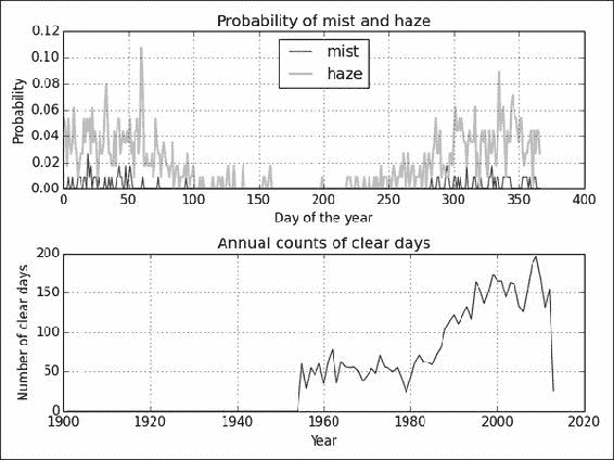
空气污染会降低能见度,尤其是在晴天。 我们可以将晴天定义为能见度高于 30km 的晴天,或数据文件中79的值。 理想情况下,我们应该使用空气污染数据,但不幸的是,我们没有这些数据。 据我所知,这个特殊气象站周围的空气污染水平不是很高。 知道每年的晴天数很有趣。 分析的代码在本书的代码包的visibility.py文件中:
import numpy as np
import matplotlib.pyplot as pltdata = np.load('cbk12.npy')# Get minimum visibility
visibility = data[:,4]# doy
doy = data[:,0] % 10000doy_range = np.unique(doy)# Initialize arrays
ndoy = len(doy_range)
mist = np.zeros(ndoy)
haze = np.zeros(ndoy)# Compute frequencies
for i, d in enumerate(doy_range):indices = np.where(d == doy)selection = visibility[indices]mist_truth = (10 < selection) & (selection < 20)mist[i] = len(selection[mist_truth])/(1\\. * len(selection))haze_truth = (20 < selection) & (selection < 50)haze[i] = len(selection[haze_truth])/(1\\. * len(selection))# Get years
years = data[:,0]/10000# Initialize annual stats arrays
y_range = np.arange(1901, 2014)
nyears = len(y_range)
y_counts = np.zeros(nyears)# Get annual counts
for year in y_range:indices = np.where(year == years)selection = visibility[indices]y_counts[year - 1901] = len(selection[selection > 79])plt.subplot(211)
plt.plot(np.arange(1, 367), mist, color='.25', label='mist')
plt.plot(np.arange(1, 367), haze, color='0.75', lw=2, label='haze')
plt.title('Probability of mist and haze')
plt.xlabel('Day of the year')
plt.ylabel('Probability')
plt.grid()
plt.legend(loc='best')plt.subplot(212)
plt.plot(y_range, y_counts)
plt.xlabel('Year')
plt.ylabel('Number of clear days')
plt.title('Annual counts of clear days')
plt.grid()
plt.tight_layout()
plt.show()
操作步骤
请按照以下步骤来绘制晴天的年度计数,即一年中的某一天(1-366)对霾和薄雾的可能性:
-
使用以下代码块计算雾霾的可能性:
for i, d in enumerate(doy_range):indices = np.where(d == doy)selection = visibility[indices]mist_truth = (10 < selection) & (selection < 20)mist[i] = len(selection[mist_truth])/(1\\. * len(selection))haze_truth = (20 < selection) & (selection < 50)haze[i] = len(selection[haze_truth])/(1\\. * len(selection)) -
使用此代码段获取年度计数:
for year in y_range:indices = np.where(year == years)selection = visibility[indices]y_counts[year - 1901] = len(selection[selection > 79])Refer to the following plot for the end result:
工作原理
如您所见,我们在 1950 年以后开始变得晴朗。这不是由于 1950 年之前的大雾天气,而是由于数据丢失或无效的现象。 去年的下降也是由于数据不完整。 1980 年以后,晴天明显增加。 这应该是全球变暖和气候变化也加剧的时期。 不幸的是,我们没有与空气污染直接相关的数据,但是我们的探索性分析表明存在趋势。
薄雾似乎主要发生在一年的头两个月中 。 您可以得出有关雾霾的类似结论。 显然,雾气比雾气更有可能,这可能是一件好事。 您也可以绘制直方图以确保。 但是,请记住,正如我之前提到的,您需要忽略0值。
另见
- “探索气压”秘籍
- “研究年度气压平均值”秘籍
- 相关维基百科页面
使用自回归模型预测气压
非常简单的预测模型会获取变量的当前值,并将其外推到下一个周期。 为了推断,我们可以使用一个简单的数学函数。 由于可以通过多项式近似泰勒级数中的多项式,因此低阶多项式可以解决问题。 归结为将先前值回归到下一个值。 因此,相应的模型称为自回归。
我们必须对此谨慎,以免过拟合。 交叉验证是一种常见的方法,将数据分为训练和测试集。 我们使用训练集拟合数据,并使用测试集测试拟合度。 这样可以减少偏差(请参见本书代码包中的autoregressive.py文件):
from __future__ import print_function
import numpy as np
import matplotlib.pyplot as pltdata = np.load('cbk12.npy')# Load average pressure
meanp = .1 * data[:,1]# Split point for test and train data
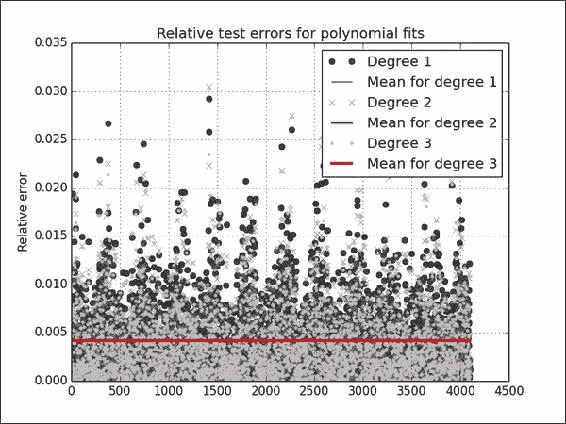
cutoff = 0.9 * len(meanp)for degree, marker in zip(xrange(1, 4), ['o', 'x','.']):poly = np.polyfit(meanp[:cutoff - 1], meanp[1:cutoff], degree)print('Polynomial coefficients', poly)fit = np.polyval(poly, meanp[cutoff:-1])error = np.abs(meanp[cutoff + 1:] - fit)/fitplt.plot(error, marker, color=str(.25* degree), label='Degree ' + str(degree))plt.plot(np.full(len(error), error.mean()), lw=degree, label='Mean for degree ' + str(degree))print("Absolute mean relative error", error.mean(), 'for polynomial of degree', degree)print()plt.title('Relative test errors for polynomial fits')
plt.ylabel('Relative error')
plt.grid()
plt.legend(loc='best')
plt.show()
操作步骤
通过执行以下 ,我们将使用不同程度的多项式拟合气压:
-
定义测试和训练集的截止:
cutoff = 0.9 * len(meanp) -
使用
polyfit()和polyval()函数拟合数据:poly = np.polyfit(meanp[:cutoff - 1], meanp[1:cutoff], degree) print('Polynomial coefficients', poly)fit = np.polyval(poly, meanp[cutoff:-1]) -
计算相对误差:
error = np.abs(meanp[cutoff + 1:] - fit)/fit此代码输出以下输出:
Polynomial coefficients [ 0.995542    4.50866543]
Absolute mean relative error 0.00442472512506 for polynomial of degree 1Polynomial coefficients [ -1.79946321e-04   1.17995347e+00   2.77195814e+00]
Absolute mean relative error 0.00421276856088 for polynomial of degree 2Polynomial coefficients [  3.17914507e-06  -6.62444552e-03   4.44558056e+00   2.76520065e+00]
Absolute mean relative error 0.0041906802632 for polynomial of degree 3
Refer to the following plot for the end result:
工作原理
这三个多项式的平均相对误差非常接近 – 约 .004 – 因此我们在图中看到一条线(很有趣的是知道气压的典型测量误差是多少), 小于百分之一。 我们看到了一些潜在的异常值,但是没有太多。 大部分繁重的工作都是通过polyfit()和polyval()函数完成的,它们分别将数据拟合到多项式并求值该多项式。
另见
- “探索气压”秘籍
- 有关交叉验证的维基百科页面
polyfit()的文档polyval()的文档
使用移动平均模型预测气压
模拟气压的简单方法是假设值围绕均值μ跳动。 然后,在最简单的情况下,我们假设连续值与平均值的偏差ε遵循以下公式:
该关系是线性的,在最简单的情况下,我们只需要估计一个参数 - θ。 为此,我们将需要 SciPy 功能。 该秘籍的完整代码在本书代码包的moving_average.py文件中:
from __future__ import print_function
import numpy as np
import matplotlib.pyplot as plt
from datetime import datetime as dt
from scipy.optimize import leastsqdata = np.load('cbk12.npy')# Load average pressure
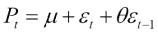
meanp = .1 * data[:,1]cutoff = 0.9 * len(meanp)def model(p, ma1):return p * ma1def error(p, t, ma1):return t - model(p, ma1)p0 = [.9]
mu = meanp[:cutoff].mean()
params = leastsq(error, p0, args=(meanp[1:cutoff] - mu, meanp[:cutoff-1] - mu))[0]
print(params)abs_error = np.abs(error(params, meanp[cutoff+1:] - mu, meanp[cutoff:-1] - mu))
plt.plot(abs_error, label='Absolute error')
plt.plot(np.full_like(abs_error, abs_error.mean()), lw=2, label='Absolute mean error')
plt.title('Absolute error for the moving average model')
plt.ylabel('Absolute error (hPa)')
plt.grid()
plt.legend(loc='best')
plt.show()
入门
如有必要,请按照第 2 章,“高级索引和数组概念”的“安装 SciPy”秘籍中的说明安装 SciPy。
操作步骤
以下步骤将移动平均模型应用于气压。
-
定义以下函数:
def model(p, ma1):return p * ma1def error(p, t, ma1):return t - model(p, ma1) -
使用上一步中的函数将移动平均模型与
leastsq()函数拟合,并将0.9的初始猜测作为模型参数:p0 = [.9] mu = meanp[:cutoff].mean() params = leastsq(error, p0, args=(meanp[1:cutoff] - mu, meanp[:cutoff-1] - mu))[0] -
使用测试数据集拟合后计算绝对误差:
abs_error = np.abs(error(params, meanp[cutoff+1:] - mu, meanp[cutoff:-1] - mu))请参考以下数据集中每个数据点的绝对误差图:
工作原理
leastsq()函数通过最小化误差来拟合模型。 它需要一个函数来计算拟合误差和模型参数的初始猜测。
另见
- “探索气压”秘籍
- 移动平均模型的维基百科页面
leastsq()的文档
研究年内平均气压
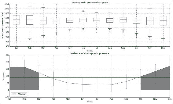
在一年内探索气压很有趣。 特别地,检查与变异性相关的模式可能是有益的,因此,与可预测性相关。 原因是几个月中的气气压会发生很大变化,从而降低了可预测性。 在此秘籍中,我们将绘制每月的箱形图和每月的气气压方差。
秘籍代码在本书代码包的intrayear.py文件中。 请特别注意突出显示的部分:
import numpy as np
import matplotlib.pyplot as plt
import calendar as caldata = np.load('cbk12.npy')# Multiply to get hPa values
meanp = .1 * data[:,1]# Get months
dates = data[:,0]
months = (dates % 10000)/100monthly = []
vars = np.zeros(12)
month_range = np.arange(1, 13)for month in month_range:indices = np.where(month == months)selection = meanp[indices]# Filter out 0 valuesselection = selection[selection > 0]monthly.append(selection)vars[month - 1] = np.var(selection)def plot():plt.xticks(month_range, cal.month_abbr[1:13])plt.grid()plt.xlabel('Month')plt.subplot(211)
plot()
plt.title('Atmospheric pressure box plots')
plt.boxplot(monthly)
plt.ylabel('Atmospheric pressure (hPa)')plt.subplot(212)
plot()# Display error bars using standard deviation
plt.errorbar(month_range, vars, yerr=vars.std())
plt.plot(month_range, np.full_like(month_range, np.median(vars)), lw=3, label='Median')# Shades the region above the median
plt.fill_between(month_range, vars, where=vars>np.median(vars), color='0.5')
plt.title('Variance of atmospheric pressure')
plt.ylabel('Variance')
plt.legend(loc='best')plt.show()
操作步骤
在我们探索时,往往会重复这些步骤,并且此秘籍与本书中的其他秘籍之间存在重叠。 以下是此秘籍中的新步骤:
-
使用标准差显示误差线:
plt.errorbar(month_range, vars, yerr=vars.std()) -
用高于中值的值对图的区域进行着色:
plt.fill_between(month_range, vars, where=vars>np.median(vars), color='0.5')Refer to the following plot for the end result:
工作原理
我们将几个月与气气压的测量相匹配。 我们使用匹配来绘制箱形图并可视化每月变化。 这项研究表明,在 1 月,2 月,11 月和 12 月的最冷月份,气压变化高于中值。 从图中可以看出,在温暖的夏季,气压范围狭窄。 这与其他秘籍的结果一致。
另见
- “探索气压”秘籍
- “研究年度气压平均值”秘籍
var()的文档
研究气压的极值
异常值是一个问题,因为它们会影响我们对数据的理解。 在此秘籍中,我们将异常值定义为与数据的第一或第三四分位数相差至少四分位数范围的 1.5 倍。 四分位数间距是第一和第三四分位数之间的距离。 让我们计算一年中每个月的异常值。 完整的代码在本书代码包的extreme.py文件中:
import numpy as np
import matplotlib.pyplot as plt
import calendar as caldata = np.load('cbk12.npy')# Multiply to get hPa values
meanp = .1 * data[:,1]# Filter out 0 values
meanp = np.ma.array(meanp, mask = meanp == 0)# Calculate quartiles and irq
q1 = np.percentile(meanp, 25)
median = np.percentile(meanp, 50)
q3 = np.percentile(meanp, 75)irq = q3 - q1# Get months
dates = data[:,0]
months = (dates % 10000)/100m_low = np.zeros(12)
m_high = np.zeros(12)
month_range = np.arange(1, 13)for month in month_range:indices = np.where(month == months)selection = meanp[indices]m_low[month - 1] = len(selection[selection < (q1 - 1.5 * irq)])m_high[month - 1] = len(selection[selection > (q3 + 1.5 * irq)])plt.xticks(month_range, cal.month_abbr[1:13])
plt.bar(month_range, m_low, label='Low outliers', color='.25')
plt.bar(month_range, m_high, label='High outliers', color='0.5')
plt.title('Atmospheric pressure outliers')
plt.xlabel('Month')
plt.ylabel('# of outliers')
plt.grid()
plt.legend(loc='best')
plt.show()
操作步骤
要绘制一年中每个月的异常数,请执行以下步骤:
-
使用
percentile()函数计算四分位数和四分位数间距:q1 = np.percentile(meanp, 25) median = np.percentile(meanp, 50) q3 = np.percentile(meanp, 75)irq = q3 - q1 -
计算异常值的数量,如下所示:
for month in month_range:indices = np.where(month == months)selection = meanp[indices]m_low[month - 1] = len(selection[selection < (q1 - 1.5 * irq)])m_high[month - 1] = len(selection[selection > (q3 + 1.5 * irq)])Refer to the following plot for the end result:
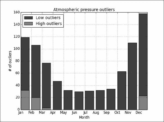
工作原理
看起来异常值大多在下侧,并且夏天不太可能出现。 较高端的异常值似乎仅在某些月份内发生。 我们发现四分位数具有percentile()函数,因为四分之一对应 25%。
另见
- “探索气压”秘籍
percentile()函数的文档