CSS基础知识,必须掌握!!!

CSS基础知识
- Background(背景)
- CSS文本格式
-
- 文本颜色
- 文本对齐格式
- 文本修饰
- 文本缩进
- CSS中的字体
-
- 字体样式
- 字体大小
- CSS链接(link)
- CSS列表
-
- 不同列表标项
- CSS列表项用图片作为标记
- CSS列表标记项位置
- CSS中表格(table)
- 表格边框
-
- 折叠边框
- 设置表格的宽度和高度
- 表格文字对齐方式
- 表格填充与表格颜色
- CSS盒子模型
-
- 元素的宽度和高度
- CSS边框
-
- 边框样式
- 边框宽度和颜色
- 边框单独设置各边
- CSS轮廓(outline)属性
- CSS块级元素、行内元素、行内快元素
- CSS中的position定位
- CSS中 overflow的用法
- CSS浮动(Float)
- CSS中的对齐&垂直居中对齐
-
- 元素居中对齐
- 文本居中对齐
- 图片居中对齐
- 垂直居中对齐(使用padding)
- CSS中的选择器
-
- 后代选择器
- 子元素选择器
- 相邻兄弟选择器
- 普通兄弟选择器
- css导航栏(重要)
-
- 水平导航栏
- 垂直导航栏
- 完结
Background(背景)
CSS背景属性用于定义HTML元素的背景
CSS属性定义背景效果:
- background-color -> 定义背景颜色
- background-image -> 定义背景图片
- background-repeat -> 是否平铺,水平平铺(repeat-x)、垂直平铺(repeat-y)、不平铺(no-repeat)
- background-attachment -> 是否固定背景图片,不随滚动而发生位置改变
- background-position -> 背景图片位置(top、left、right)
<!DOCTYPE html>
<html lang="en">
<head><meta charset="UTF-8"><meta http-equiv="X-UA-Compatible" content="IE=edge"><meta name="viewport" content="width=device-width, initial-scale=1.0"><title>背景元素</title><style>body {background-image: url(image/lisa.jpeg);background-color: pink;background-repeat: no-repeat;background-position: center;background-attachment: fixed;}</style>
</head>
<body><p>有点意思</p><p>有点意思</p><p>有点意思</p><p>有点意思</p><p>有点意思</p><p>有点意思</p><p>有点意思</p><p>有点意思</p><p>有点意思</p><p>有点意思</p><p>有点意思</p><p>有点意思</p><p>有点意思</p><p>有点意思</p><p>有点意思</p><p>有点意思</p><p>有点意思</p><p>有点意思</p><p>有点意思</p><p>有点意思</p><p>有点意思</p><p>有点意思</p><p>有点意思</p><p>有点意思</p><p>有点意思</p><p>有点意思</p><p>有点意思</p><p>有点意思</p><p>有点意思</p><p>有点意思</p><p>有点意思</p><p>有点意思</p><p>有点意思</p><p>有点意思</p><p>有点意思</p>
</body>
</html>
注意: 段落多的用意是为了显示图片固定的效果
CSS文本格式
文本颜色
颜色属性可以用来设置文字的颜色。
CSS中的颜色经常的指定
- 十六进制值 如 :#FFFFFF
- 一个RGB值 如 : RGB(255,0,0)
- 颜色的名称 如: red、pink、blue
style {h1 {color:red;}h2 {color:#ff00ff;}p {color:RGB(255,0,0);	}
}
文本对齐格式
- 文本排列属性是用来设置文本的水平对齐格式
- 文本可居中或者左对齐及右对齐
用法:
- text-align:center -> 居中对齐
- text-align:left -> 左对齐
- text-align -> 右对齐
<!DOCTYPE html>
<html lang="en">
<head><meta charset="UTF-8"><meta http-equiv="X-UA-Compatible" content="IE=edge"><meta name="viewport" content="width=device-width, initial-scale=1.0"><title>文本对齐</title><style>p {text-align:center;color: red;}</style>
</head>
<body><p>真的很有意思</p>
</body>
</html>
文本修饰
text-decoration属性用来设置或删除文本的装饰
注意: 主要用来删除超链接的下划线
案例:
<!DOCTYPE html>
<html lang="en">
<head><meta charset="UTF-8"><meta http-equiv="X-UA-Compatible" content="IE=edge"><meta name="viewport" content="width=device-width, initial-scale=1.0"><title>文本装饰</title><style>p a {text-decoration: none;}</style>
</head>
<body><p>这是一个超链接:<a href="#">去往有点意思的地方</a></p>
</body>
</html>
文本缩进
特点:文本缩进是用来指定文本第一行的缩进
演示:
<!DOCTYPE html>
<html lang="en">
<head><meta charset="UTF-8"><meta http-equiv="X-UA-Compatible" content="IE=edge"><meta name="viewport" content="width=device-width, initial-scale=1.0"><title>文本缩进</title><style>#one {/* text-indent: 2em; */text-indent: 50px;}</style>
</head>
<body><p id="one">还是有点意思啊</p><p>这就没意思了啊</p><p>这就没意思了啊</p><p>这就没意思了啊</p><p>这就没意思了啊</p>
</body>
</html>
注意: 如果要使用首行缩进两个字,可以使用2em,每个em都会自己计算每个文字缩进的大小。
CSS中的字体
CSS中字体属性定义字体、加粗、大小、文字样式
字体系列:可以设置为宋体、微软雅黑等等。
<!DOCTYPE html>
<html lang="en">
<head><meta charset="UTF-8"><meta http-equiv="X-UA-Compatible" content="IE=edge"><meta name="viewport" content="width=device-width, initial-scale=1.0"><title>字体样式</title><style>h1 {font-family:"Times New Roman",Times,serif;}</style>
</head>
<body><h1>有点意思</h1>
</body>
</html>
字体样式
用途: 主要用来指定斜体文字的字体样式属性
主要有三个值:
- 正常-正常显示文字 {font-style:normal;}
- 斜体-以斜体来显示文字 {font-style:italic;}
- 倾斜的文字-文字向一般倾斜 {font-style:oblique;}
字体大小
主要通过font-size:28px设置字体像素,后面跟大小像素就可以。
CSS链接(link)
链接的样式可以用CSS属性来设置,如颜色、字体、大小等
常见的链接伪类选择器:
- a:link -> 未被访问的链接
- a:visited -> 已经被访问过的链接
- a:hover -> 鼠标移动到链接上时显示的效果
- a:active -> 链接被点击的那一时刻,鼠标未松开
注意: 若设置若干链接样式,也有一些顺序规则
- a:hover 必须跟在a:link 和 a:visited 的后面
- a:active 必须跟在a:hover 的后面
演示:
<!DOCTYPE html>
<html lang="en">
<head><meta charset="UTF-8"><meta http-equiv="X-UA-Compatible" content="IE=edge"><meta name="viewport" content="width=device-width, initial-scale=1.0"><title>链接伪类</title><style>a:link {color: yellow;text-decoration: none;}a:visited {color: red;}a:hover {color: orange;}a:active {color: pink;}</style>
</head>
<body><a href="#" target="_blank">有点意思</a>
</body>
</html>
CSS列表
在HTML中设置列表有两种类型:
- 无序列表ul,在CSS中可以设置列表标记项(如:小黑点、小方框等)
- 有序列表ol,列表项可以是数字也可以是字母
在CSS中可以进一步给出样式,并可以用图像作为列表标记项
不同列表标项
CSS中list-style-type 可以指定列表标记项类型
实例:
<!DOCTYPE html>
<html lang="en">
<head><meta charset="UTF-8"><meta http-equiv="X-UA-Compatible" content="IE=edge"><meta name="viewport" content="width=device-width, initial-scale=1.0"><title>列表标记项</title><style>.a {list-style: circle;}.b {list-style: square;}.c {list-style: lower-roman;}.d {list-style: upper-latin;}</style>
</head>
<body><ul class="a"><li>有点意思</li><li>真有意思</li><li>太有意思</li></ul><ul class="b"><li>有点意思</li><li>真有意思</li><li>太有意思</li></ul><ol class="c"><li>有点意思</li><li>真有意思</li><li>太有意思</li></ol><ol class="d"><li>有点意思</li><li>真有意思</li><li>太有意思</li></ol>
</body>
</html>
CSS列表项用图片作为标记
用法: 使用list-style-image: 可以设置图像列表标记项
示例:
<!DOCTYPE html>
<html lang="en">
<head><meta charset="UTF-8"><meta http-equiv="X-UA-Compatible" content="IE=edge"><meta name="viewport" content="width=device-width, initial-scale=1.0"><title>图像列表标记项</title><style>.a {list-style-image:url(image/lisa.jpeg);}</style>
</head>
<body><ul class="a"><li>有点意思</li><li>真有意思</li><li>太有意思</li></ul>
</body>
</html>
CSS列表标记项位置
这CSS中可以使用list-style-position设置列表标记项位置
一般有三个属性:
- inside -> 列表项标记放在文本内,环绕文本根据标记对齐
- outside -> 默认值。保持标记文本的左侧
- inherit -> 表示从父亲元素继承list-style-position的值
示例:
<!DOCTYPE html>
<html lang="en">
<head><meta charset="UTF-8"><meta http-equiv="X-UA-Compatible" content="IE=edge"><meta name="viewport" content="width=device-width, initial-scale=1.0"><title>图像列表标记项</title><style>.a {list-style-image:url(image/lisa.jpeg);}</style>
</head>
<body><ul class="a"><li>有点意思</li><li>真有意思</li><li>太有意思</li></ul>
</body>
</html>
CSS中表格(table)
表格边框
用法: 指定表格边框,使用boarder属性
<!DOCTYPE html>
<html lang="en">
<head><meta charset="UTF-8"><meta http-equiv="X-UA-Compatible" content="IE=edge"><meta name="viewport" content="width=device-width, initial-scale=1.0"><title>表格边框</title><style>table,th,td {border: 1px solid pink;}</style>
</head>
<body><table><tr><th>数据类型</th><th>大小</th></tr><tr><td>byte</td><td>1字节</td></tr><tr><td>short</td><td>2字节</td></tr><tr><td>int</td><td>4字节</td></tr></table>
</body>
</html>
折叠边框
用法: 使用boarder-callopse设置表格边框是否折叠为单个边框或者分开
<!DOCTYPE html>
<html lang="en">
<head><meta charset="UTF-8"><meta http-equiv="X-UA-Compatible" content="IE=edge"><meta name="viewport" content="width=device-width, initial-scale=1.0"><title>表格边框</title><style>table,th,td {border: 1px solid pink;}table {/* 指定折叠边框 */border-collapse: collapse;}</style>
</head>
<body><table><tr><th>数据类型</th><th>大小</th></tr><tr><td>byte</td><td>1字节</td></tr><tr><td>short</td><td>2字节</td></tr><tr><td>int</td><td>4字节</td></tr></table>
</body>
</html>
设置表格的宽度和高度
用法: 使用height和width属性分别设置表格的宽度和高度
<!DOCTYPE html>
<html lang="en">
<head><meta charset="UTF-8"><meta http-equiv="X-UA-Compatible" content="IE=edge"><meta name="viewport" content="width=device-width, initial-scale=1.0"><title>表格边框</title><style>table,th,td {border: 1px solid pink;}table {/* 设置表格宽度和高度 */width: 400px;height: 50px;}</style>
</head>
<body><table><tr><th>数据类型</th><th>大小</th></tr><tr><td>byte</td><td>1字节</td></tr><tr><td>short</td><td>2字节</td></tr><tr><td>int</td><td>4字节</td></tr></table>
</body>
</html>
表格文字对齐方式
用法: 使用text-align属性一般设置center(居中对齐)、left(居左对齐)、right(居右对齐);使用vertical-align可以实现垂直方向对齐,top(顶部对齐)、bottom(底部对齐)。
<!DOCTYPE html>
<html lang="en">
<head><meta charset="UTF-8"><meta http-equiv="X-UA-Compatible" content="IE=edge"><meta name="viewport" content="width=device-width, initial-scale=1.0"><title>表格边框</title><style>table,th,td {border: 1px solid pink;}td {/* 设置表格文字对齐方式 */text-align: center;}td {/* 设置垂直对齐 */height: 50px;vertical-align: top;}</style>
</head>
<body><table><tr><th>数据类型</th><th>大小</th></tr><tr><td>byte</td><td>1字节</td></tr><tr><td>short</td><td>2字节</td></tr><tr><td>int</td><td>4字节</td></tr></table>
</body>
</html>
表格填充与表格颜色
表格填充: 如需设置表格中的内容与边框的距离可以使用pidding属性设置相应的像素值
表格颜色: 可以使用background-color 设置表个背景颜色,color直接可以设置表格中的字体颜色。
<!DOCTYPE html>
<html lang="en">
<head><meta charset="UTF-8"><meta http-equiv="X-UA-Compatible" content="IE=edge"><meta name="viewport" content="width=device-width, initial-scale=1.0"><title>表格边框</title><style>table,th,td {border: 1px solid pink;}td {/* 控制表格内容与边框的距离 */padding: 20px;}th {background-color: orange;color: white;}</style>
</head>
<body><table><tr><th>数据类型</th><th>大小</th></tr><tr><td>byte</td><td>1字节</td></tr><tr><td>short</td><td>2字节</td></tr><tr><td>int</td><td>4字节</td></tr></table>
</body>
</html>
CSS盒子模型
说明: 所有HTML元素都可以看作为一个盒子模型,CSS盒子模型本质上就是一个盒子,它包括:边距、边框、填充、内容。
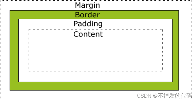
- Margin(外边距) -> 清除边框外的区域,外边距是透明的。
- Borader(边框) -> 围绕在内边距和内容外的边框。
- Padding (内边距)-> 内容周围区域,内边距也是透明的
- Content (内容) -> 盒子中的内容,显示图像和文字
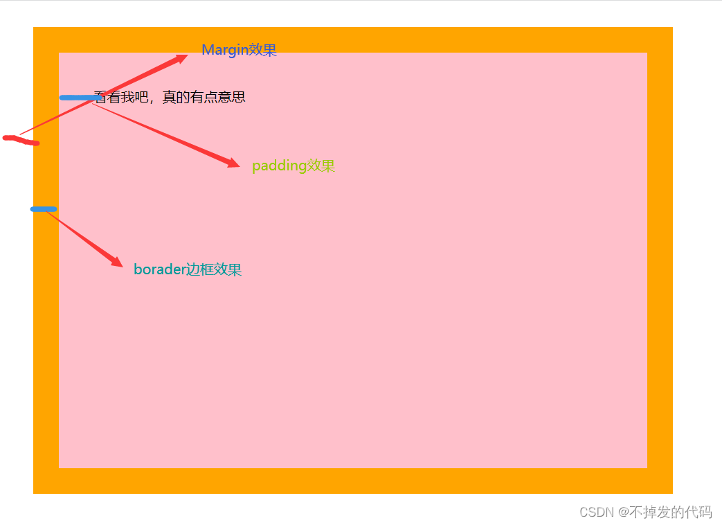
元素的宽度和高度
注意: 一般指定一个CSS元素的宽度和高度属性时,你只是设置内容上的宽度和高度。完整的大小元素,你还需要添加内边距、边框、外边距
下面看一个例子理解:
<!DOCTYPE html>
<html lang="en">
<head><meta charset="UTF-8"><meta http-equiv="X-UA-Compatible" content="IE=edge"><meta name="viewport" content="width=device-width, initial-scale=1.0"><title>盒子模型</title><style>div {background-color: pink;width: 600px;height: 400px;/* 边框大小30像素、实线、橙色 */border: 30px solid orange;padding: 40px;margin: 30px;}</style>
</head>
<body><div>看看我吧,真的有点意思</div>
</body>
</html>
CSS边框
在CSS中允许设置一个元素边框的样式和颜色,比如有四条边的边框和不是方形的边框也是可以设置的。
边框样式
用法: 一般通过boarder-style属性来定义边框的样式
| 值 | 说明 |
|---|---|
| none | 默认无边框 |
| dotted | 定义一个点线边框 |
| solid | 定义实线边框 |
| double | 定义两个边框,两个边框宽度相同 |
| groove | 定义3D沟槽边框,效果取决于边框颜色值 |
| ridge | 定义3D脊边框,效果取决于边框颜色值 |
| inset | 定义3D嵌入边框,效果取决于颜色值 |
| outset | 定义3D突出边框,效果取决于颜色值 |
边框宽度和颜色
- 通过borader-color可以设置边框的颜色,颜色三种写法
- 通过borader-width可以设置边框的宽度,给定响应的像素值
边框单独设置各边
说明: 在CSS中可以指定不同侧边不同的边框
- 通过boarder-top-style设置上边框的样式
- 通过boarder-right-style设置右边框的样式
- 通过boarder-bottom-style设置下边框的样式
- 通过boarder-left-style设置左边框的样式
CSS轮廓(outline)属性
说明: 轮廓位于边框边缘的外围,可起到突出元素的作用。
使用: outline属性规定元素轮廓的样式、颜色、宽度。
属性值:
- outline-color -> 设置轮廓的颜色
- outline-style -> 设置轮廓的样式
- outline-width -> 设置轮廓的宽度
| 属性 | 值 |
|---|---|
| outline-color | 颜色的三种表达方式 |
| outline-style | none、dotted、dashed、solid、double、groove、ridge、inset、outset、inherit |
| outline-width | thin、medium、thick、length、inherit |
CSS块级元素、行内元素、行内快元素
块级元素: 块级元素占用了全部的宽度(页面一整行),收尾都是换行符。
行内元素: 行内元素只需要必要的宽度,不强制换行
行内块元素: 行内快元素既有块级元素的特点也有行内元素的特点,主要特点就是它可以指明宽度和高度。
块级元素举例:
行内元素举例:
行内快元素: 行内块元素可以从块级元素和行内元素转换而来,同时,块级元素可以转换为行内元素,行内元素也可以转换为块级元素。
转换方式:
- display:inline-block -> 转换为行内块元素
- dispaly:inline -> 转换为行内元素
- display:block -> 转换为块级元素
例子: 这是一个块级元素转换为行内块元素的例子
<!DOCTYPE html>
<html lang="en">
<head><meta charset="UTF-8"><meta http-equiv="X-UA-Compatible" content="IE=edge"><meta name="viewport" content="width=device-width, initial-scale=1.0"><title>块级元素</title><style>div.a {display: inline-block;width: 200px;height:100px;background-color: pink;font-size: 20px;}div.b {display: inline-block;width: 200px;height:100px;background-color: red;font-size: 20px;}</style>
</head>
<body><div class="a">有点意思</div><div class="b">我也有点意思</div>
</body>
</html>
CSS中的position定位
说明: position属性指定了元素的定位类型
属性值:
- static -> 无特殊定位
- relative -> 相对定位元素移动
- fixed -> 相对于浏览器位置是固定的,不随滚轮滑动而改变位置
- absolute -> 相对于已经定位的父元素,如果元素没有已经定位的父元素,这个父元素就是
- stiky -> 粘贴定位依赖与滚轮来定位,滚轮往下滚的时候效果才能显示出来
例子: 这是一个粘贴定位的例子
注意: 指定属性后一定要制定粘贴定位的位置,否则不起效果
<!DOCTYPE html>
<html lang="en">
<head><meta charset="UTF-8"><meta http-equiv="X-UA-Compatible" content="IE=edge"><meta name="viewport" content="width=device-width, initial-scale=1.0"><title>元素定位</title><style>p.sticky {position: -webkit-sticky;position: sticky;top: 10px;border: 5px solid pink;background-color: orange;}</style>
</head>
<body><p class="sticky">有点意思</p><p>滑动滚轮</p><p>滑动滚轮</p><p>滑动滚轮</p><p>滑动滚轮</p><p>滑动滚轮</p><p>滑动滚轮</p><p>滑动滚轮</p><p>滑动滚轮</p><p>滑动滚轮</p><p>滑动滚轮</p><p>滑动滚轮</p><p>滑动滚轮</p><p>滑动滚轮</p><p>滑动滚轮</p><p>滑动滚轮</p><p>滑动滚轮</p><p>滑动滚轮</p><p>滑动滚轮</p><p>滑动滚轮</p><p>滑动滚轮</p><p>滑动滚轮</p><p>滑动滚轮</p><p>滑动滚轮</p><p>滑动滚轮</p><p>滑动滚轮</p><p>滑动滚轮</p><p>滑动滚轮</p><p>滑动滚轮</p><p>滑动滚轮</p><p>滑动滚轮</p><p>滑动滚轮</p><p>滑动滚轮</p><p>滑动滚轮</p><p>滑动滚轮</p><p>滑动滚轮</p><p>滑动滚轮</p><p>滑动滚轮</p><p>滑动滚轮</p><p>滑动滚轮</p><p>滑动滚轮</p>
</body>
</html>
CSS中 overflow的用法
说明:
| 值 | 说明 |
|---|---|
| inherit | 从父元素继承overflow的值 |
| visible | 默认值,内容不会被修剪,呈现在元素框之外 |
| hidden | 内容会被修剪,其余内容不会呈现 |
| scroll | 内容会被修剪,但是浏览器显示滚动条呈现 |
| auto | 如果内容被修剪,浏览器显示滚动条查看其余内容 |
例子: 演示scroll效果
<!DOCTYPE html>
<html lang="en">
<head><meta charset="UTF-8"><meta http-equiv="X-UA-Compatible" content="IE=edge"><meta name="viewport" content="width=device-width, initial-scale=1.0"><title>overflow的使用</title><style>div {width: 200px;height:50px;border: 5px solid pink;overflow: scroll;}</style>
</head>
<body><div><p>有点意思</p><p>有点意思</p><p>有点意思</p><p>有点意思</p></div>
</body>
</html>
CSS浮动(Float)
作用: 一般这个属性会用于一段文字中的图片浮动,可以图片浮动在文字的左边,也可以浮动在文字的右边。
用法: 在图片标签使用属性float
- float:left -> 浮动在文字左边
- float:right -> 浮动在文字右边
- float:inline-start -> 浮动在文字的开头
- float:inline-end -> 浮动在文字的结尾
<!DOCTYPE html>
<html lang="en">
<head><meta charset="UTF-8"><meta http-equiv="X-UA-Compatible" content="IE=edge"><meta name="viewport" content="width=device-width, initial-scale=1.0"><title>float的使用</title><style>p img{float: inline-start;}</style>
</head>
<body><p> <img src="image/lisa.jpeg" width="200px">--有点意思----有点意思----有点意思----有点意思----有点意思----有点意思----有点意思----有点意思----有点意思----有点意思----有点意思----有点意思----有点意思----有点意思----有点意思----有点意思----有点意思----有点意思----有点意思----有点意思----有点意思----有点意思----有点意思----有点意思----有点意思----有点意思----有点意思----有点意思----有点意思----有点意思----有点意思----有点意思----有点意思----有点意思----有点意思--</p>
</body>
</html>
CSS中的对齐&垂直居中对齐
说明: CSS中的对齐无非就两种,一种是使用特点的属性使元素居中对齐,还有一种就是通过指定的宽度将两边的边距平均分配。
- 元素div对齐,可以使用margin:auto
- 表格中的文本居中对齐可以只用padding设置左右边距一样可以实现居中对齐
元素居中对齐
例子: div元素居中对齐
<!DOCTYPE html>
<html lang="en">
<head><meta charset="UTF-8"><meta http-equiv="X-UA-Compatible" content="IE=edge"><meta name="viewport" content="width=device-width, initial-scale=1.0"><title>对齐&垂直居中对齐</title><style>div {background-color: pink;border: 3px solid orange;margin: auto;/*如果没有设置则起不到效果*/width: 60%;}</style>
</head>
<body><div>有点意思</div>
</body>
</html>
文本居中对齐
说明: 最常用text-align:center就能实现
图片居中对齐
说明: 可以是图片元素包裹到块级元素中,让块级元素居中对齐,例如吧img元素包裹到p标签中,让p标签中的内容居中对齐;还可以图片(行内元素)转换为块级元素,按照块级元素的方式居中对齐。
例子:包裹在块级元素中对齐
<!DOCTYPE html>
<html lang="en">
<head><meta charset="UTF-8"><meta http-equiv="X-UA-Compatible" content="IE=edge"><meta name="viewport" content="width=device-width, initial-scale=1.0"><title>图片居中对齐</title><style>p {text-align: center;}</style>
</head>
<body><p><img src="image/pyy.jpeg" width="300"></p>
</body>
</html>
垂直居中对齐(使用padding)
说明:使元素的头部和底部都设置同样的边距来呈现垂直居中的效果
padding参数介绍:
| 参数个数 | 效果 |
|---|---|
| 1 | 上、右、下、左会依次受设置的 参数影响 |
| 2 | 上下、左右依次会受设置的参数影响 |
| 3 | 上、左右、下会依次受设置的参数影响 |
| 4 | 上、下、左、右会依次受设置边的影响 |
例子:
<!DOCTYPE html>
<html lang="en">
<head><meta charset="UTF-8"><meta http-equiv="X-UA-Compatible" content="IE=edge"><meta name="viewport" content="width=device-width, initial-scale=1.0"><title>padding参数使用</title>
</head>
<style>div {/* 设置成行内块元素就可以指定宽高 */display: inline-block;background-color: pink;/* padding效果在盒子宽高不够的情况下会把盒子给顶开 */padding: 30px 80px;}
</style>
<body><div>有点意思</div>
</body>
</html>
CSS中的选择器
说明: 选择器就是选择对应的元素添加相应的样式,重点突出在选择方面
CSS中包含四种选择器:
- 后代选择器(使用空格分隔)
- 子元素选择器 (使用>分隔)
- 相邻元素选择器 (使用+分隔)
- 普通兄弟选择器 (以~分隔)
后代选择器
例子: 选择div中所有的p标签添加样式
<style>div p {text-align: center;}
</style>
子元素选择器
说明: 与后代选择器相比,子元素选择器只能选择嵌套的一级子元素
例子:
<style>div>p {text-align: center;}
</style>
相邻兄弟选择器
说明: 相邻选择器在同一级中选择,或者拥有同一父元素
例子:
<style>div+p {text-align: center;}
</style>
普通兄弟选择器
说明: 选取指定元素之后的相邻兄弟元素
例子:
<!DOCTYPE html>
<html lang="en">
<head><meta charset="UTF-8"><meta http-equiv="X-UA-Compatible" content="IE=edge"><meta name="viewport" content="width=device-width, initial-scale=1.0"><title>选择器</title><style>div~p {background-color: pink;}</style>
</head>
<body><div><p>没有意思</p><p>没有意思</p><p>没有意思</p></div><span><p>真有点意思哦</p></span><p>有点意思</p><p>有点意思</p>
</body>
</html>
css导航栏(重要)
说明: 导航栏主要分为垂直导航栏和水平导航栏,熟练掌握导航栏对于开发来说非常重要,导航栏同时也搭配链接来使用
水平导航栏
下面主要通过例子来介绍导航栏
<!DOCTYPE html>
<html lang="en"><head><meta charset="UTF-8"><meta http-equiv="X-UA-Compatible" content="IE=edge"><meta name="viewport" content="width=device-width, initial-scale=1.0"><title>水平导航栏</title><style>a {display: inline-block;width: 230px;height: 40px;background-color: gray;text-decoration: none;line-height: 40px;text-indent: 3em;color: white;}#a {margin-left: -10px;}#s {margin-top: 200px;margin-left: 180px;}a:hover {background-color: orange;color: black;}</style>
</head><body><a href="#" id="s">主页</a><a href="#" id="a">国产</a><a href="#" id="a">日韩</a><a href="#" id="a">欧美</a><a href="#" id="a">联系我们</a>
</body></html>
效果:

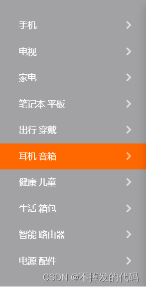
垂直导航栏
例子: 这里尝试做一下小米侧边栏
效果图:
<!DOCTYPE html>
<html lang="en">
<head><meta charset="UTF-8"><meta http-equiv="X-UA-Compatible" content="IE=edge"><meta name="viewport" content="width=device-width, initial-scale=1.0"><title>小米侧边栏</title><style>a {display: block;text-decoration: none;background-color: gray;font-size: 18px;text-indent: 3em;height: 40px;width: 230px;line-height: 40px;color: white;}a:hover {background-color: rgb(255, 103, 0);}</style>
</head>
<body><a href="#">手机</a><a href="#">电视</a><a href="#">家电</a><a href="#">笔记本 平板</a><a href="#">出行 穿搭</a>    <a href="#">健康 儿童</a>    <a href="#">耳机 音响</a>    <a href="#">生活 箱包</a>    <a href="#">智能 路由器</a>    <a href="#">电源 配件</a>
</body>
</html>
完结
这是CSS中很基础的内容,是一定要掌握的,博主撰写目的也是CSS的初学者,都是涵盖学习过来的经历,希望这篇文章能真正帮助到你。